README
react-xarrows
introduction
Draw arrows between components in React!


main features
- Connect between elements by passing a ref or an id for startElement and endElement.
- Automatic anchoring based on smallest path.
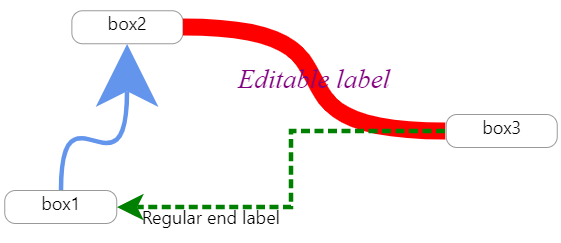
- can add customizable labels
- relatively fast algorithm to find path and to adjust canvas.
- Easily customize the look and behavior of the arrow.
- Written in typescript so you get nice props suggestions(but support js also of course).
found a problem? not a problem! post a new issue(here).
liked my work? please star this repo.
installation
with npm npm install react-xarrows.
(or yarn add react-xarrows)
Examples
Demos
see here! codebox of few examples(in this repo at /examples).
see this interactive example: https://lwwwp.csb.app/CustomizeArrow
simple example:
import React, {useRef} from "react";
import Xarrow from "react-xarrows";

const boxStyle = {
    border: "grey solid 2px",
    borderRadius: "10px",
    padding: "5px",
};

function SimpleExample() {
    const box1Ref = useRef(null);
    return (
        <div style={{display: "flex", justifyContent: "space-evenly", width: "100%"}}>
            <div ref={box1Ref} style={boxStyle}>
                hey
            </div>
            <p id="elem2" style={boxStyle}>
                hey2
            </p>
            <Xarrow
                start={box1Ref} //can be react ref
                end="elem2" //or an id
            />
        </div>
    );
}

export default SimpleExample;
Usage
react-xarrows does not renders automatically if one of the connected elements is rendered. You have to manually trigger an update on the arrows whenever one of the connected elements renders(possibaly by trigger update on the parent of the arrows) ,this is because the Xarrow component does not have any control or awareness of the connected elements. in addition, make sure to render Xarrows later in the DOM then the connected elements else the app will crash. this is planned to be changed in react-xarrows v2.
Contributing
Want a feature that is not supported? found a bug?
no need to clone the repo and set up the dev environment anymore!
here's a ready to use development environment with a click of a button(patience, it takes about a minute to setup):

pro tip - after signing into Gitpod go to IDE preferences and change default editor from theia to vscode!
this will set up environment that will clone react-xarrow master,and will link the code from the src to the examples,
and will start examples,with typescript watch process that will recompile when any change is made.
this means that any code changes in src/index.tsx will immediately be reflected to the running example at port 3000!
(add console.log("test") line and see!)
to reproduce this dev env on your local machine git clone and follow same commands as in gitpod.yml.
if you made an improvement that you think is relevant for most users, you can quickly submit a pull request using the right toolbar.
react-xarrows v2
v2 is on its way. want to contribute and participate in plannig the next react architecture for react-xarrows? see discussion here!
types definitions
the properties the xarrow component receives is as follows(don't panic,the important ones explained next):
export type xarrowPropsType = {
    start: refType;
    end: refType;
    startAnchor?: anchorType | anchorType[];
    endAnchor?: anchorType | anchorType[];
    label?: labelType | labelsType;
    color?: string;
    lineColor?: string | null;
    headColor?: string | null;
    tailColor?: string | null;
    strokeWidth?: number;
    showHead?: boolean;
    headSize?: number;
    showTail?: boolean;
    tailSize?: number;
    path?: "smooth" | "grid" | "straight";
    curveness?: number;
    dashness?: | boolean | { strokeLen?: number; nonStrokeLen?: number; animation?: boolean | number; };
    passProps?: React.SVGProps<SVGPathElement>;
    SVGcanvasProps?: React.SVGAttributes<SVGSVGElement>;
    arrowBodyProps?: React.SVGProps<SVGPathElement>;
    arrowHeadProps?: React.SVGProps<SVGPathElement>;
    arrowTailProps?: React.SVGProps<SVGPathElement>;
    divContainerProps?: React.HTMLProps<HTMLDivElement>;
    SVGcanvasStyle?: React.CSSProperties;
    divContainerStyle?: React.CSSProperties;
    _extendSVGcanvas?: number;
    _debug: boolean;
    _cpx1Offset: number;
    _cpy1Offset: number;
    _cpx2Offset: number;
    _cpy2Offset: number;
};

export type anchorType = anchorPositionType | anchorCustomPositionType;
export type anchorPositionType = | "middle" | "left" | "right" | "top" | "bottom" | "auto";

export type anchorCustomPositionType = {
    position: anchorPositionType;
    offset: { rightness?: number; bottomness?: number };
};
export type refType = React.MutableRefObject<any> | string;
export type labelsType = {
    start?: labelType;
    middle?: labelType;
    end?: labelType;
};
export type labelType = JSX.Element | string;
export type domEventType = keyof GlobalEventHandlersEventMap;
API flexibility
This API is built in such way that most props can accept different types. you can keep things simple or provide more
detailed props for more custom behavior - the API except both(see startAnchor or label
properties for good examples)
.
see typescript types above for detailed descriptions of what type excepts every prop.
Properties
This documentation is examples driven.
The examples is sorted from the most common use case to the most custom one.
'start' and 'end'
required
can be a reference to a react ref to html element or string - an id of a DOM element.
examples:
start="myid"-myidis id of a dom element.start={myRef}-myRefis a react ref.
'startAnchor' and 'endAnchor'
optional, default: "auto" \
each anchor can be: "auto" | "middle" | "left" | "right" | "top" | "bottom".
auto will choose automatically the path with the smallest length. can also be a list of possible anchors. if list is
provided - the minimal length anchors will be choose from the list. you can also offset each anchor passing offset.
examples:
endAnchor="middle"will set the anchor of the end of the line to the middle of the end element.endAnchor= { position: "auto", offset: { rightness: 20 } }will choose automatic anchoring for end anchor but will offset it 20 pixels to the right after normal positioning.endAnchor= ["right", {position: "left", offset: {bottomness: -10}}]only right and left anchors will be allowed for endAnchor, and if the left side connected then it will be offset 10 pixels up.
label
optional, default: null
you can place up to 3 labels. see examples
label="middleLabel"- middle labellabel=<div style={{ fontSize: "1.3em", fontFamily: "fantasy", fontStyle: "italic" }}>styled middle label</div>- custom middle labellabel={{ start:"I'm start label",middle: "middleLabel",end:<div style={{ fontSize: "1.3em", fontFamily: "fantasy", fontStyle: "italic" }}>big end label</div> }}- start and middle label and custom end label
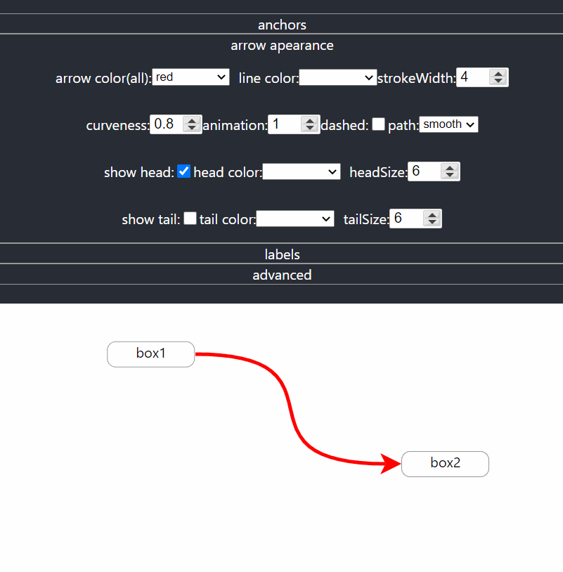
color,lineColor and headColor and tailColor
optional, default: "CornflowerBlue"
color defines color to the entire arrow. lineColor,headColor and tailColor will override color specifically for
line,tail or head. examples:
color="red"will change the color of the arrow to red(body and head).headColor="red"will change only the color of the head to red.tailColor="red"will change only the color of the tail to red.lineColor="red"will change only the color of the body to red.
strokeWidth and headSize and tailSize
optional, default: 6
strokeWidth defines the thickness of the entire arrow. headSize and tailSize defines how big will be the head or tail
relative to the strokeWidth. examples:
strokeWidth={15}will make the arrow more thick(body and head).headSize={15}will make the head of the arrow more thick(relative to strokeWidth as well).tailSize={15}will make arrow's tail thicker.
path
optional, default: "smooth"
path can be one of: "smooth" | "grid" | "straight", and it controls the path arrow is drawn, exactly how their name
suggest. examples:
path={"grid"}will draw the line in sharp curves(90 degrees) like grid.
curveness
optional, default: 0.8
defines how much the lines curve. examples:
curveness={false}will make the line straight without curves(exactly like path='straight').curveness={true}will choose default values of curveness.curveness={2}will make Xarrow extra curved.
dashness
optional, default: false
can make the arrow dashed and can even animate. if true default values(for dashness) are chosen. if object is passed
then default values are chosen except what passed. examples:
dashness={true}will make the line of the arrow to be dashed.dashness={{ strokeLen: 10, nonStrokeLen: 15, animation: -2 }}will make a custom looking dashness.
passing props
The xarrow is fully customizable, and you can pass props to any part of the component. if unlisted(unknown) property is
passed to xarrow so by default it'll be passed down to divConatiner.
passProps
optional, default: {}
you can pass properties to visible parts(body and head) of the arrow (such event handlers and much more). this supposed
to be enough for most cases. examples:
passProps= {{onClick: () => console.log("xarrow clicked!")}}- now the arrow will console log a message when clicked.passProps= {{cursor: "pointer"}}- now the cursor will change to pointer style when hovering over Xarrow.passProps= {{pointerEvents: "none"}}- now the user cannot interact with Xarrow via mouse events.
advanced customization
The properties below can be used to customize the arrow even farther:
arrowBodyProps, arrowHeadProps, SVGcanvasProps, divContainerProps
optional, default: {} \
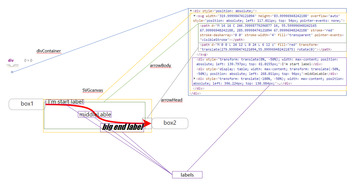
if you wish you can pass props specific part of the component.
divContainerProps- the container which contains the SVG canvas, and the optional labels elements. It takes no place, and located where you normaly placed him in the elements tree(no offset). The SVGcanvas and the labels will be placed in a offset from this div.SVGcanvasProps- the svg canvas which contains arrow head and body.arrowBodyProps- the body of the arrowarrowHeadProps- the arrow head.
Note that arrowBody and arrowHead receives props of svg path element, SVGcanvas receives props of svg element,
and divContainerProps of a div element.
examples:
arrowHead = {onClick: () => console.log("head clicked!")}- now only the head will console log a message when clicked.
SVGcanvasStyle divContainerStyle
if you wish to pass style to divContainer or SVGcanvas use SVGcanvasStyle,divContainerStyle and not SVGcanvasProps
,divContainerProps to not override existing style.
_extendSVGcanvas
optional, default: 0
will extend the svg canvas at all sides. can be useful if for some reason the arrow is cut though to small
svg canvas(should be used in advanced custom arrows). example: _extendSVGcanvas = {30} - will extend svg canvas in all
sides by 30 pixels.
_cpx1Offset,_cpy1Offset,_cpx2Offset,_cpy2Offset
optional, default: 0
now you can manipulate and offset the control points of the arrow. this way you can control how the line curves. check
out the interactive codesandbox, set _debug to true and play with these properties.
default props
default props is as follows:
Xarrow.defaultProps = {
    startAnchor: "auto",
    endAnchor: "auto",
    label: null,
    color: "CornflowerBlue",
    lineColor: null,
    headColor: null,
    strokeWidth: 4,
    headSize: 6,
    path: "smooth",
    curveness: 0.8,
    dashness: false,
    passProps: {},
    arrowBodyProps: {},
    arrowHeadProps: {},
    SVGcanvasProps: {},
    divContainerProps: {},
    _extendSVGcanvas: 0,
    _debug: false,
    _cpx1Offset: 0,
    _cpy1Offset: 0,
    _cpx2Offset: 0,
    _cpy2Offset: 0,
};
Versions
See CHANGELOG.md in this repo.