README
ReactstrapNativeWeb
This is project create support library bootstrap on react native and react native web
Table of contents
- Installation
- Global Style
- Setup
- Document Structure Dynamic Theme
- Text Color
- Background Color
- Border Color
- Border Width
- Padding
- Margin
- Width and Height
- Display
- Overflow
- Position
- ZIndex
- Font Size
- Font Weight
- Letter Spacing
- Line Height
- Text Align
- Text Decoration
- Text Transform
- Flex Direction
- Flex Wrap
- Align Items
- Align Content
- Align Self
- Justify Content
- Flex
- Flex Grow
- Flex Shrink
- Container Component
- Row Component
- Col Component
- Image Component
- TextShadow Component
- Inspired by
- Contributing
- Author
- License
Installation
If using yarn:
yarn add reactstrap-native-web@beta
If using npm:
npm i reactstrap-native-web@beta
Global Style
Setup
- Create file styles any (recommended use name: theme.style.js or theme.style.ts if you use the typescript in a folder style)
- Load theme
defaultordynamic themeyou want.
And then you can import global style anywhereimport {buildTheme} from 'reactstrap-native-web'; import {StyleSheet} from 'react-native' const themes = buildTheme({ lightTheme: { spacer: 30, colors: { primary: 'red', }, }, }); export const bootstrap = StyleSheet.create(themes.default.styleSheet); export const lightTheme = StyleSheet.create(themes.lightTheme.styleSheet);Note: when we definecolorsvariable for any theme will auto-generate text color, background color, and border color equivalent Beside aboutspacervariable will auto-generate margin and padding equivalent please reference spacing - Theme defaults similar :root of bootstrap
export default { spacer: 16, colors: { blue: '#007bff', indigo: '#6610f2', purple: '#6f42c1', pink: '#e83e8c', red: '#dc3545', orange: '#fd7e14', yellow: '#ffc107', green: '#28a745', teal: '#20c997', cyan: '#17a2b8', white: '#fff', gray: '#6c757d', grayDark: '#343a40', primary: '#007bff', secondary: '#6c757d', success: '#28a745', info: '#17a2b8', warning: '#ffc107', danger: '#dc3545', light: '#f8f9fa', dark: '#343a40', }, };
Document Structure Dynamic Theme
| Name | Description | Default | Type | Required |
|---|---|---|---|---|
| colors | Define color for your dynamic theme or override theme default | None | Object | false |
| spacer | Number present size please reference spacing | 16 | Number | false |
| ### Text Color |
- Generate when we setting
colors - Example:
import {buildTheme} from 'reactstrap-native-web';
import {StyleSheet} from 'react-native'
const themes = buildTheme({
  lightTheme: {
    spacer: 30,
    colors: {
      primary: 'red',
    },
  },
});

export const bootstrap = StyleSheet.create(themes.default.styleSheet);
export const lightTheme = StyleSheet.create(themes.lightTheme.styleSheet);
- Auto generate
text colorforlightTheme:
import {StyleSheet} from "react-native";
StyleSheet.create({
textPrimary: {
color: 'red'
}
})
- we can access style in code the following:
export const ExampleComponent = () => {
return (
<View style={lightTheme.textPrimary}/>
);
}
Background Color
- Generate when we setting
colors - Example:
     import {buildTheme} from 'reactstrap-native-web';
     import {StyleSheet} from 'react-native'
     const themes = buildTheme({
         lightTheme: {
            spacer: 30,
            colors: {
              primary: 'red',
            },
         },
     });

     export const bootstrap = StyleSheet.create(themes.default.styleSheet);
     export const lightTheme = StyleSheet.create(themes.lightTheme.styleSheet);
- Auto generate
background colorforlightTheme:
import {StyleSheet} from "react-native";
StyleSheet.create({
bgPrimary: {
backgroundColor: 'red'
}
})
- we can access style in code the following:
export const ExampleComponent = () => {
return (
<View style={lightTheme.bgPrimary}/>
);
}
Border Color
- Generate when we setting
colors - Example:
     import {buildTheme} from 'reactstrap-native-web';
     import {StyleSheet} from 'react-native'
     const themes = buildTheme({
         lightTheme: {
             spacer: 30,
             colors: {
                 primary: 'red',
             },
         },
     });

     export const bootstrap = StyleSheet.create(themes.default.styleSheet);
     export const lightTheme = StyleSheet.create(themes.lightTheme.styleSheet);
- Auto generate
border colorforlightTheme:
import {StyleSheet} from "react-native";
StyleSheet.create({
borderPrimary: {
borderColor: 'red',
},
borderFullPrimary: {
borderWidth: 1,
borderColor: 'red',
borderStyle: 'solid',
},
borderBottomPrimary: {
borderBottomColor: 'red',
borderBottomWidth: 1,
borderStyle: 'solid',
},
borderLeftPrimary: {
borderLeftColor: 'red',
borderLeftWidth: 1,
borderStyle: 'solid',
},
borderRightPrimary: {
borderRightColor: 'red',
borderRightWidth: 1,
borderStyle: 'solid',
},
borderTopPrimary: {
borderTopColor: 'red',
borderTopWidth: 1,
borderStyle: 'solid',
}
})
- we can access style in code the following:
export const ExampleComponent = () => {
return (
<View style={lightTheme.borderFullPrimary}/>
);
}
Border Width
- Generate when we setting
spacer - Example:
     import {buildTheme} from 'reactstrap-native-web';
     import {StyleSheet} from 'react-native'
     const themes = buildTheme({
         lightTheme: {
             spacer: 30,
             colors: {
                 primary: 'red',
             },
         },
     });

     export const bootstrap = StyleSheet.create(themes.default.styleSheet);
     export const lightTheme = StyleSheet.create(themes.lightTheme.styleSheet);
- Auto generate
border widthforlightTheme:
import {StyleSheet} from "react-native";
StyleSheet.create({
border0: {
borderWidth: 0,
},
borderB0: {
borderBottomWidth: 0,
},
borderE0: {
borderEndWidth: 0,
},
borderL0: {
borderLeftWidth: 0,
},
borderR0: {
borderRightWidth: 0,
},
borderS0: {
borderStartWidth: 0,
},
borderT0: {
borderTopWidth: 0,
},
borderX0: {
borderRightWidth: 0,
borderLeftWidth: 0,
},
borderY0: {
borderBottomWidth: 0,
borderTopWidth: 0,
},
... generate => spacer / 2 ,
border15: {
borderWidth: 15,
}
})
- we can access style in code the following:
export const ExampleComponent = () => {
return (
<View style={lightTheme.border3}/>
);
}
Padding
- Generate when we setting
spacer - Example:
     import {buildTheme} from 'reactstrap-native-web';
     import {StyleSheet} from 'react-native'
     const themes = buildTheme({
         lightTheme: {
             spacer: 30,
             colors: {
                 primary: 'red',
             },
         },
     });

     export const bootstrap = StyleSheet.create(themes.default.styleSheet);
     export const lightTheme = StyleSheet.create(themes.lightTheme.styleSheet);
- Auto generate
paddingforlightThemeaccording to the rate of spacing of the bootstrap
import {StyleSheet} from "react-native";
StyleSheet.create({
p0: {
padding: 0,
},
pb0: {
paddingBottom: 0,
},
pl0: {
paddingLeft: 0,
},
pt0: {
paddingTop: 0,
},
pr0: {
paddingRight: 0,
},
px0: {
paddingHorizontal: 0,
},
py0: {
paddingVertical: 0,
},
... generate => 5,
p5: {
padding: spacer * 3,
}
})
- we can access style in code the following:
export const ExampleComponent = () => {
return (
<View style={lightTheme.p3}/>
);
}
Margin
- Generate when we setting
spacer - Example:
     import {buildTheme} from 'reactstrap-native-web';
     import {StyleSheet} from 'react-native'
     const themes = buildTheme({
         lightTheme: {
             spacer: 30,
             colors: {
                 primary: 'red',
             },
         },
     });

     export const bootstrap = StyleSheet.create(themes.default.styleSheet);
     export const lightTheme = StyleSheet.create(themes.lightTheme.styleSheet);
- Auto generate
marginforlightThemeaccording to the rate of spacing of the bootstrap
     import {StyleSheet} from "react-native";

     StyleSheet.create({
         m0: {
             margin: 0,
         },
         mb0: {
             marginBottom: 0,
         },
         ml0: {
             marginLeft: 0,
         },
         mt0: {
             marginTop: 0,
         },
         mr0: {
             marginRight: 0,
         },
         mx0: {
             marginHorizontal: 0,
         },
         my0: {
             marginVertical: 0,
         },
         ... generate => 5,
         m5: {
             margin: spacer * 3,
         }
     })
- we can access style in code the following:
     export const ExampleComponent = () => {
         return (
             <View style={lightTheme.m3}/>
         );
     }
Width and Height
- Inspiration from library react-native-tailwindcss
Display
| Class | Properties |
|---|---|
| flex | display: 'flex' |
| hidden | display: 'none' |
| ### Overflow | |
| Class | Properties |
| :------------------ | :---------------------- |
| overflowVisible | overflow: 'visible' |
| overflowHidden | overflow: 'hidden' |
| ### Position | |
| Class | Properties |
| :---------- | :------------------------------------------ |
| relative | position: 'relative' |
| absolute | position: 'absolute' |
| inset0 | top: 0, bottom: 0, left: 0, right: 0 |
| insetY0 | top: 0, bottom: 0 |
| insetX0 | left: 0, right: 0 |
| top0 | top: 0 |
| right0 | right: 0 |
| bottom0 | bottom: 0 |
| left0 | left: 0 |
| ### ZIndex | |
| Class | Properties |
| :------ | :-------------- |
| z0 | zIndex: 0 |
| z10 | zIndex: 10 |
| z20 | zIndex: 20 |
| z30 | zIndex: 30 |
| z40 | zIndex: 50 |
| z50 | zIndex: 50 |
| ### Font Size | |
| Class | Properties |
| :---------- | :-------------- |
| textXs | fontSize: 12 |
| textSm | fontSize: 14 |
| textBase | fontSize: 16 |
| textLg | fontSize: 18 |
| textXl | fontSize: 20 |
| text2xl | fontSize: 24 |
| text3xl | fontSize: 30 |
| text4xl | fontSize: 36 |
| text5xl | fontSize: 48 |
| text6xl | fontSize: 64 |
| ### Font Weight | |
| Class | Properties |
| :-------------- | :---------------------- |
| fontHairline | fontWeight: 100 |
| fontThin | fontWeight: 200 |
| fontLight | fontWeight: 300 |
| fontNormal | fontWeight: 'normal' |
| fontMedium | fontWeight: 500 |
| fontSemibold | fontWeight: 600 |
| fontBold | fontWeight: 'bold' |
| fontExtrabold | fontWeight: 800 |
| fontBlack | fontWeight: 900 |
| ### Letter Spacing | |
| Class | Properties |
| :------------------ | :---------------------- |
| trackingTighter | letterSpacing: -0.8 |
| trackingTight | letterSpacing: -0.4 |
| trackingNormal | letterSpacing: 0 |
| trackingWide | letterSpacing: 0.4 |
| trackingWider | letterSpacing: 0.8 |
| trackingWidest | letterSpacing: 1.6 |
| ### Line Height | |
| Class | Properties |
| :------------------ | :------------------ |
| leadingNone | lineHeight: 1 |
| leadingTight | lineHeight: 1.25 |
| leadingSnug | lineHeight: 1.375 |
| leadingNormal | lineHeight: 1.5 |
| leadingRelaxed | lineHeight: 1.625 |
| leadingLoose | lineHeight: 2 |
| ### Text Align | |
| Class | Properties |
| :-------------- | :---------------------- |
| textAuto | textAlign: auto |
| textLeft | textAlign: left |
| textRight | textAlign: right |
| textCenter | textAlign: center |
| textJustify | textAlign: justify |
| ### Text Decoration | |
| Class | Properties |
| :---------------------- | :---------------------------------------------- |
| noUnderline | textDecorationLine: 'none' |
| underline | textDecorationLine: 'underline' |
| lineThrough | textDecorationLine: 'line-through' |
| underlineLineThrough | textDecorationLine: 'underline line-through' |
| ### Text Transform | |
| Class | Properties |
| :-------------- | :------------------------------ |
| normalCase | textTransform: 'none' |
| uppercase | textTransform: 'uppercase' |
| lowercase | textTransform: 'lowercase' |
| capitalize | textTransform: 'capitalize' |
| ### Flex Direction | |
| Class | Properties |
| :------------------ | :---------------------------------- |
| flexRow | flexDirection: 'row' |
| flexRowReverse | flexDirection: 'row-reverse' |
| flexCol | flexDirection: 'column' |
| flexColReverse | flexDirection: 'column-reverse' |
| ### Flex Wrap | |
| Class | Properties |
| :------------------ | :-------------------------- |
| flexWrap | flexWrap: 'wrap' |
| flexWrapReverse | flexWrap: 'wrap-reverse' |
| flexNoWrap | flexWrap: 'nowrap' |
| ### Align Items | |
| Class | Properties |
| :------------------ | :-------------------------- |
| itemsStart | alignItems: 'flex-start' |
| itemsEnd | alignItems: 'flex-end' |
| itemsCenter | alignItems: 'center' |
| itemsStretch | alignItems: 'stretch' |
| itemsBaseline | alignItems: 'baseline' |
| ### Align Content | |
| Class | Properties |
| :------------------ | :------------------------------ |
| contentStart | alignContent: 'flex-start' |
| contentEnd | alignContent: 'flex-end' |
| contentCenter | alignContent: 'center' |
| contentStretch | alignContent: 'stretch' |
| contentBetween | alignContent: 'space-between' |
| contentAround | alignContent: 'space-around' |
| ### Align Self | |
| Class | Properties |
| :-------------- | :-------------------------- |
| selfAuto | alignSelf: 'auto' |
| selfStart | alignSelf: 'flex-start' |
| selfEnd | alignSelf: 'flex-end' |
| selfCenter | alignSelf: 'center' |
| selfStretch | alignSelf: 'stretch' |
| selfBaseline | lignSelf: 'baseline' |
| ### Justify Content | |
| Class | Properties |
| :------------------ | :---------------------------------- |
| justifyStart | justifyContent: 'flex-start' |
| justifyEnd | justifyContent: 'flex-end' |
| justifyCenter | justifyContent: 'center' |
| justifyBetween | justifyContent: 'space-between' |
| justifyAround | justifyContent: 'space-around' |
| justifyEvenly | justifyContent: 'space-evenly' |
| ### Flex | |
| Class | Properties |
| :--------- | :----------- |
| flexNone | flex: 0 |
| flexAuto | flex: 1 |
| ### Flex Grow | |
| Class | Properties |
| :-------------- | :------------------ |
| flexGrow | flexGrow: 1 |
| flexGrowNone | flexGrow: 0 |
| ### Flex Shrink | |
| Class | Properties |
| :------------------ | :------------------ |
| flexShrink | flexShrink: 1 |
| flexShrinkNone | flexShrink: 0 |
## Container Component |
|
| ### Usage | |
| ```jsx | |
| import {Container} from 'reactstrap-native-web'; | |
| ``` | |
| ### Document | |
| Name | Description |
| :---------- | :---------------------------------------------------------------------------------- |
| fluid | Type container you want: "sm", "md", "lg", "xl", true You can reference link Container bootstrap to know use them |
| debug | Support debug for container component ( add border around container component ) |
Example with default container and enable debug
import React from 'react';
import {View, Text} from 'react-native';
import {Container} from 'reactstrap-native-web';

export const ContainerWithDebug = () => {
  return (
    <Container debug>
      <View>
        <Text>Container</Text>
      </View>
    </Container>
  );
};
| On Web | On IOS | On Android |
|---|---|---|
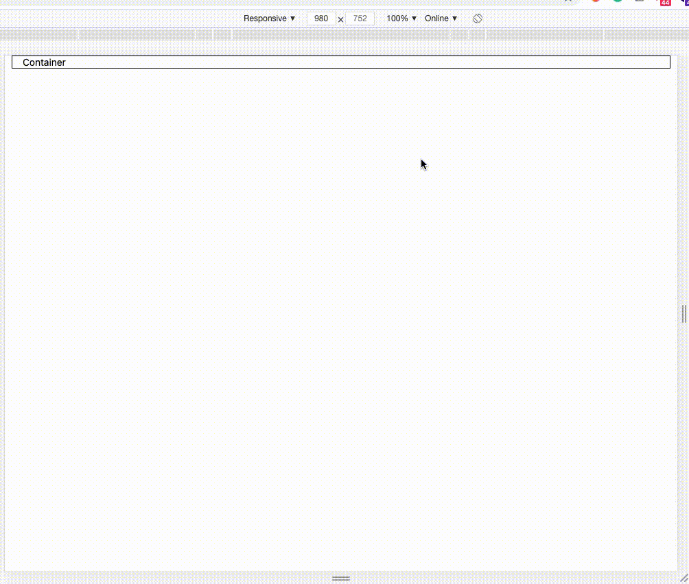 containerWithDebug.js containerWithDebug.js |
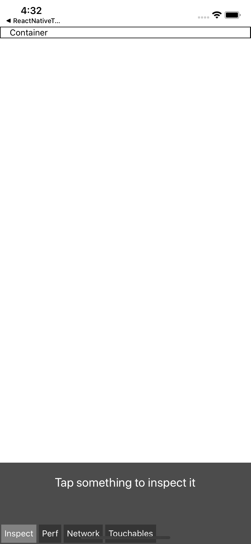 containerWithDebug.js containerWithDebug.js |
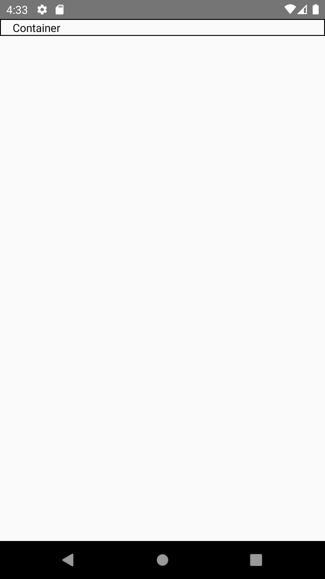 containerWithDebug.js containerWithDebug.js |
Row Component
Usage
import {Row} from 'reactstrap-native-web';
Document
Col Component
Usage
import {Col} from 'reactstrap-native-web';
Document
| Name | Description | Default | Type | Required |
|---|---|---|---|---|
| col | Number column: [1...12] or 'auto' or object: {size: number, offset: number} You can reference link Column Reactstrap |
None | String or Number or Object | true |
| sm | Number column: [1...12] or 'auto' or object: {size: number, offset: number} You can reference link Column Reactstrap |
None | String or Number or Object | false |
| md | Number column: [1...12] or 'auto' or object: {size: number, offset: number} You can reference link Column Reactstrap |
None | String or Number or Object | false |
| xl | Number column: [1...12] or 'auto' or object: {size: number, offset: number} You can reference link Column Reactstrap |
None | String or Number or Object | false |
| lg | Number column: [1...12] or 'auto' or object: {size: number, offset: number} You can reference link Column Reactstrap |
None | String or Number or Object | false |
| debug | Support debug | false | Boolean | false |
| ### Example | ||||
| ```jsx | ||||
| import React from 'react'; | ||||
| import {Text} from 'react-native'; | ||||
| import {Container, Row, Col} from 'reactstrap-native-web'; |
export const TestColumn = () => {
return (
Image Component
Usage
import {Image} from 'reactstrap-native-web';
Document
Use library react-native-fit-image
Example
Please reference link react-native-fit-image
TextShadow Component
Usage
import {TextShadow} from 'reactstrap-native-web';
Document
| Name | Description | Default | Type | Required |
|---|---|---|---|---|
| children | string text shadow | Text Shadow | String | false |
| style | style for text Text Style | None | TextStyleProps | false |
| textShadow | string shadow as css text shadow | None | String | true |
| ### Example | ||||
| ```jsx | ||||
| import {TextShadow} from 'reactstrap-native-web'; |
export const TextShadowDemo = () => { return ( <View style={{flex: 1, backgroundColor: "#232323"}}> <TextShadow textShadow={'0 0 5px #FFF, 0 0 10px #FFF, 0 0 15px #FFF, 0 0 20px #49ff18, 0 0 30px #49FF18, 0 0 40px #49FF18, 0 0 55px #49FF18, 0 0 75px #49ff18'} style={{color: "#FFFFFF"}} /> ); };
| On Android | On IOS |
|:-----------|:-------|
| |  |
## Inspired by
- [Library Reactstrap](https://reactstrap.github.io/)
- [React native taildwincss](https://github.com/TVke/react-native-tailwindcss)
## Contributing
Pull requests are always welcome! Feel free to open a new GitHub issue for any changes that can be made.
**Working on your first Pull Request?** You can learn how from this *free* series [How to Contribute to an Open Source Project on GitHub](https://egghead.io/series/how-to-contribute-to-an-open-source-project-on-github)
## Author
Pham Minh Hai Au
## License
[MIT](./LICENSE)