README
Responsive Debug

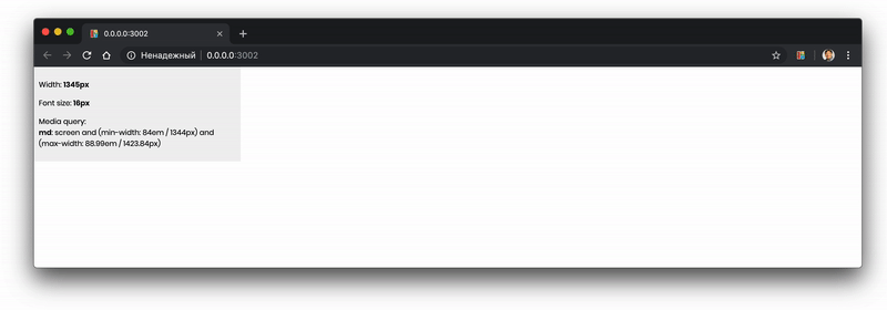
The simple utility to debug a responsive layout. It allows:
- Display current window width
- Display current root element font size (useful for
rem/em) - Display current responsive break
Usage
- Install the package:
> npm install responsive-debug
- Add debug overlay to your website
import enableDebug from 'responsive-debug';

enableDebug([
    {
        name: 'xlg',
        mediaQuery: 'screen and (min-width: 120em)'
    },
    {
        name: 'lg',
        mediaQuery: 'screen and (min-width: 89em) and (max-width: 119.99em)'
    },
    {
        name: 'md',
        mediaQuery: 'screen and (min-width: 84em) and (max-width: 88.99em)'
    },
    {
        name: 'sm',
        mediaQuery: 'screen and (min-width: 40em) and (max-width: 83.99em)'
    },
    {
        name: 'xs',
        mediaQuery: 'screen and (min-width: 30em) and (max-width: 39.99em)'
    },
    {
        name: 'xxs',
        mediaQuery: 'screen and (max-width: 29.99em)'
    }
]);
enableDebug function acceppts array of objects that contains name and mediaQuery params. They will be used to display current responsive break.
License
The project is released under the MIT License.