README
The Skyline chart
This library provides a rising skyline chart, i.e. a skyline widget, which is linked to a dynamic history of buildings.
This chart has been created for the project Fitzhì. In Fitzhì, the goal is to display the history of a rising applications portfolio, confronted to the turn-over risk on these applications.
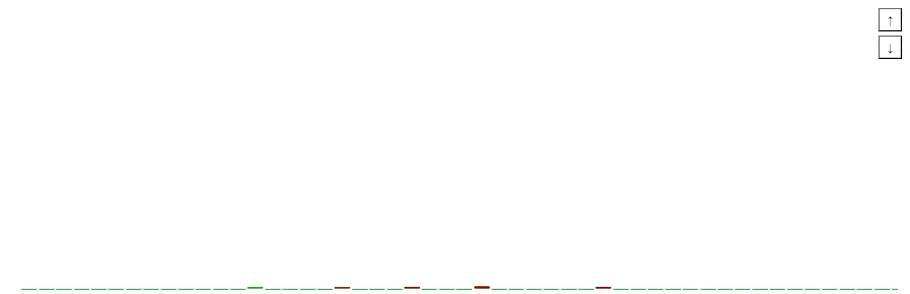
On the top right corner, two buttons, with one up and one down arrays, allow the end-user to zoom-in, or zoom-out the view.
Installing this library in your project ?
The most simple command npm install rising-skyline will install this library
To import the module inside your application, just add the module RisingSkylineModule in your app.module.ts.
location :
import {RisingSkyline} from 'rising-skyline';
Using this library in your application ?
To include this component into a container, you just have to declare this section into your HTML template.
<rising-skyline
    [height] = "'370px'"
    [width] = "'90%'"
    [margin] = "'10px'"
    [risingSkylineHistory$] = risingSkylineHistory$
    [speed] = 30
    [startingColor] = "'#28a745'"
    [endingColor] = "'#8B0000'"
    [displayVerticalTitle] = true
    [font] = "'20px/1 Arial'"
    (onClickBuilding)="onClickBuilding($event)"
    (onEnterBuilding)="onEnterBuilding($event)"
    (onLeaveBuilding)="onLeaveBuilding($event)">
</rising-skyline>
The parameters are :
| Parameter | Decorator | Comment |
|---|---|---|
| height | INPUT | The height of the container, with its unit of measure, hosting the skyline (such as '100px'). |
| width | INPUT | The width of the container, with its unit of measure, hosting the skyline (such as '100px'). |
| speed | INPUT | The speed of the animation in ms. |
| margin | INPUT | The margin around the container. |
| startingColor | INPUT | The starting color in the index-range. (Each building has a property named index, and this index determines the color). |
| endingColor | INPUT | The ending color in the index-range. (Each building has a property named index, and this index determines the color). |
| displayVerticalTitle | INPUT | (Optional) boolean Should the vertical title on top of each building be drawn ? Or not ? Default value is false. |
| buildingMinimumHeightVerticalTitle | INPUT | (Optional) Display the vertical title when the height of buildings reaches this value. Default value is 10. |
| font | INPUT | This setting is used by the vertical title. This is Shorthand property for setting 'font-style', 'font-variant', 'font-weight', 'font-size', 'line-height', and 'font-family'. "italic 2em "Open Sans", sans-serif'" is a possible example. |
| onClickBuilding | OUTPUT | The component will emit an event containing a BuildingSelected object, each time the user is clicking on a building. |
| onEnterBuilding | OUTPUT | The component will emit an event containing a BuildingSelected object, each time the user is entering in a building. |
| onLeaveBuilding | OUTPUT | The component will emit an event containing a BuildingSelected object, each time the user is leaving a building. |
What is a building ?
In this component, the skyline is an array of buildings.
So a building is a piece of the skyline.
| Property | type | Comment |
|---|---|---|
| id | number | the identifier |
| width | number | the width of the building |
| height | number | the height of the building |
| year | number | the year of the building corresponding to this state of building |
| week | number | the week of the building corresponding to this state of building |
| index | number | the index of the building in the range of colors. Index range is from 0 to 100. |
| title | string | the title of the building |
What is a selected building ?
This component is emetting this object during mouse interaction.
| Property | type | Comment |
|---|---|---|
| building | Building | the building under the mouse pointer |
| event | MouseEvent | the underlying mouse event |