README
React Native Card Swiper
A card swiper library using Reanimated 2
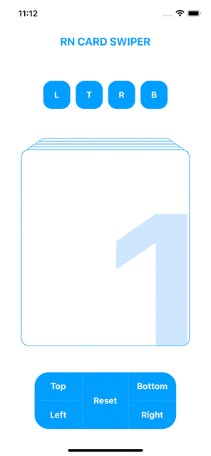
Preview
Installation
npm install --save rn-card-swiper
or
yarn add rn-card-swiper
Dependencies
yarn add react-native-gesture-handler react-native-reanimated
Usage
import { CardSwiper } from 'rn-card-swiper';

// ...
const Data = [{ id: '1' }, { id: '2' }, { id: '3' }, { id: '4' }, { id: '5' }, { id: '6' }, { id: '7' }];

const _renderCard = (item: any) => {
    return (
      <View
        style={{
          flex: 1,
          alignItems: 'flex-end',
          justifyContent: 'flex-end',
        }}>
        <Text
          style={{
            fontSize: 400,
            fontWeight: 'bold',
            color: '#C7E2FF',
            right: -40,
            bottom: -20,
          }}>
          {item.id}
        </Text>
      </View>
    );
  };

const _renderEmptyMessage = () => {
    return (
      <View>
        <Text
          style={{
            fontSize: 28,
            fontWeight: 'bold',
            color: '#C7E2FF',
          }}
        >
          No more cards...
        </Text>
      </View>
    );
  };
// ...
<CardSwiper
  stackSize={5}
  cardsData={Data}
  renderCard={_renderCard}
  renderEmptyView={_renderEmptyMessage}
  cardStyle={
    {
      width: 300,
      height: 400,
      backgroundColor: 'white',
      borderColor: '#0095FF',
      borderWidth: 1,
    }
  }
  />;
// ...
Component props
| prop | type | default | description |
|---|---|---|---|
| cardsData | array | [] | array of data for the cards to be rendered |
| renderCard | func | renders the card based on the data | |
| renderEmptyView | func | renders the view to be shown after swiped last card | |
| stackSize | number | 5 | number of cards to be shown |
| startIndex | number | 0 | initial card index |
| infinite | boolean | true | keep swiping indefinitely |
| cardStyle | object | Ooverride default card style | |
| containerStyle | object | override default container style | |
| offsetDirection | object | "Top" | which way cards offsets will be shown |
| offsetSpace | number | 8 | distance between cards |
| scaleRatio | number | 0.8 | cards scale ratio in stack |
| disableLeftSwipe | boolean | false | disable left swipe |
| disableRightSwipe | boolean | false | disable right swipe |
| disableTopSwipe | boolean | false | disable top swipe |
| disableBottomSwipe | boolean | false | disable bottom swipe |
| disableSwipe | boolean | false | disable swipe in all directions |
| horizontalSwipe | boolean | true | swipe cards horizontally |
| verticalSwipe | boolean | true | swipe cards vertically |
| onlyTopSwipeable | boolean | false | only top card can be swiped |
| cardElevated | boolean | true | puts shadows on card |
| touchInset | number | 10 | card's touch range from the edge |
| onSwipedAll | func | function to be called when the last card is swiped | |
| onSwiped | func | function to be called when a card is swiped | |
| onTap | func | function to be called when a card is tapped | |
| onReset | func | function to be called when a card is released back to it's original position | |
| onSwipedLeft | func | function to be called when a card swiped left | |
| onSwipedRight | func | function to be called when a card is swiped right | |
| onSwipedTop | func | function to be called when a card is swiped top | |
| onSwipedBottom | func | function to be called when a card is swiped bottom |
License
MIT