README
rn-customizable-radio-button
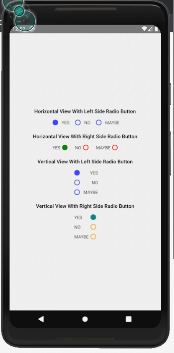
One can customize the radio buttons using custom color, button styles, orientation or button positions. The developer has full control to customize all the properties of the radio buttons.
Setup
npm i rn-customizable-radio-button
Usages
import { RadioButton } from 'rn-customizable-radio-button';
<RadioButton selectedIndex={selectedIndex} onPress={(item, index) => { setSelectedIndex(index); }} items={itemList} orientation={'center-horizontal'} textStyle={styles.textStyleRadio} />
Properties
| Prop | Type | default | Required | Note |
|---|---|---|---|---|
| items | Array | NA | Required | The Array of the items or check checklist with key-value pair |
| selectedIndex | String | Empty String | Required | The key of the selected item |
| onPress | Function | NA | Required | Function Called onpress of the radio button |
| orientation | String | center-horizontal | Optional | Orientation of the Radio Button View, can be set to vertical or center-horizontal |
| buttonPosition | String | left | Optional | Position of the radio button with respect to the text, can be set to right or left |
| selectedButtonStyle | Object | NA | Optional | styles for the selected radio button |
| buttonStyle | Object | NA | Optional | styles for all radio buttonsof the array |
| textStyle | Object | NA | Optional | styles for radio button label |
| style | Object | NA | Optional | pass the style object |
| containerStyle | Object | NA | Optional | styles for radio containers |
| errorMessage | String | NA | Optional | Pass the error Message you want to show |
| errorTextStyle | Object | NA | Optional | Pass the style object for the error Message |
Screenshot