README
ScrollPadlock


A small (~4K gzipped) unobtrusive script aimed to encourage a CSS-first approach when locking html elements scroll reducing cumulative layout shift and iOS Safari quirkiness.
🙅 Without this library:
💁 With this library:
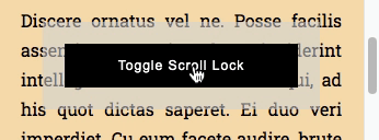
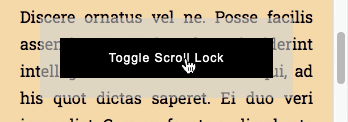
Try it out
Here's some example projects for the most common setups:
- React (Preview - Browse)
- Angular (Preview - Browse)
- Vue (Preview - Browse)
- Vanilla (Preview - Browse)
Inclusion
This library is downloadable via npm:
$ npm install scroll-padlock
The source code is entirely written in standard ECMAScript with no dependencies, which means that any of its modules can be imported in any JavaScript project; the builded distribution includes transpiled umd, iife, amd, cjs, esm and SystemJS bundles.
Source code inclusion example:
<script type="module">
    import ScrollPadlock from './node_modules/scroll-padlock/src/padlock.js';

    void new ScrollPadlock();
</script>
Distribution code inclusion example:
<script src="./node_modules/scroll-padlock/dist/iife/scroll-padlock.min.js"></script>

<script>
    void new ScrollPadlock();
</script>
Under the Hood
Some CSS variables, addressing a given html element data attribute (dinamically set), are set through a style appended in head, a given CSS class is observed to determine current state while window resize and scroll events are listened in order to update CSS variables; no other DOM modifications besides that.
Usage
An instance requires the html element which scroll needs to be controlled and the CSS class that would lock it.
// The css class with the rules that would lock the page scroll
const SCROLL_LOCKED_CSS_CLASS_NAME = 'your-locked-class';

// The element which scroll state needs to be controlled
const { documentElement } = document;

// Creates the instance
const instance = new ScrollPadlock(documentElement, SCROLL_LOCKED_CSS_CLASS_NAME);
At this point, the lock state can be changed simply toggling that CSS class; since the CSS class change is internally observed, the class change itself can be done through native DOM API, a virtual DOM library, another DOM manipulation script, etc...
const { classList } = documentElement;

// Locks the body scroll
classList.add(SCROLL_LOCKED_CSS_CLASS_NAME);

// Unlocks the body scroll
classList.remove(SCROLL_LOCKED_CSS_CLASS_NAME);
CSS Rules Examples
The following ruleset alone is enough to ensure a cross-browser body scroll lock for a standard vertical-scroll page:
html.your-locked-class {
    /* Position-fixed hack, locks iOS too */
    position: fixed;
    width: 100%;

    /* Avoids scroll to top */
    top: calc(var(--scroll-padlock-scroll-top) * -1);

    /* Reserves space for scrollbar */
    padding-right: var(--scroll-padlock-scrollbar-width);
}
Some browser recognition logic can be applied in order to address iOS more specifically, keeping the standard overflow approach for the browsers that respects it:
/* iOS only */
html.your-locked-class.ios {
    /* iOS fixed position hack */
    position: fixed;
    width: 100%;

    /* Avoids scroll to top */
    top: calc(var(--scroll-padlock-scroll-top) * -1);
}

/* Standard browsers only */
html.your-locked-class.not-ios,
html.your-locked-class.not-ios body {
    /* Standard way to lock scroll */
    overflow: hidden;
}

html.your-locked-class.not-ios body {
    /* Reserves space for scrollbar */
    /* (iOS has overlay scrollbars, this rule would have no effect there anyway) */
    padding-right: var(--scroll-padlock-scrollbar-width);
}
CSS Variables
This is the complete list of CSS variables set by this library on the given elements.
--scroll-padlock-scroll-top: the number of pixels that the target is scrolled vertically.--scroll-padlock-scroll-left: the number of pixels that the target is scrolled horizontally.--scroll-padlock-scrollbar-width: the target's vertical scrollbar size.--scroll-padlock-scrollbar-height: the target's horizontal scrollbar size.--scroll-padlock-outer-width: the target's width including the scrollbar size.--scroll-padlock-outer-height: the target's height including the scrollbar size.--scroll-padlock-inner-width: the target's width without the scrollbar size.--scroll-padlock-inner-height: the target's height without the scrollbar size.--scroll-padlock-scroll-width: the target's content width.--scroll-padlock-scroll-height: the target's content height.
API
The destroy method is particularly important when using reactive frameworks (such as React, Vue, Angular, etc...) which components lifecycle might generate memory leaks: call destroy method when the component in which scroll-padlock is used gets unmounted.
// Detaches instance events, removes styles, etc...
instance.destroy();
Some other methods or accessors can be useful when custom DOM-manipulation logic takes place.
// Updates current instance computed styles (CSS variables, etc...)
instance.update();

// Gets the the current scroll position
const { top, left } = instance.scroll;

// Sets a new scroll position;
// if the instance state is locked,
// the given position is saved for a future restoration;
// otherwise the instance element is directly scrolled to the given position
instance.scroll = { top, left };

// Gets the current instance element layout sizes
const {
    // The target's width and height including the scrollbar size
    outerWidth,
    outerHeight,

    // The target's width and height without the scrollbar size
    innerWidth,
    innerHeight,

    // The target's content width and height
    scrollWidth,
    scrollHeight,

    // The target's vertical and horizontal scrollbar size
    scrollbarWidth,
    scrollbarHeight
} = instanse.layout;
TL;TR: a body scroll overview
🙅 body { overflow: hidden; } is the most common way to lock the scroll position on every browsers, unfortunately, unless user's browser has overlay scrollbars, that would cause the scrollbar to disappear, the body to expand and the contents to jump to the right (CLS);
to make things worse that technique just doesn't work on iOS safari: when set the user can still somehow scroll the page.
🙅 body { touch-action: none; } can't help since Safari doesn't seem to support it anytime soon.
🤷 Some libraries propose to solve this preventing touchmove events, which might work out very well in many cases; unfortunately some issues with some viewport configurations or pinch to zoom might still be encountered, also iOS navigation bars might end up covering some layout elements.
🙅 body { position: fixed; } alone can force iOS to lock the scroll, but when applied the scroll position would eventually jump to the top of the page.
💁 This library sets some css variables and css classes in order to allow the developer to choose their preferred CSS-only approach, while the class instance exposes a quite granular API in order to implement some JS strategies too.
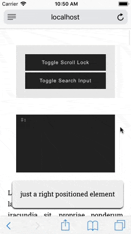
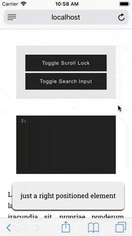
Positioned Elements
If positioned elements "jumps" on a parent lock state change, the same CSS variables that are used to reserve the scrollbar width can be used to overcome this problem as well.
/* A right-positioned child */
.positioned-element {
    position: fixed;
    right: 0;
}

/* The same right-positioned element, */
/* not affected by its own container scrollbars disappearance */
.your-locked-class .positioned-element {
    right: var(--scroll-padlock-scrollbar-width);
}
iOS Bars and Keyboard Tray
There might still be an iOS edge case when locking body scroll with position: fixed technique.
When the page is scrolled the system bars become smaller; at that point, when focusing an input element programmatically, the keyboard tray is triggered and the bars become larger again; that, probably when some animations are taking place, can cause the following visual artifacts.
iOS forces a scroll to the focused element (still out of canvas) in an already "locked" area (limited by the OS itself) which would be also shortly resized because of the system bars getting bigger.
To overcome this problem the native resize event can be listened to programmatically scroll to top that ios-keyboard-sub-window-thing.
const isIOS = someWayToDetectAppleIOS();

// Addressing the "ios-keyboard-sub-window-thing offset" bug:
// body scroll lock along with a programmatic focus
// on an a form field make the keyboard tray to show
// and that triggers, along with the visual artifact itself, a "resize" event
window.addEventListener("resize", () => {
    if (isIOS && classList.contains(SCROLL_LOCKED_CSS_CLASS_NAME)) {
        // "Re-aligns" the iOS keyboard sub-window
        window.scrollTo(0, 0);
    }
});
The problem should be solved at this point.
Support
All modern browsers have been tested.
The library doesn't provide a fallback for those browsers which don't support CSS variables (mainly Internet Explorer 11); since these browsers tipically support overflow: hidden, the JS API can be used to implement the scrollbars-gaps compensation normally achievable through CSS by standard browsers (a graceful degradation approach is highly suggested though).