README
semantic-ui-react-ext
Extra components for Semantic UI React

Install
npm install --save semantic-ui-react-ext
Components
FormField
The FormField component conveniently combines several Semantic UI React components:
- a Label
- a form control (an Input component by default)
- an error label
The embedded control is specified using the 'control' prop.
The 'error' prop (string) specifies the error label message and wether the error label is displayed or not.
import React, { Component } from 'react'

import { Form, Checkbox } from 'semantic-ui-react';

import FormField from 'semantic-ui-react-ext';

class Example extends Component {
  render () {
    return (
      <Form>
        <FormField
          label='First Name'
          required
        />
        <FormField
          label='Last Name'
          required
        />
        <FormField
          control={Checkbox}
          label='I consent to everything'
          defaultIndeterminate={true}
          required
        />
      </Form>
    )
  }
}
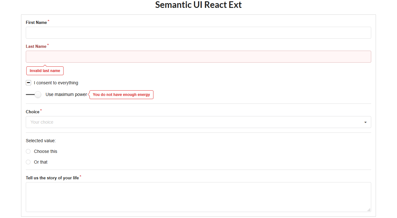
Example
Screenshot from included example:
License
MIT © jabberbees