README
Customizable SegmentedControl with Android support
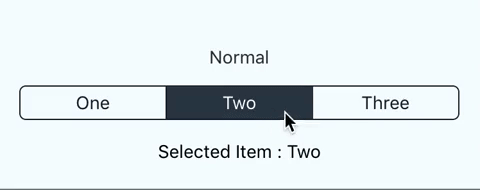
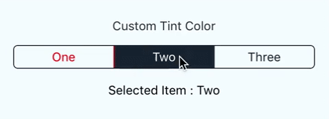
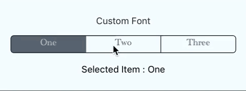
Screenshots:
Installation:
npm i sepsegmentedcontrol --save
Usage:
import {SEPSegmentedControl, Item} from "sepsegmentedcontrol";

export default class App extends Component<Props> {
  render() {
    return (
      <View style={styles.container}>
        <SEPSegmentedControl
          onItemChange={(index: number) => {
            console.log(index, " clicked!")
          }}>
          <Item>One</Item>
          <Item tintColor={'red'}>Custom Tint</Item>
          <Item>{'Three'}</Item>
          <Item style={{fontFamily: 'San Francisco'}}>Custom Font</Item>
        </SEPSegmentedControl>
      </View>
    );
  }
}
Available SegmentedControl props:
style: General style includingfontFamilyisReverse: Boolean value indicating items ordertintColor: Color of SegmentedControlonItemChange: callback function when user selects an item
Available Item props:
style: General style includingfontFamilytintColor: Color of SegmentedControl