README
sp-react-native-iconbutton
A React Native button that can also have an icon within it through the iconProps property.
It works both WITH an icon AND without so it can cover all your button needs.

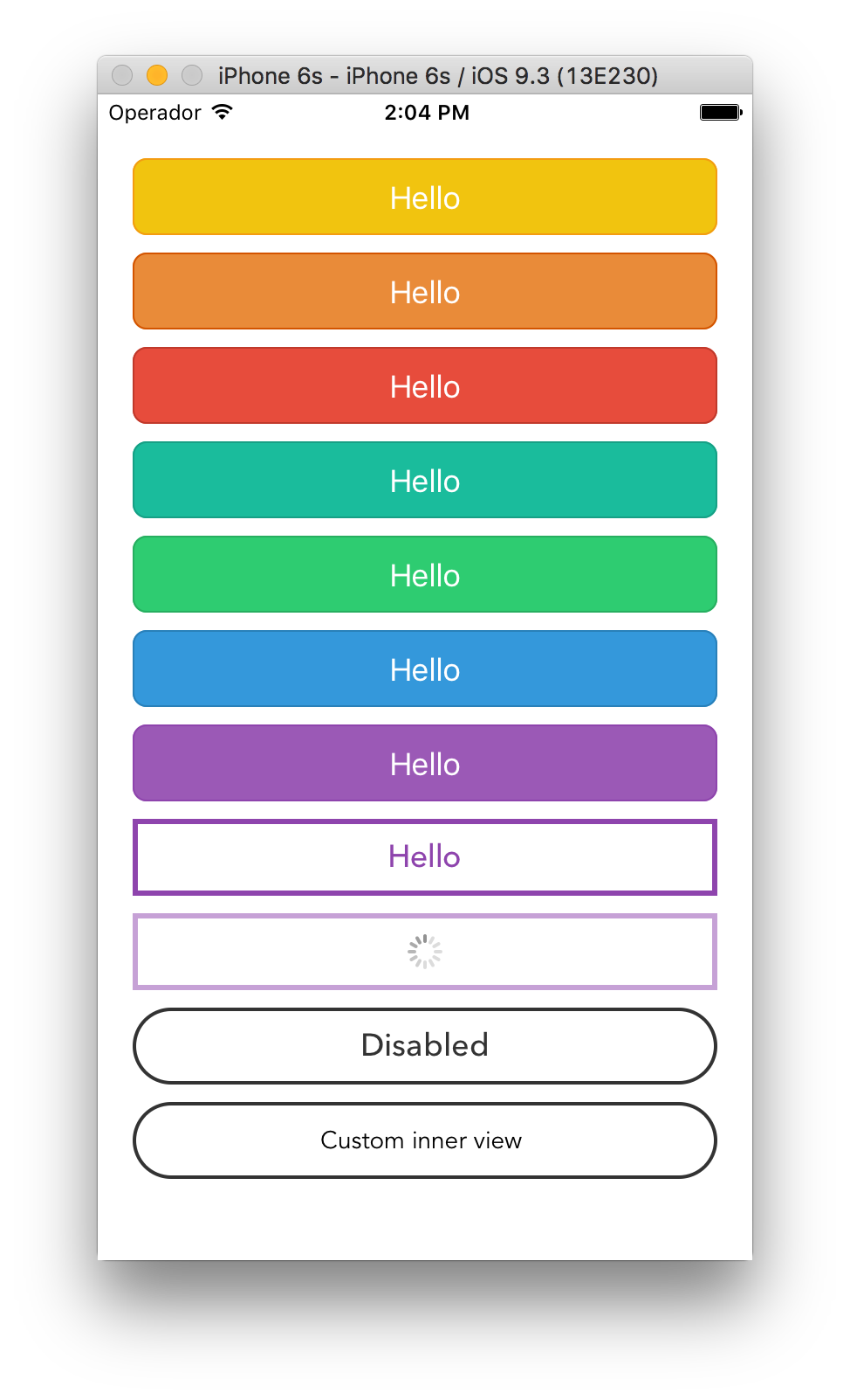
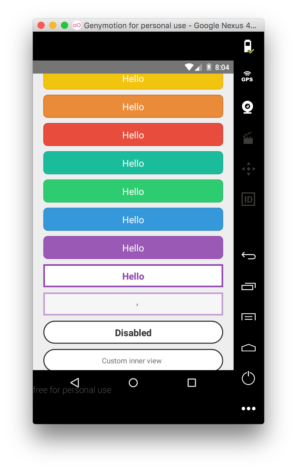
Renders a TouchableOpacity under iOS and a TouchableNativeFeedback under Android.
Install
sp-react-native-iconbutton needs React Native 0.16 or higher.
Install the package:
$ npm i sp-react-native-iconbutton --save
Import the Button component:
import Button from 'sp-react-native-iconbutton'
Caution: This library is now compatible for react-native 29 and onwards.
Thats because it uses the ActivityIndicator which does not exist in previous versions of react-native.
If you wish to run it in previous react-native versions you will have to use the branch called pre29.
Usage
Provide TouchableWithoutFeedback' props to the component (including style),
textStyle's StyleSheet to customize the inner text and a children node
to render. You can also provide the isLoading prop that will dim the button
and disable it to prevent accidental taps.
<Button
    style={{backgroundColor: '#3D5B96', height:60, borderRadius: 4, borderWidth: 1, borderColor: 'rgba(0,0,0,0.2)'}}
    textStyle={{color: 'white', textAlign: 'center'}}
    iconProps={{name: "facebook",size:25, color: "white"}}
    iconStyle={{paddingHorizontal:20}}
>
    Login with Facebook
</Button>
API
| Prop | Type | Description |
|---|---|---|
onPress |
func |
Function to execute when the onPress event is triggered. |
onPressIn |
func |
Function to execute when the onPressIn event is triggered. |
onPressOut |
func |
Function to execute when the onPressOut event is triggered. |
onLongPress |
func |
Function to execute when the onLongPress event is triggered. |
customIcon |
func |
A function that returns a custom React element that will serve as the icon. (If you use that, you should NOT use iconProps or iconStyle) |
iconContainerStyle |
ViewStylePropTypes |
The StyleSheet to apply to the view that contains our icon be it a custom icon or a default (FontAwesome) icon. |
iconStyle |
ViewStylePropTypes |
The StyleSheet to apply to the inner button text. (If you use that, you should NOT use customIcon) |
iconProps |
Object |
If you pass iconProps you're actually telling the Button to create a FontAwesome icon, and you then pass those props to that icon. The properties to pass to your (FontAwesome) icon. You can pass any prop that you could pass on react-native-vector-icons (If you use that, you should NOT use customIcon) |
textStyle |
TextStylePropTypes |
The StyleSheet to apply to the inner button text. |
disabledStyle |
TextStylePropTypes |
The StyleSheet to apply when disabled. |
children |
string |
The string to render as the text button. |
isLoading |
bool |
Renders an inactive state dimmed button with a spinner if true. |
isDisabled |
bool |
Renders an inactive state dimmed button if true. |
activityIndicatorColor |
string |
Sets the button of the ActivityIndicatorIOS or ProgressBarAndroid in the loading state. |
background |
TouchableNativeFeedback.propTypes.background |
Android only. The background prop of TouchableNativeFeedback. |
License
MIT.