README

⚙️ Install
yarn add -D storybook-addon-grid
// .storybook/main.js
module.exports = {
  addons: [require.resolve('storybook-addon-grid/preset')],
};
Chromatic users
Include this additional preset to configure the column guides for your Chromatic screenshots.
// .storybook/main.js
module.exports = {
  addons: [
    require.resolve('storybook-addon-grid/preset'),
    require.resolve('storybook-addon-grid/chromatic'),
  ],
};
🚀 Usage
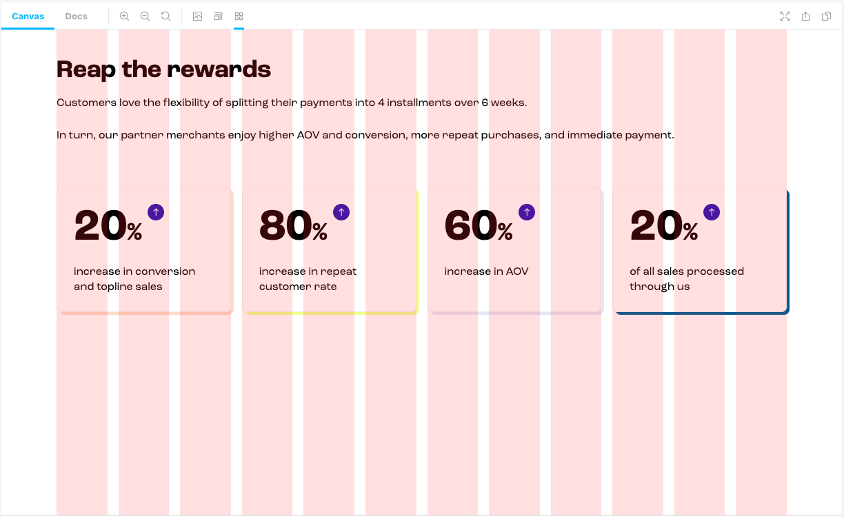
The column guides are controlled with parameters and as such you can define this globally or per story.
The column guides can be turned on either via clicking the toolbar button, or via a keyboard shortcut Ctrl + G.
Note: Due to the nature of
z-index, the rootdivof the stories will have aposition: relativeandz-index: 0applied to it, allowing the column guides to sit over the top.
Parameters
Column design system is defined by 3 values:
- the number of
columns - the
gapbetween them - the
gutter— minimal margin between the system and the screen maximal-widthfor the system to limit maximum width of all columns as well.
gridOn?: boolean = false
Defines if the column guides should be turned on this story by-default. The
guides are controlled with a toolbar item, keyboard shortcut which may cause
this to not always be on. This will force it to either be on or off when
the story is loaded.
columns?: number = 12
The number of columns guides.
gap?: string = '20px'
The gap between columns.
gutter?: string = '50px'
System's gutter (margin) for both left and right.
gutterLeft?: string
Define to override the gutter defined on the left-hand-side.
gutterRight?: string
Define to override the gutter defined on the right-hand-side.
maxWidth?: string = '1024px'
The maximum width our columns should grow.
animation?: bollean = true
Enable or Disable the guides from fading in or out when toggling the state.
Chromatic users, this will be
falseby default.
guidesColor?: string = 'rgba(255, 0, 0, 0.1)'
Sets the color used for the column guides.
Global Parameters~
// .storybook/preview.js
export const parameters = {
  grid: {
    gridOn: true,
    columns: 12,
    gap: '20px',
    gutter: '50px',
    maxWidth: '1024px',
  },
};
Per story~
// MyComponent.stories.js

export const Example = () => {...};
Example.parameters = {
    grid: {
        columns: 6,
    },
};
📚 Further Readings
License
MIT © Marais Rossouw