README
styled-loaders-react

Loaders for React built with Styled Components.
Credits
This is React clone of SaraVieira 's amazing styled-loaders which provides loaders for Preact.
Huge thanks for all the hard work and letting me port it for React users.
Any new loaders that will be added in that original repository will be cloned here.
Usage
npm install styled-loaders-react

or

yarn add styled-loaders-react
import React from 'react'
import { Cube } from 'styled-loaders-react'

const Page = ({ loading }) =>
    <div>
        { loading ?
            <Cube/>
            : 'Your Content'
        }
    </div>
With Props
import React from 'react'
import { Block } from 'styled-loaders-react'

const Page = ({ loading }) =>
    <div>
        { loading ?
            <Block color="red" size="60px" duration="5s" />
            : 'Your Content'
        }
    </div>
Loaders
Bar
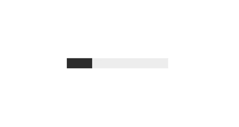
- Props
- bgBar - Background of the bar default is #efefef
- color - Color of the bar default is #333
- duration - Animation duration default is 0.5s
- Props
Block

- Props
- color- Background of the spinner default is #333
- duration - Animation duration default is 1.2s
- size - Size of the spinner default is 40px
- Props
Circular

- Props
- color- Background of the spinner default is #333
- size - Size of the spinner default is 40px
- Props
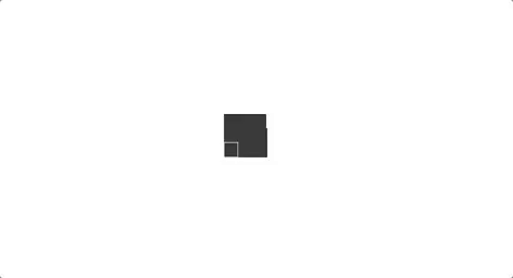
Cube
- Props
- color- Background of the spinner default is #333
- size - Size of the spinner default is 40px
- cubeSize - Size of the each cube default is 15
- duration - Animation duration default is 1.2s
- Props
CubeGrid
- Props
- color- Background of the spinner default is #333
- size - Size of the spinner default is 40px
- Props
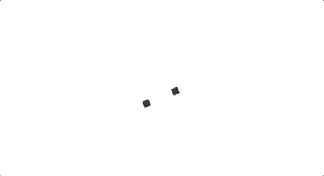
DotScale
- Props
- color- Background of the spinner default is #333
- duration - Animation duration default is 1.2s
- size - Size of the spinner default is 40px
- dotSize - Size of the dots default is 18px
- Props
Pulsate

- Props
- color- Background of the spinner default is #333
- duration - Animation duration default is 1.2s
- size - Size of the spinner default is 40px
- Props
RotateScale
- Props
- color- Background of the spinner default is #333
- duration - Animation duration default is 1.2s
- size - Size of the spinner default is 40px
- Props
Scale

- Props
- color- Background of the spinner default is #333
- duration - Animation duration default is 1.2s
- size - Size of the spinner default is 40px
- Props
Stretch
- Props
- color- Background of the spinner default is #333
- duration - Animation duration default is 1.2s
- size - Size of the spinner default is 40px
- rectWidth - Width of each rectangle default is 6px
- Props
License
MIT