README
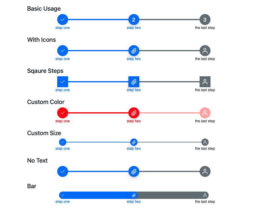
🐾 Svelte steps component 🐾
A customizable step component written in Svelte!
- Bootstrap color theme
- Icons
- Animate progress
- Horizontal and vertical
- Dumpbells and bar
- Custom size
- Custom color
- Custom font
- Circle, square and between
- Left and right

Installation
npm install --saveDev svelte-steps
Example Usages
Clone this project and run it. Itself is an example. Take a look at the homepage here. The source file of the demo is at src/routes/index.svelte
Basic Usage
<script>
    import { Steps } from 'svelte-steps';
    let steps = [
        { text: 'step one' },
        { text: 'step two' },
        { text: 'the last step' }
    ];
</script>

<Steps {steps} />
Vertical Steps (NEW)
NOTE: needs svelte version 3.46.3 or newer
Add vertical props to Steps component.
<Steps vertical {steps} />
You can also use reverse to put text label to the left.
<Steps vertical reverse {steps}>
With Icons
let steps = [
    { text: 'step one', icon: IconMoney },
    { text: 'step two', icon: IconPaperClip },
    { text: 'the last step', icon: IconPerson }
]
Square Steps
<Steps {steps} borderRadius="0"/>
Custom Color
<Steps {steps} primary="#ff0000" secondary="#ffaaaa"/>
Custom Size
<Steps {steps} size="2rem" line="2px"/>
No Text
let steps = [
    { icon: IconMoney },
    { icon: IconPaperClip },
    { icon: IconPerson }
]
Bar
<Steps {steps} size="2rem" line="2rem"/>
Events
<Steps
    {steps}
    {current}
    on:click={(e) => {
        last = e.detail.last;
        current = e.detail.current;
    }}
/>
Use with Bootstrap
It by default uses --bs-primary, --bs-secondary, --bs-light, and --bs-dark css variables if they are defined. These css vars are defined in bootstrap css:
<!-- Include Bootstrap css in app.html <head></head> -->
<link
    href="https://cdn.jsdelivr.net/npm/bootstrap@5.0.2/dist/css/bootstrap.min.css"
    rel="stylesheet"
    integrity="sha384-EVSTQN3/azprG1Anm3QDgpJLIm9Nao0Yz1ztcQTwFspd3yD65VohhpuuCOmLASjC"
    crossorigin="anonymous"
/>
Props
steps:- Array of object. Length has to be more than 1
- Required
- Each item is a step object that can have:
text: The text displayed below each steps.icon: A svelte component displayed inside each steps.iconProps: An object that will be passed as props to theiconcomponent.
current: current step index. Number. Default0size: size of the step buttons. String. Default"3rem"("2rem"for vertical steps)line: thickness of the connecting lines between the step buttons. String. Default"0.3rem"("0.15rem"for vertical steps)primary: Primary color of passed and current steps. String. Default'var(--bs-primary, #3a86ff)'secondary: Secondary color of future steps. String. Default'var(--bs-secondary, #bbbbc0)'light: Primary color of text color in passed anc current steps. String. Default'var(--bs-light, white)'dark: Secondary color of text color in future steps. String. Default'var(--bs-dark, black)'borderRadius: Border radius of the step buttons. String. Default'50%'(circle)fontFamily: Font family of the component. String. Default"'Helvetica Neue', Helvetica, Arial, sans-serif"vertical: Vertical steps. Defaultfalsereverse: For horizontal steps, reverse the step from right to the left; for vertical steps, reverse puts text labels to the left. Defaultfalseclickable: When set tofalse, Clicking icons and labels will not change step. You have to changecurrentto change step. Defaulttrue
Events
on:click(e): click event. Event detail object has two keys:e.detail.current: the index of current stepe.detail.last: the index of last step