README
Svelte-Toasts
A highly configurable toast/notification component with individual toast state management capabilities.
Demo & Docs
https://mzohaibqc.github.io/svelte-toasts/
REPL: https://svelte.dev/repl/ff34bad88213493ab878c71497c01152?version=3.35.0
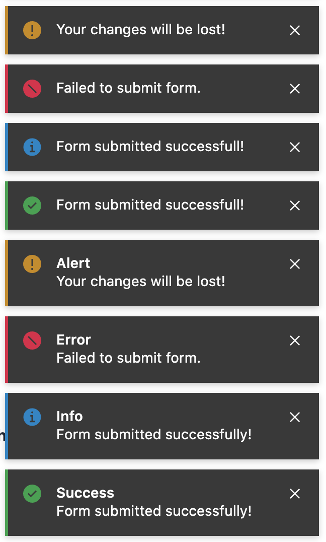
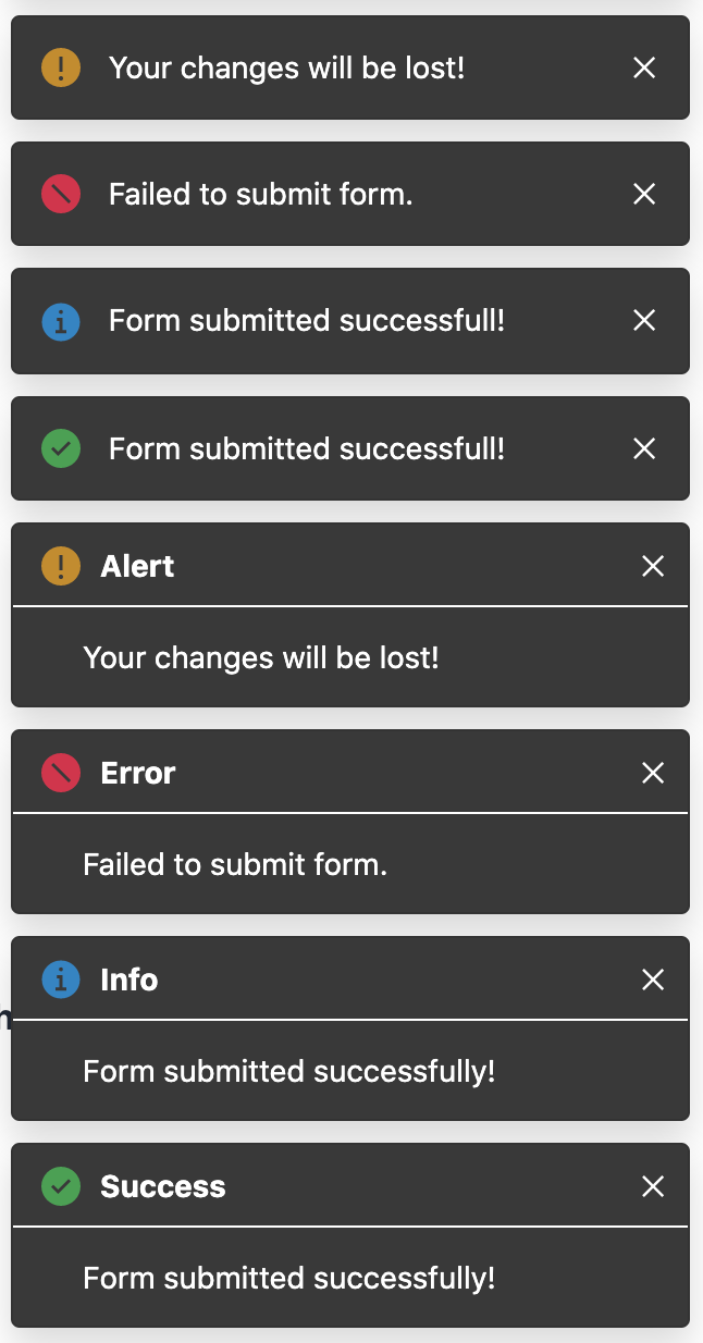
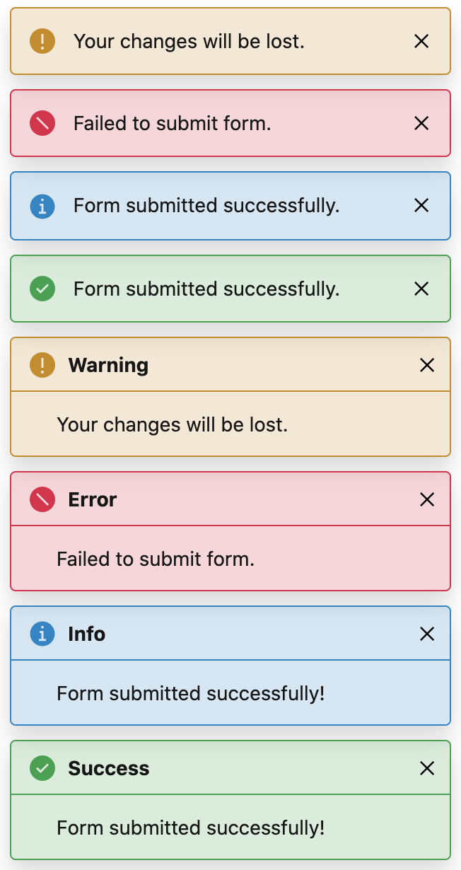
Flat Toast
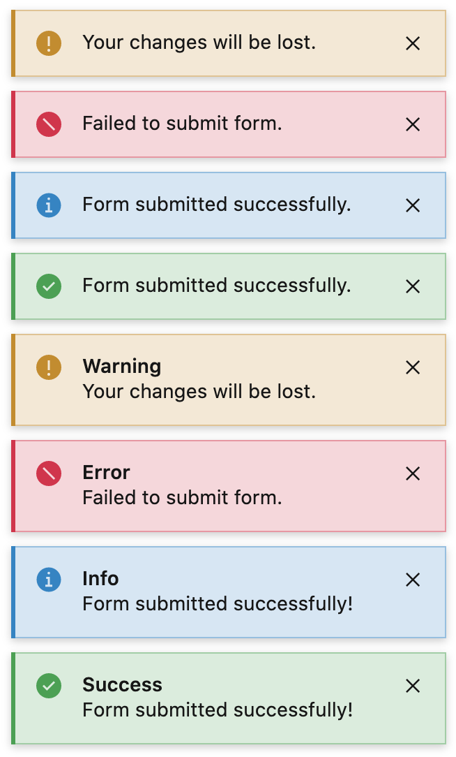
Bootstrap Toast
Install
npm i svelte-toasts
or if you are using yarn
yarn add svelte-toasts
Getting Started
<script>
  import { toasts, ToastContainer, FlatToast, BootstrapToast }  from "svelte-toasts";

  const showToast = () => {
    const toast = toasts.add({
      title: 'Message title',
      description: 'Message body',
      duration: 10000, // 0 or negative to avoid auto-remove
      placement: 'bottom-right',
      type: 'info',
      theme: 'dark',
      placement: 'bottom-right',
      type: 'success',
      theme,
      onClick: () => {},
      onRemove: () => {},
      // component: BootstrapToast, // allows to override toast component/template per toast
    });

    // toast.remove()

  };
</script>

<main class="flex flex-col container items-center mt-10">
    <h1 class="text-lg block text-center">Svelte Toasts</h1>
  <button on:click={showToast}>Show Toast</button>
  <ToastContainer placement="bottom-right" let:data={data}>
    <FlatToast {data} /> <!-- Provider template for your toasts -->
  </ToastContainer>
</main>
Every toast object has following structure:
{
  title: "Welcome",
  description: "Thanks for trying svelte-toasts!",
  uid: 1615153277482,
  placement: "bottom-right",
  type: "success",
  theme: "dark",
  duration: 0,
  remove: () => { /* implementation */ },
  update: () => { /* implementation */ },
  onClick: () => { console.log("Toast clicked"); }
  onRemove: () => { console.log("Toast removed"); },
  // and whatever properties that you want to add when calling toasts.add(options)
}
Below is a detail description of every property.
| Prop | Type | Default | Description |
|---|---|---|---|
title | string | - | Title of toast |
description | string | - | Description/body of toast |
remove | Function | - | Invoking remove method will remove the respective toast object from store/UI. e.g. toast1.remove() |
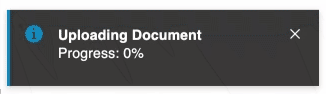
update | Function | - | Invoke update method to update a specific toast values like title, description or duration etc. toast.update({ title; "Progress: 80%" }) |
onClick | Function | () => {} | You can provide onClick callback which will be invoked when toast will be clicked (except toast close icon/button) |
onRemove | Function | () => {} | You can provide onRemove callback which will be invoked when toast will be auto removed or removed by clicking on cross icon/button. |
component | Svelte Component | - | You can provide your own toast component to render toast for a specific toast object |
placement | string | - | Set placement of current toast, it will override default placement set by ToastContainer |
showProgress | boolean | - | If set to "true" and duration is greater than 0 then a timeout progress bar will be shown at the bottom of current toast. It will override default value set by ToastContainer. |
theme | string | - | "dark" and "light" themes are implemented for builtin Toast components but in case of your own Toast component, you can implement or leave this feature. This will override default value set by ToastContainer if you are using builtin Toast components. |
type | string | - | Four types of toasts are available i.e. success, info, error and warning. It will override toast type set by ToastContainer. |
duration | number | - | Duration in milliseconds after which toast will be auto removed. If duration will be 0 or negative, toast will not be auto removed but user can click on cross icon to remove it. It will override duration specified by ToastContainer. |
Helper Methods
You can use helper functions to create toast with just message argument.
toasts.success('Message body here'); // just 1 argument
toasts.success('Message Title', 'Message body here'); // 2 arguments, title, description
toasts.success('Message Title', 'Message body here', { duration: 5000 }); // 3 arguments, title, description and all other options object
Similarly, toasts.info(), toasts.warning() and toasts.error()
Docs
Store
Components
ToastStore
import { toasts } from 'svelte-toasts';
Store toasts contains an array of toasts objects. It has following methods:
| Name | Type | Description |
|---|---|---|
add | Function | This is key function to show toast. You can pass options and modify the generated toast. It will return toast object which you can use to modify or remove that specific toast programmatically, e.g. toast1.update({ title: 'New Title'}) |
removeAll | Function | This function removes all toasts and clears store state to empty array |
removeLast | Function | This function removes one toast (if any) that was generated at the end |
getById | Function | This function returns toast data for given id. Every toast has a unique uid |
setDefaults | Function | This function sets default options so you don't need to pass those options again and again, e.g. theme, placement etc. |
success | Function | Show success/green toast. |
info | Function | Show info/blue toast. |
error | Function | Show error/red toast. |
warning | Function | Show warning/orange toast. |
BootstrapToast
import { BootstrapToast } from 'svelte-toasts';
Props
| Prop name | Kind | Reactive | Type | Default value | Description |
|---|---|---|---|---|---|
| theme | let |
No | Theme |
'light' |
Default theme for all toasts |
| data | let |
No | ToastProps |
{} |
Default theme for all toasts |
Slots
| Slot name | Default | Props | Fallback |
|---|---|---|---|
| close-icon | No | -- | <svg |
| extra | No | -- | -- |
| icon | No | -- | Svg icons based on type |
Events
None.
FlatToast
import { FlatToast } from 'svelte-toasts';
Props
| Prop name | Kind | Reactive | Type | Default value | Description |
|---|---|---|---|---|---|
| theme | let |
No | Theme |
'light' |
Default theme for all toasts |
| data | let |
No | ToastProps |
{} |
Default theme for all toasts |
Slots
| Slot name | Default | Props | Fallback |
|---|---|---|---|
| close-icon | No | -- | <svg |
| extra | No | -- | -- |
| icon | No | -- | Svg icons based on type |
Events
None.
ToastContainer
import { ToastContainer } from 'svelte-toasts';
Props
| Prop name | Kind | Reactive | Type | Default value | Description |
|---|---|---|---|---|---|
| theme | let |
No | Theme |
'dark' |
Default theme for all toasts |
| placement | let |
No | Placement |
'bottom-right' |
Default placement for all toasts |
| type | let |
No | ToastType |
'info' |
Default type of all toasts |
| showProgress | let |
No | boolean |
false |
Show progress if showProgress is true and duration is greater then 0 |
| duration | let |
No | number |
3000 |
Default duration for all toasts to auto close. 0 to disable auto close |
| width | let |
No | 'string' |
'320px' |
Width of all toasts |
Slots
| Slot name | Default | Props | Fallback |
|---|---|---|---|
| -- | Yes | { data: ToastProps } |
-- |
Events
None.
Types
Theme
export type Theme = 'dark' | 'light';
ToastType
export type ToastType = 'success' | 'info' | 'error' | 'warning';
Placement
export type Placement =
  | 'bottom-right'
  | 'bottom-left'
  | 'top-right'
  | 'top-left'
  | 'top-center'
  | 'bottom-center'
  | 'center-center';
ToastProps
export interface ToastProps {
  uid: number;
  title?: string;
  description: string;
  duration: number;
  type: ToastType;
  theme?: Theme;
  placement: Placement;
  showProgress?: boolean;
  remove?: Function;
  update?: Function;
  onRemove?: Function;
  onClick?: Function;
}
ToastStore
export interface ToastStore extends Writable<ToastProps[]> {
  add(options: Partial<ToastProps>): ToastProps;
  success(options: Partial<ToastProps>): ToastProps;
  success(description: string): ToastProps;
  success(description: string, options: Partial<ToastProps>): ToastProps;
  success(
    title: string,
    description: string,
    options?: Partial<ToastProps>
  ): ToastProps;

  info(options: Partial<ToastProps>): ToastProps;
  info(description: string): ToastProps;
  info(description: string, options: Partial<ToastProps>): ToastProps;
  info(
    title: string,
    description: string,
    options?: Partial<ToastProps>
  ): ToastProps;

  error(options: Partial<ToastProps>): ToastProps;
  error(description: string): ToastProps;
  error(description: string, options: Partial<ToastProps>): ToastProps;
  error(
    title: string,
    description: string,
    options?: Partial<ToastProps>
  ): ToastProps;

  warning(options: Partial<ToastProps>): ToastProps;
  warning(description: string): ToastProps;
  warning(description: string, options: Partial<ToastProps>): ToastProps;
  warning(
    title: string,
    description: string,
    options?: Partial<ToastProps>
  ): ToastProps;

  getById(uid: number): ToastProps;
  clearAll(): void;
  clearLast(): void;
  setDefaults(options: Partial<ToastProps>): void;
}