README
univariate-infographics
React component library of SVG info-graphics for displaying uni-variate data

Install
npm install --save univariate-infographics
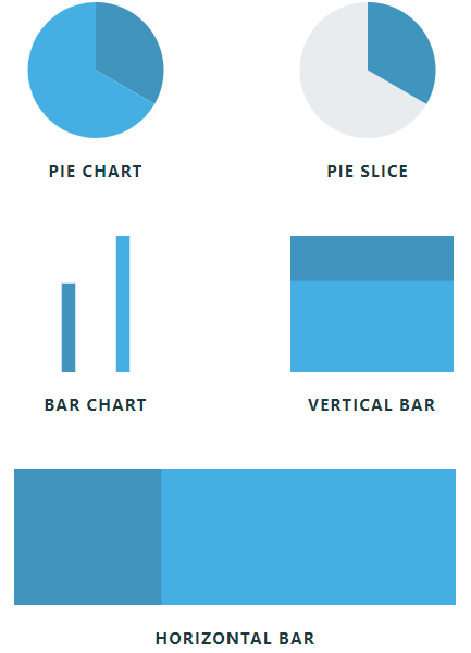
Components
<PieChart data={data} /><PieSlice data={data} /><BarChart data={data} /><HorizontalBar data={data} /><VerticalBar data={data} />
Usage
import React from 'react'

import { PieChart, BarChart, PieSlice, HorizontalBar, VerticalBar } from 'univariate-infographics'
Data Config
Each component takes in an array of objects called data. Each object must have a value property that represents the value of the item in the data set. You can also include other properties if you want to use them in a component's legend or as an overlay on some of the components.
// this is all that's required for the components to work
const data = [
  {
    value: 1
  },
  {
    value: 2
  }
]

/*
=== BUT ===
*/

// you can also add more fields
const data = [
  {
    value: 3,
    label: 'Plot A',
    unit: 'acres',
    ...
  },
  {
    value: 5,
    label: 'Plot B',
    unit: 'acres',
    ...
  }
]
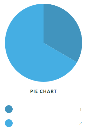
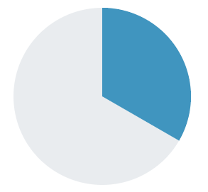
PieChart
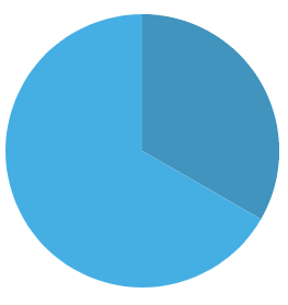
How to use
const data = [
  {
    value: 1
  },
  {
    value: 2
  }
]

const Example = () => (
  <PieChart
    data={data}
  />
)
Props
| Property | Type | Default | Description |
|---|---|---|---|
| data (required) | array | - | Data to be represented by component |
| width | number | 200 | Pixel width of component |
| height | number | 200 | Pixel height of component |
| baseColor | string | '#4095bf' | Starting color for component's gradient. Accepts rgb, hsl, and hex color formats |
| title | string | null | Title of component |
| titleColor | string | '#1d3940' | Text color of title. Accepts any color format |
| highlightColor | string | '#884ca1' | Hover color of component. Accepts any color format |
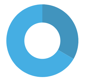
| donut | boolean | false | Turns the pie chart into a donut chart |
| donutColor | string | 'white' | Color of inner donut circle. Accepts any color format |
| legend | boolean | false | Includes a legend for the component. |
| legendColor | string | '#1d3940' | Text color of legend. Accepts any color format |
| legendDataType | string | 'value' | Selects the property of the objects in the data array to display in the legend |
| orientation | number (0-1) | 0 | Where the start of the piechart is on the circle. eg, 0, 1, 0.25, 0.5, etc |
| circleArea | number (0-1) | 1 | What percentage of the circle should the pie chart fill |
| gradientDirection | string | null | Set to 'reverse' to reverse the gradient in the component |
| style | obj | null | Style object passed to the component |
| className | string | null | Class names to be added to the component |
Examples
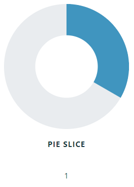
PieSlice
How to use
const data = [
  {
    value: 1
  },
  {
    value: 2
  }
]

const Example = () => (
  <PieSlice
    data={data}
   />
)
Props
| Property | Type | Default | Description |
|---|---|---|---|
| data (required) | array | - | Data to be represented by component |
| slice | number | 0 | Index of data array that is going to displayed |
| width | number | 200 | Pixel width of component |
| height | number | 200 | Pixel height of component |
| baseColor | string | '#4095bf' | Color of slice |
| secondaryColor | string | '#e9ecef' | Background color of pie chart |
| title | string | null | Title of component |
| titleColor | string | '#1d3940' | Text color of title. Accepts any color format |
| donut | boolean | false | Turns the pie chart into a donut chart |
| donutColor | string | 'white' | Color of inner donut circle. Accepts any color format |
| legend | boolean | false | Includes a legend for the component. |
| legendColor | string | '#1d3940' | Text color of legend. Accepts any color format |
| legendDataType | string | 'value' | Selects the property of the objects in the data array to display in the legend |
| orientation | number (0-1) | 0 | Where the start of the piechart is on the circle. eg, 0, 1, 0.25, 0.5, etc |
| circleArea | number (0-1) | 1 | What percentage of the circle should the pie chart fill |
| gradientDirection | string | null | Set to 'reverse' to reverse the gradient in the component |
| style | obj | null | Style object passed to the component |
| className | string | null | Class names to be added to the component |
Examples
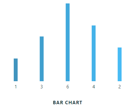
BarChart

How to use
const data = [
  {
    value: 1
  },
  {
    value: 4
  },
  {
    value: 2
  }
]


const Example = () => (
  <BarChart
    data={data}
   />
)
Props
| Property | Type | Default | Description |
|---|---|---|---|
| data (required) | array | - | Data to be represented by component |
| width | number | 200 | Pixel width of component |
| height | number | 200 | Pixel height of component |
| barWidth | number | 20 | Pixel width of individual bars |
| baseColor | string | '#4095bf' | Starting color for component's gradient. Accepts rgb, hsl, and hex color formats |
| title | string | null | Title of component |
| titleColor | string | '#1d3940' | Text color of title. Accepts any color format |
| highlightColor | string | '#884ca1' | Hover color of component. Accepts any color format |
| legend | boolean | false | Includes a legend for the component. |
| legendColor | string | '#1d3940' | Text color of legend. Accepts any color format |
| legendDataType | string | 'value' | Selects the property of the objects in the data array to display in the legend |
| overlay | boolean | false | Include an overlay value on the bars of the component |
| overlayColor | string | '#1d3940' | Text color of overlay. Accepts any color format |
| overlayDataType | string | 'value' | Selects the property of the objects in the data array to display in the overlay |
| gradientDirection | string | null | Set to 'reverse' to reverse the gradient in the component |
| style | obj | null | Style object passed to the component |
| className | string | null | Class names to be added to the component |
Examples
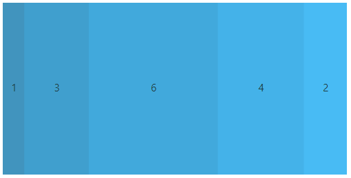
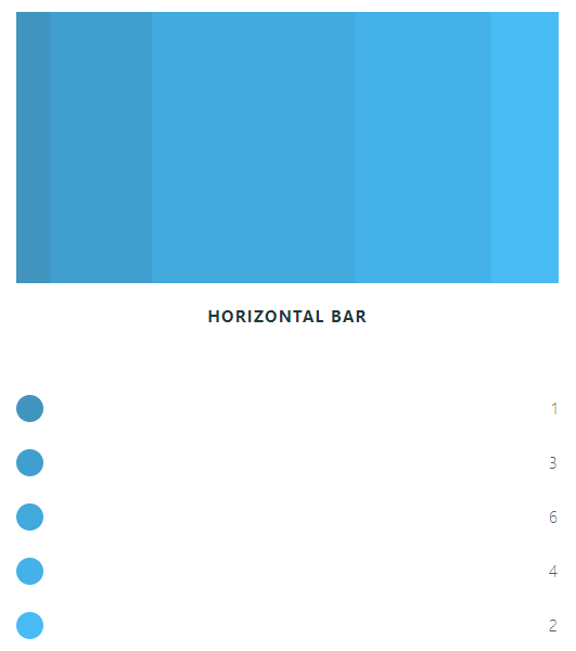
HorizontalBar

How to use
const data = [
  {
    value: 1
  },
  {
    value: 4
  },
  {
    value: 2
  }
]

const Example = () => (
  <HorizontalBar
    width={400}
    height={50}
    data={data}
   />
)
Props
| Property | Type | Default | Description |
|---|---|---|---|
| data (required) | array | - | Data to be represented by component |
| width | number | 200 | Pixel width of component |
| height | number | 200 | Pixel height of component |
| baseColor | string | '#4095bf' | Starting color for component's gradient. Accepts rgb, hsl, and hex color formats |
| title | string | null | Title of component |
| titleColor | string | '#1d3940' | Text color of title. Accepts any color format |
| highlightColor | string | '#884ca1' | Hover color of component. Accepts any color format |
| legend | boolean | false | Includes a legend for the component. |
| legendColor | string | '#1d3940' | Text color of legend. Accepts any color format |
| legendDataType | string | 'value' | Selects the property of the objects in the data array to display in the legend |
| overlay | boolean | false | Include an overlay value on the bars of the component |
| overlayColor | string | '#1d3940' | Text color of overlay. Accepts any color format |
| overlayDataType | string | 'value' | Selects the property of the objects in the data array to display in the overlay |
| gradientDirection | string | null | Set to 'reverse' to reverse the gradient in the component |
| style | obj | null | Style object passed to the component |
| className | string | null | Class names to be added to the component |
Examples
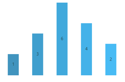
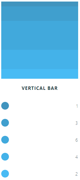
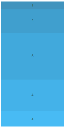
VerticalBar
const data = [
  {
    value: 1
  },
  {
    value: 4
  },
  {
    value: 2
  }
]

const Example = () => (
  <VerticalBar
    width={50}
    height={200}
    data={data}
   />
)

Props
| Property | Type | Default | Description |
|---|---|---|---|
| data (required) | array | - | Data to be represented by component |
| width | number | 200 | Pixel width of component |
| height | number | 200 | Pixel height of component |
| baseColor | string | '#4095bf' | Starting color for component's gradient. Accepts rgb, hsl, and hex color formats |
| title | string | null | Title of component |
| titleColor | string | '#1d3940' | Text color of title. Accepts any color format |
| highlightColor | string | '#884ca1' | Hover color of component. Accepts any color format |
| legend | boolean | false | Includes a legend for the component. |
| legendColor | string | '#1d3940' | Text color of legend. Accepts any color format |
| legendDataType | string | 'value' | Selects the property of the objects in the data array to display in the legend |
| overlay | boolean | false | Include an overlay value on the bars of the component |
| overlayColor | string | '#1d3940' | Text color of overlay. Accepts any color format |
| overlayDataType | string | 'value' | Selects the property of the objects in the data array to display in the overlay |
| gradientDirection | string | null | Set to 'reverse' to reverse the gradient in the component |
| style | obj | null | Style object passed to the component |
| className | string | null | Class names to be added to the component |
Examples
License
MIT © hackersupreme