README
use-viewport-sizes


a tiny React hook which allows you to track visible window viewport size in your components w/ an optional debounce and other flexible options for optimal usage.
Installation
npm install -D use-viewport-sizes
Benefits
- extremely lightweight and zero dependencies -- adds 1.9kb after gzip.
- only one
window.onresizehandler used to subscribe to any changes in an unlimited number of components no matter the use-cases. - optional debounce to delay updates until user stops dragging their window for a moment; this can make expensive components with size-dependent calculations run much faster and your app feel smoother.
- debouncing does not create new handlers or waste re-renders in your component; the results are also pooled from only one resize result.
- optional hash function to update component subtree only at points you would like to.
- supports SSR (see example under Usage section).
Usage
See it in Action
Basic Use-case
registers dimension changes on every resize event immediately
import React from 'react'
import useViewportSizes from 'use-viewport-sizes'

function MyComponent(props) {
    const [vpWidth, vpHeight] = useViewportSizes();

    ...renderLogic
}
Measure/Update only on one dimension
If passed options.dimension as w or h, only the viewport width or height will be
measured and observed for updates.
The only dimension returned in the return array value will be the width or height, according
to what was passed.
import React from 'react';
import useViewportSizes from 'use-viewport-sizes';

function MyComponent(props) {
    const [vpHeight] = useViewportSizes({ dimension: 'h' });

    ...renderLogic
}
With Throttling
If passed options.throttleTimeout, or options are entered as a Number, dimension changes
are registered on a throttled basis e.g. with a maximum frequency.
This is useful for listening to expensive components such as data grids which may be too expensive to re-render during window resize dragging.
import React from 'react';
import useViewportSizes from 'use-viewport-sizes';

function MyExpensivelyRenderedComponent(props) {
    const [vpWidth, vpHeight] = useViewportSizes({ throttleTimeout: 1000 }); // 1s throttle

    // ...renderLogic
}
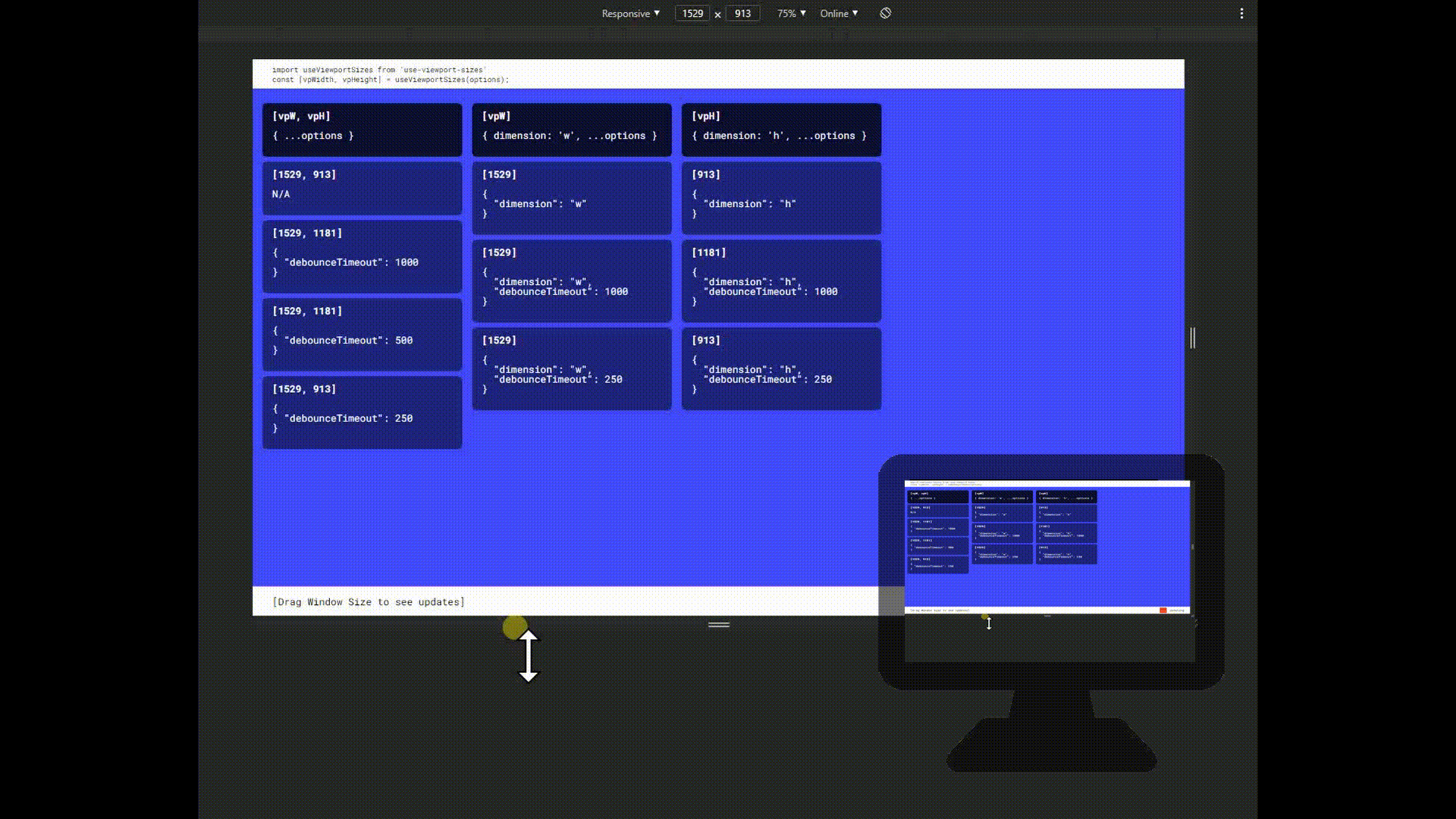
With Debouncing
If passed options.debounceTimeout, dimension changes are registered only when a user stops dragging/resizing the window for a specified number of miliseconds. This is an alternative behavior to throttleTimeout where it may be less
important to update viewport the entire way that a user is resizing.
import React from 'react';
import useViewportSizes from 'use-viewport-sizes';

function MyExpensivelyRenderedComponent(props) {
    const [vpWidth, vpHeight] = useViewportSizes({ debounceTimeout: 1000 }); // 1s debounce

    // ...renderLogic
}
Only update vpW/vpH passed on specific conditions
If passed an options.hasher function, this will be used to calculate a hash that only updates the viewport when the calculation changes. In the example here, we are using it to detect when we have a breakpoint change which may change how a component is rendered if this is not fully possible or inconvenient via CSS @media queries. The hash will also be available as the 3rd value returned from the hook for convenience.
import React from 'react';
import useViewportSizes from 'use-viewport-sizes';

function getBreakpointHash({ vpW, vpH }) {
    if(vpW < 640) {
        return 'md';
    }
    if(vpW < 320) {
        return 'sm';
    }
    else if(vpW < 240) {
        return 'xs';
    }
    else {
        return 'lg';
    }
}

function MyBreakpointBehaviorComponent() {
    const [vpW, vpH, bp] = useViewportSizes({ hasher: getBreakpointHash });

    // do-something-with-breakpoints in render
    // and add new update for vpW, vpH in this component's
    // subtree only when a named breakpoint changes
}
Server Side Rendering
Note: While serverside rendering is supported, it requires an explicit update via useEffect since viewport does not actually exist on the server before rendering to client. The following has been tested with NextJS.
Sidenote that you will see a useLayoutEffect warning from React. This is perfectly expected as there is no viewport/context to paint to when pre-rendering in SSR and will not interfere with your app once served to the client
import React, { useLayoutEffect } from 'react'
import useViewportSizes from 'use-viewport-sizes'

function MySSRComponent (props) {
    const [vpW, vpH, updateVpSizes] = useViewportSizes();

    // below, we add one post-render update
    // in order to register the client's viewport sizes
    // after serving SSR content

    useEffect(()=> { updateVpSizes() }, []);

    // ...renderLogic
}
Support
If you have read the examples and have any issues which you know are glitches,or would like to request something changed, please feel free to post an issue on Github.
Otherwise, if this was useful and you'd like to show your support, no donations necessary, but please consider checking out the repo and giving it a star (⭐).
License
- Open Source MIT license