README
vr-file-upload-preview


This is a custom element (web component - can be used every where regardless the framework).
vr-file-upload aims to address the issue of showing a preview of a user's uploaded image.
Installation
There are few options on how to include/import vr-file-upload-preview into your project:
Install from NPM/YARN
We can install component from NPM/YARN
# npm
npm i vr-file-upload-preview

# yarn
yarn add vr-file-upload-preview
// import component
import 'vr-file-upload-preview';
// import styles
import 'vr-file-upload-preview/vr-file-upload-preview.min.css';
Use from CDN
If you don't want to include vr-file-upload-preview files in your project, you may use it from CDN. The following files are available:
<link rel="stylesheet" href="https://unpkg.com/vr-file-upload-preview/vr-file-upload-preview.min.css" />
<link rel="stylesheet" href="https://unpkg.com/vr-file-upload-preview/vr-file-upload-preview.css" />

<script src="https://unpkg.com/vr-file-upload-preview/vr-file-upload-preview.min.js"></script>
If you use ES modules in browser, there is a CDN version for that too:
<script type="module">
    import 'https://unpkg.com/vr-file-upload-preview/vr-file-upload-preview.umd.js'
</script>
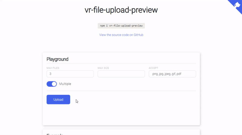
Full Example
<!-- *.html -->
<vr-file-upload-preview
    class="custom-wrapper"
    accept=".png,.jpg,.jpeg,.gif"
    max-files="3"
    max-size="55000"
    multiple
>
    <button class="custom-button">
        Upload
    </button>
</vr-file-upload-preview>
// *.js
import 'vr-file-upload-preview';
import 'vr-file-upload-preview/vr-file-upload-preview.min.css';

const uploader = document.querySelector('vr-file-upload-preview');

uploader.addEventListener('change', (e) => {
    console.log(e.detail.files);
    // console.log(uploader.files);
});

uploader.addEventListener('error', (e) => {
    const {file, type} = e.detail;

    console.log({file, type});
});
API Reference
| Attributes | Description |
|---|---|
| accept | Acceptable file types can be specified with the accept attribute, which takes a comma-separated list of allowed file extensions or MIME types. accept="image/png, image/jpeg" accept=".png, .jpg, .jpeg, .pdf" |
| multiple | The multiple attribute allows the user to specify multiple files at the same time in the file upload field. multiple multiple="true" |
| max-files | Maximum number of files. max-files="3" |
| max-size | Maximum file size, the value is specified in bytes. max-size="5000" |
| preview | Allows you to specify your own container for displaying file previews through a selector or a group of selectors. preview=".custom-preview" preview="#custom-preview" preview=".custom-preview.custom-wrapper" |
| dropzone | The dropzone attribute allows the user to drag files to the drop zone. dropzone dropzone="true" |
| Methods | Description |
|---|---|
| upload | Uploading files. parameters: value value: Blob \| Array<Blob> |
| remove | Removing a file by index. parameters: index value: number |
| clear | Cleans up all files. |
| Events | Description |
|---|---|
| change | Triggered each time file/files are selected. Delivers the array of files. value: event.detail {files: Array<File>} |
| error | Triggered each time an error occurs while selecting a file / files. Delivers file and error type. value: event.detail {type: "FORMAT" \| "MAX_FILES" \| "MAX_SIZE", file: File} |
Testing
Use npm run test to run the tests.
Development
Clone the repo, then use the following to work on the project locally:
# Install dependencies
npm install

# Run demo project
npm run start

# Build library
npm run build:library