README
vue-stepper-touch
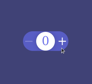
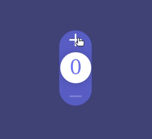
Stepper Touch for Vue 3 based on a Dribbble showcase designed by Oleg Frolov and coded in vanilla JavaScript by Marvin Rudolph
Horizontal view
Vertical view
Installation
Install the component into your repo/app
npm i vue-stepper-touch
Import component in your template
import VueStepperTouch from 'vue-stepper-touch'
Usage
<VueStepperTouch
    class="m-1 px-3 border border-collapse border-black-900 text-center"
    axis="x"
    background="#6d72fe"
    color="#ffffff"
    fontFamily="Poppins"
    :opacity=25
    :min=0
    :max=100
    :initialValue=0
    :size=4
    @valueChange="changeValue"
/>
Props configuration
| Prop | Type | Description |
|---|---|---|
| class | String | add any css class you prefer for the component formating, it supports tailwind.css |
| axis | String | the axis direction of the component, can take x for horizontal or y for vertical rendering |
| background | String | the hex colour code for the background of the element e.g. #ffffff |
| color | String | the hex colour code for the indicator and the plus minus parts e.g. #333333 |
| fontFamily | String | the font type of the numeric indicator value e.g. Arial |
| opacity | Number | the alpha opacity color that applies on the stepper element as background based on color can take values from 0 to 100 |
| min | Number | the minimum value that the counter can take |
| max | Number | the maximum value that the counter can take |
| initialValue | Number | the initial value that the counter will take on first load |
| size | Number | the size of the stepper element in rem's e.g. : 3.5 or 3 |
| @valueChange | Callback | event listener with a callback function that accepts a payload as parameter which includes the changed value e.g. : a method like : changeValue(payload) { return payload.value } |