README


vue-advanced-chat
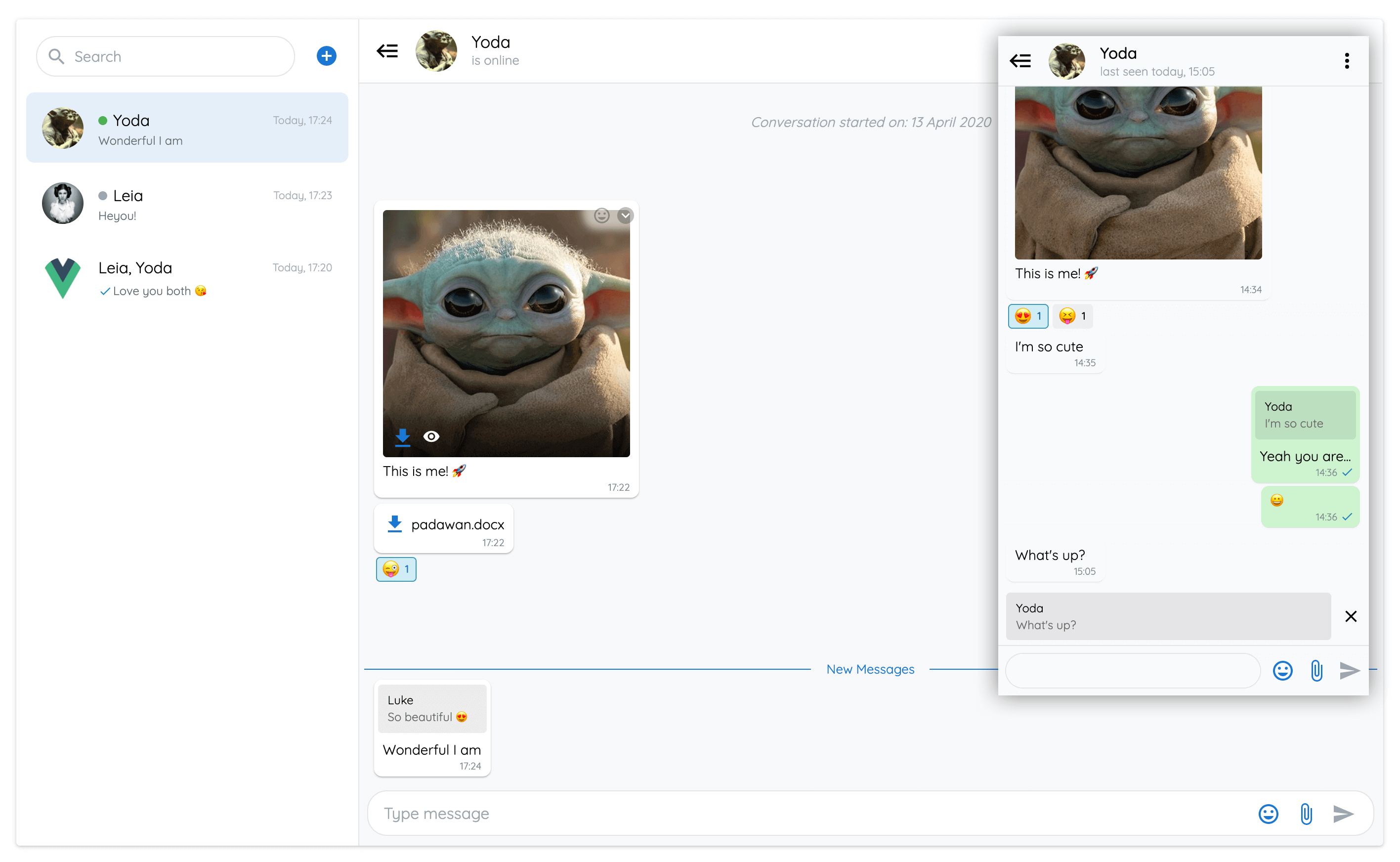
Features
- Realtime chat messaging
- Customizeable
- Backend agnostic
- Images, files & emojis
- Edit messages
- Reply to other messages
- UI elements for seen, new, deleted and typing messages
- Text formatting - bold, italic, strikethrough, code
- Online / Offline status
- Flexible options
- Custom theming - light and dark modes
- Firestore example
- PWA support
- Web Component support
Demo
Enjoy :smile:
Real World Example
A Progressive Web Application showcasing all the features of vue-advanced-chat component.
Built with Firestore, Vuetify, and Push Notifications.
Table of Contents
- Installation
- Usage
- Props API
- Props data structure
- Events API
- Named Slots
- Using with Firestore
- Use as a Web Component
Installation
# Using npm
npm install --save vue-advanced-chat

# Using yarn
yarn add --save vue-advanced-chat
Usage
You can import it as a custom component:
<template>
  <chat-window :currentUserId="currentUserId" :rooms="rooms" :messages="messages" />
</template>

<script>
  import ChatWindow from 'vue-advanced-chat'
  import 'vue-advanced-chat/dist/vue-advanced-chat.css'

  export default {
    components: {
      ChatWindow
    },
    data() {
      return {
        rooms: [],
        messages: [],
        currentUserId: 1234
      }
    }
  }
</script>
Props API
| Prop | Type | Required | Default |
|---|---|---|---|
| height | String | - | 600px |
| currentUserId (1) | [String, Number] | true | - |
| rooms | Array | - | [ ] |
| loadingRooms (2) | Boolean | - | false |
| roomId (3) | [String, Number] | - | null |
| messages | Array | - | [ ] |
| roomMessage (4) | Object | - | null |
| messagesLoaded (5) | Boolean | - | false |
| menuActions (6) | Array | - | [ ] |
| messageActions (7) | Array | - | (4) |
| showAddRoom | Boolean | - | true |
| showFiles | Boolean | - | true |
| showEmojis | Boolean | - | true |
| showReactionEmojis | Boolean | - | true |
| showNewMessagesDivider (8) | Boolean | - | true |
| textMessages (9) | Object | - | null |
| textFormatting (10) | Boolean | - | true |
| responsiveBreakpoint (11) | Number | - | 900 |
| singleRoom (12) | Boolean | - | false |
| theme (13) | Sring | - | light |
| styles (14) | Object | - | (10) |
(1) currentUserId is required to display UI and trigger actions according to the user using the chat (ex: messages position on the right, etc.)
(2) loadingRooms can be used to show/hide a spinner icon while rooms are loading
(3) roomId can be used to load a specific room at any time
(4) roomMessage can be used to add a default textarea value
(5) messagesLoaded must be manually set to true when all messages of a conversation have been loaded. Meaning the user cannot scroll on top anymore
(6) menuActions can be used to display your own buttons when clicking the vertical dots icon inside a room.
You can then use the menuActionHandler event to call your own action after clicking a button. Ex:
menuActions="[
  {
    name: 'inviteUser',
    title: 'Invite User'
  },
  {
    name: 'removeUser',
    title: 'Remove User'
  },
  {
    name: 'deleteRoom',
    title: 'Delete Room'
  }
]"
(7) messageActions can be used to display your own buttons when clicking the dropdown icon inside a message.
You can then use the messageActionHandler event to call your own action after clicking a button. Ex:
messageActions="[
  {
    name: 'addMessageToFavorite',
    title: 'Add To Favorite'
  },
  {
    name: 'shareMessage',
    title: 'Share Message'
  }
]"
You can use built-in messageActions names to trigger specific UI modifications when clicked.
Currently, replyMessage, editMessage and deleteMessage action names are available.
If messageActions is not set, it will use the default values below.
If you don't want to display this messageActions menu, you can pass it an empty array.
messageActions="[
  {
    name: 'replyMessage',
    title: 'Reply'
  },
  {
    name: 'editMessage',
    title: 'Edit Message',
    onlyMe: true
  },
  {
    name: 'deleteMessage',
    title: 'Delete Message',
    onlyMe: true
  }
]"
(8) showNewMessagesDivider can be used to show/hide the blue line divider between seen and unseen messages.
(9) textMessages can be used to replace default i18n texts. Ex:
textMessages="{
  NEW_MESSAGES: 'Nouveaux messages',
  MESSAGE_DELETED: 'Ce message a été supprimé',
  MESSAGES_EMPTY: 'Aucun message',
  CONVERSATION_STARTED: 'La conversation a commencée le :',
  TYPE_MESSAGE: 'Taper votre message',
  SEARCH: 'Rechercher'
}"
(10) textFormatting can be used to add text formatting. Currently, bold, italic, strikethrough, underline, inline code and multiline code formatting are available and can be used in conjonction. You can disable text formatting by passing the prop as :textFormatting="false".
| Style | Syntax | Example | Output |
|---|---|---|---|
| Bold | * * |
*This is bold text* |
This is bold text |
| Italic | _ _ |
_This text is italicized_ |
This text is italicized |
| Strikethrough | ~ ~ |
~This was mistaken text~ |
|
| Underline | ° ° |
°This text is underlined° |
This text is underlined |
| Nested formatting | * * and _ _ |
*This text is _extremely_ important* |
This text is extremely important |
Inline Code
Example: `This is inline code`
Output: This is inline code
Multiline Code
Example: ```This is multiline code```
Output:
This is
multiline code
(11) responsiveBreakpoint can be used to collapse the rooms list on the left when then viewport size goes below the specified width.
(12) singleRoom can be used if you never want to show the rooms list on the left. You still need to pass the rooms prop as an array with a single element.
(13) theme can be used to change the chat theme. Currently, only light and dark are available.
(14) styles can be used to customize your own theme. Ex:
styles="{
  general: {
    color: '#0a0a0a',
    backgroundInput: '#fff',
    colorPlaceholder: '#9ca6af',
    colorCaret: '#1976d2',
    colorSpinner: '#333',
    borderStyle: '1px solid #e1e4e8',
    backgroundScrollIcon: '#fff'
  },

  container: {
    border: 'none',
    borderRadius: '4px',
    boxShadow: '0px 3px 1px 1px #000'
  },

  header: {
    background: '#fff',
    colorRoomName: '#0a0a0a',
    colorRoomInfo: '#9ca6af'
  },

  footer: {
    background: '#f8f9fa',
    borderStyleInput: '1px solid #e1e4e8',
    borderInputSelected: '#1976d2',
    backgroundReply: 'rgba(0, 0, 0, 0.08)'
  },

  content: {
    background: '#f8f9fa'
  },

  sidemenu: {
    background: '#fff',
    backgroundHover: '#f6f6f6',
    backgroundActive: '#e5effa',
    colorActive: '#1976d2',
    borderColorSearch: '#e1e5e8'
  },

  dropdown: {
    background: '#fff',
    backgroundHover: '#f6f6f6'
  },

  message: {
    background: '#fff',
    backgroundMe: '#ccf2cf',
    color: '#0a0a0a',
    colorStarted: '#9ca6af',
    backgroundDeleted: '#dadfe2',
    colorDeleted: '#757e85',
    colorUsername: '#9ca6af',
    colorTimestamp: '#828c94',
    backgroundDate: '#e5effa',
    colorDate: '#505a62',
    backgroundReply: 'rgba(0, 0, 0, 0.08)',
    colorReplyUsername: '#0a0a0a',
    colorReply: '#6e6e6e',
    backgroundImage: '#ddd',
    colorNewMessages: '#1976d2',
    backgroundReaction: '#eee',
    borderStyleReaction: '1px solid #eee',
    backgroundReactionHover: '#fff',
    borderStyleReactionHover: '1px solid #ddd',
    colorReactionCounter: '#0a0a0a',
    backgroundReactionMe: '#cfecf5',
    borderStyleReactionMe: '1px solid #3b98b8',
    backgroundReactionHoverMe: '#cfecf5',
    borderStyleReactionHoverMe: '1px solid #3b98b8',
    colorReactionCounterMe: '#0b59b3'
  },

  markdown: {
    background: 'rgba(239, 239, 239, 0.7)',
    border: 'rgba(212, 212, 212, 0.9)',
    color: '#e01e5a',
    colorMulti: '#0a0a0a'
  },

  room: {
    colorUsername: '#0a0a0a',
    colorMessage: '#67717a',
    colorTimestamp: '#a2aeb8',
    colorStateOnline: '#4caf50',
    colorStateOffline: '#ccc',
    backgroundCounterBadge: '#0696c7',
    colorCounterBadge: '#fff'
  },

  emoji: {
    background: '#fff'
  },

  icons: {
    search: '#9ca6af',
    add: '#1976d2',
    toggle: '#0a0a0a',
    menu: '#0a0a0a',
    close: '#9ca6af',
    closeImage: '#fff',
    file: '#1976d2',
    paperclip: '#1976d2',
    closeOutline: '#000',
    send: '#1976d2',
    sendDisabled: '#9ca6af',
    emoji: '#1976d2',
    emojiReaction: '#828c94',
    document: '#1976d2',
    pencil: '#9e9e9e',
    checkmark: '#0696c7',
    eye: '#fff',
    dropdownMessage: '#fff',
    dropdownMessageBackground: 'rgba(0, 0, 0, 0.25)',
    dropdownScroll: '#0a0a0a'
  }
}"
Props data structure
Your props must follow a specific structure to display rooms and messages correctly:
Rooms prop
rooms="[
  {
    roomId: 1,
    roomName: 'Room 1',
    unreadCount: 4,
    lastMessage: {
      content: 'Last message received',
      sender_id: 1234,
      username: 'John Doe',
      timestamp: '10:20',
      date: 123242424,
      seen: false,
      new: true
    },
    users: [
      {
        _id: 1234,
        username: 'John Doe',
        status: {
          state: 'online',
          last_changed: 'today, 14:30'
        }
      },
      {
        _id: 4321,
        username: 'John Snow',
        status: {
          state: 'offline',
          last_changed: '14 July, 20:00'
        }
      }
    ],
    typingUsers: [ 4321 ]
  }
]"
If you set a
datetolastMessageproperty, your rooms will be ordered using this date valueFor each room user, you can add the
statusproperty, which can hold thestateandlast_changedproperties:statecan be'online'or'offline'last_changedis the date whenstatewas last modified.
typingUsersis an array of all the users who are currently writing a message
Messages prop
Message objects are rendered differently depending on their type. Currently, only text, emoji and file types are supported.
Each message object has a sender_id field which holds the id of the corresponding agent. If sender_id matches the currentUserId prop, specific UI and actions will be implemented.
Note: username will be displayed on each message of corresponding agents if at least 3 users are in the room.
messages="[
  {
    _id: 7890,
    content: 'message 1',
    sender_id: 1234,
    username: 'John Doe',
    date: '13 November',
    timestamp: '10:20',
    seen: true,
    disable_actions: false,
    disable_reactions: false,
    file: {
      name: 'My File',
      size: 67351,
      type: 'png',
      url: 'https://firebasestorage.googleapis.com/...'
    },
    reactions: {
      wink: [
        1234, // USER_ID
        4321
      ],
      laughing: [
        1234
      ]
    }
  }
]"
Events API
| Event | Params | Fires when |
|---|---|---|
| fetchMessages (1) | { room, options } |
A user has scrolled on top to load more messages |
| sendMessage | { roomId, content, file (4), replyMessage (5) } |
A user has sent a message |
| editMessage | { roomId, messageId, newContent, file (4), replyMessage (5) } |
A user has edited a message |
| deleteMessage | { roomId, messageId } |
A user has deleted a message |
| openFile | { message, action } |
A user has clicked to view or download a file |
| addRoom | - | A user clicks on the plus icon next to searchbar |
| menuActionHandler (2) | { roomId, action } |
A user clicks on the vertical dots icon inside a room |
| messageActionHandler (3) | { roomId, action, message } |
A user clicks on the dropdown icon inside a message |
| sendMessageReaction | { roomId, messageId, reaction, remove } |
A user clicks on the emoji icon inside a message |
| typingMessage | { message, roomId } |
A user is typing a message |
| roomInfo | { room } |
A user has clicked the room header bar |
(1) fetchMessages is triggered every time a room is opened. If the room is opened for the first time, the options param will hold reset: true
(1) fetchMessages should be a method implementing a pagination system. Its purpose is to load older messages of a conversation when the user scroll on top
(2) menuActionHandler is the result of the menuActions prop.
When clicking a button from your menuActions array, menuActionHandler will give you the name of the button that was click.
Then you can do whatever you want with it. Ex:
menuActionHandler({ roomId, action }) {
  switch (action.name) {
    case 'inviteUser':
      // call a method to invite a user to the room
    case 'removeUser':
      // call a method to remove a user from the room
    case 'deleteRoom':
      // call a method to delete the room
  }
}
(3) messageActionHandler is the result of the messageActions prop.
When clicking a message menu button from your messageActions array, messageActionHandler will give you the name of the button that was click and the corresponding message data.
Then you can do whatever you want with it. Ex:
messageActionHandler({ roomId, action, message }) {
  switch (action.name) {
    case 'addMessageToFavorite':
      // call a method to add a message to the favorite list
    case 'shareMessage':
      // call a method to share the message with another user
  }
}
(4) All file params contain: { blob, localURL, name, size, type }
(5) replyMessage object is available when the user replied to another message by clicking the corresponding icon, and contains the message information that was clicked
Named Slots
| Slot | Action |
|---|---|
| rooms-header | Add a template on top of rooms list (above the search bar) |
Using with Firestore
Source code
You can find the source code to implement a full featured chat app using Firebase/Firestore inside the demo folder.
To test it using your own Firebase project:
- Setup Cloud Firestore (to store users and rooms) and Realtime Database (to store users online status)
- Clone this repository:
git clone https://github.com/antoine92190/vue-advanced-chat.git - Inside
demo/src/firestore/index.jsfile, replace the lineconst config = ...by your own Firebase config - Go inside
demofolder and runnpm run serve
Data structure
If you decide to use the same code as in the demo folder to create your chat app, you need to have a specific Firestore data structure.
To help you get started, I added in demo/src/App.vue a method addData to initialize some data on your Firestore database.
Users collection
users: {
  USER_ID_1: {
    _id: 1,
    username: 'User 1'
  },
  USER_ID_2: {
    _id: 2,
    username: 'User 2'
  },
  USER_ID_3: {
    _id: 3,
    username: 'User 2'
  }
}
Rooms collection
chatRooms: {
  ROOM_ID_1: {
    users: [1, 3]
  },
  ROOM_ID_2: {
    users: [1, 2, 3]
  }
}
Messages collection inside a room document
messages: {
  MESSAGE_ID_1: {
    content: 'My first message',
    sender_id: 2,
    timestamp: 'December 11, 2019 at 4:00:00 PM',
    seen: true
  }
}
Use as a Web Component
Clone vue-advance-chat project
git clone https://github.com/antoine92190/vue-advanced-chat.git
Build it as a Web Component
npm i && npm run build:wc
Add Vue.js to your application
<!-- index.html -->
<script src="https://unpkg.com/vue"></script>
Import the built minified component in your application
Add vue-advanced-chat.min.js in your application files
vue-advanced-chat/dist/vue-advanced-chat.min.js
Import the vue-advanced-chat.min.js file you just added
import './vue-advanced-chat.min.js'
License
This project is licensed under MIT License