README
wc-responsive-container
Web component to allow an author to control styling based on the size of a containing element rather than the size of the user’s viewport.
An implementation based on Philip Walton's Responsive Components: a Solution to the Container Queries Problem using custom elements and resize observer.
Why?
If a container is within a dynamic app layout that can affect the container size, e.g. layout has closable drawers, it becomes difficult to encapsulate and localize the responsive logic within the container. Media queries as they exist today fall short. Container queries are a long desired CSS feature that could help, but unfortunately progress has stalled.
Install
npm i wc-responsive-container
Example
<style>
* {
box-sizing: border-box;
}
body {
margin: 0;
min-height: 100vh;
display: flex;
align-items: center;
justify-content: center;
}
article {
width: 76%;
height: 500px;
}
section {
background-color: lightgray;
outline: 3px dotted tomato;
padding: 2rem;
}
wc-responsive-container {
min-height: 100%;
display: grid;
grid-gap: 2rem;
padding: 2rem;
outline: 3px dotted skyblue;
}
wc-responsive-container.md {
grid-template-columns: repeat(3, 1fr);
}
wc-responsive-container.md > [md-colspan="2"] {
grid-column: span 2;
}
wc-responsive-container.md > [md-colspan="3"] {
grid-column: span 3;
}
</style>
<script type="module">
// Using @web/dev-server or your favorite bundler...
import 'wc-responsive-container';
</script>
<article>
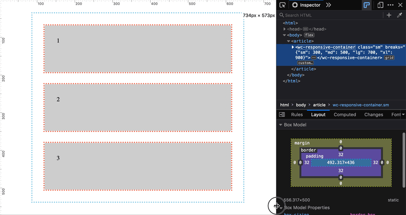
<wc-responsive-container breaks='{"sm": 300, "md": 500, "lg": 700, "xl": 900}'>
<section md-colspan="1">
1
</section>
<section md-colspan="2">
2
</section>
<section md-colspan="3">
3
</section>
</wc-responsive-container>
</article>