README
GraphJS
About
GraphJS will draw for you a lot of types of charts. Just select grid, chart and provide data. We will do the rest.
Installation
npm install web-graphs
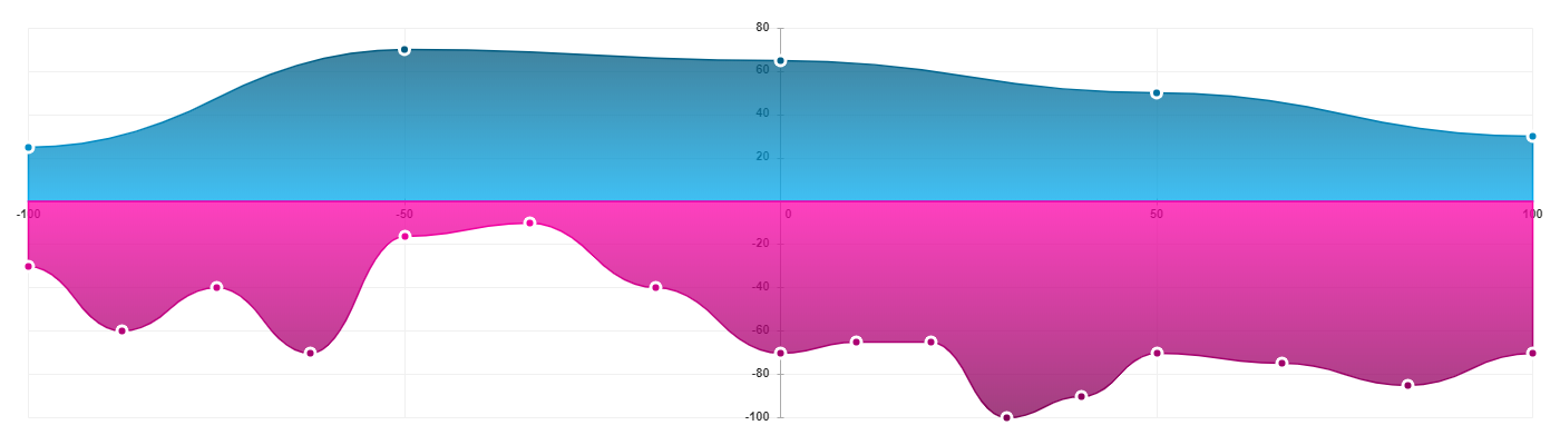
Example
Code
<canvas width="1400" height="700"></canvas>
import { CoordinateSystem2dGrid, LineChart, ValueLabel, FlexLabel } from 'web-graphs'
const canvas = document.querySelector('canvas')

const grid = new CoordinateSystem2dGrid(canvas, {
  x: new ValueLabel(-100, 100, 50),
  y: new FlexLabel(100, 0, 20)
})

grid.addCharts({
  line: new LineChart({
    fill: true,
    dots: true,
    smooth: true,
    values: [
      {
        color: ['#005B80', '#00B6FF'],
        values: [25, 70, 65, 50, 30]
      },
      {
        color: ['#FF00AA', '#800055'],
        values: [
          [-30, -60, -40, -70],
          [-16, -10, -40],
          [-70, -65, -65, -100, -90],
          [-70, -75, -85],
          -70
        ]
      }
    ]
  })
})
grid.draw()
Output
Documentation
Labels
String label
It will label your data with string values.
- values - array of names
- reverse - reverses the direction of labels
Code
class StringLabel(values: string[], { reverse?: boolean } = {});

const label = new StringLabel(['Monday', 'Tuesday', 'Wednesday', 'Thursday', 'Friday', 'Saturday', 'Sunday']);
const label = new StringLabel(['Monday', 'Tuesday', 'Wednesday', 'Thursday', 'Friday', 'Saturday', 'Sunday'], {reverse: true});
Output

Value label
It will label your data with numeric values.
- start - first number of label
- end - last number of label
- step - step to next number
- reverse - reverses the direction of labels
Code
class ValueLabel(start: number, end: number, step: number, {reverse?: boolean} = {});

const label1 = new ValueLabel(-100, 100, 50);
const label2 = new ValueLabel(100, -100, 25);
const label3 = new ValueLabel(100, -80, 20, {reverse: true});
Output

Flex label
It will automatically generate numeric labels based on values.
- start - first number of label
- end - last number of label
- step - step to next number
Code
class FlexLabel(start: number = 0, end: number = 100, step: number = 20);

const label1 = new FlexLabel();
const label2 = new FlexLabel(-100, 100, 50);
const label3 = new FlexLabel(100, -100, 25);
Output
Percent label
It will label your data with percentages.
- step - step to next number
- reverse - reverses direction of label
Code
class PercentLabel(step: number, {reverse?: boolean} = {});

const label1 = new PercentLabel(20);
const label2 = new PercentLabel(20, {reverse: true});
Output

Grids
List of methods that you can use on any grid:
- addCharts - Adds charts to your grid. You can find below which of the chart can be added to which grid. You will have access to your chart by the name that you've provided in addCharts method.
- draw - Draws grid with all of the charts.
- chartList - Contains object with all of the charts that are assigned to this grid.
| Horizontal | Vertical | CoordinateSystem2d | CoordinateSystem1d | Polygon | No | |
|---|---|---|---|---|---|---|
| Line | yes | - | yes | - | - | - |
| Column | yes | - | yes | - | - | - |
| Row | - | yes | yes | - | - | - |
| Bubble | - | - | yes | - | - | - |
| Range | - | - | - | yes | - | - |
| Polygon | - | - | - | - | yes | - |
| Round | - | - | - | - | - | yes |
| SameDirectionRound | - | - | - | - | - | yes |
const grid = new PolygonGrid(canvas, new StringLabel(['a', 'b', 'c']))
const chart = new PolygonChart({ values: [{ color: '#00f', values: [10, 30, 40, 50, 20] }] })

grid.addCharts({
  name: chart
})

grid.draw()

const myPolygonChart = grid.chartList.name
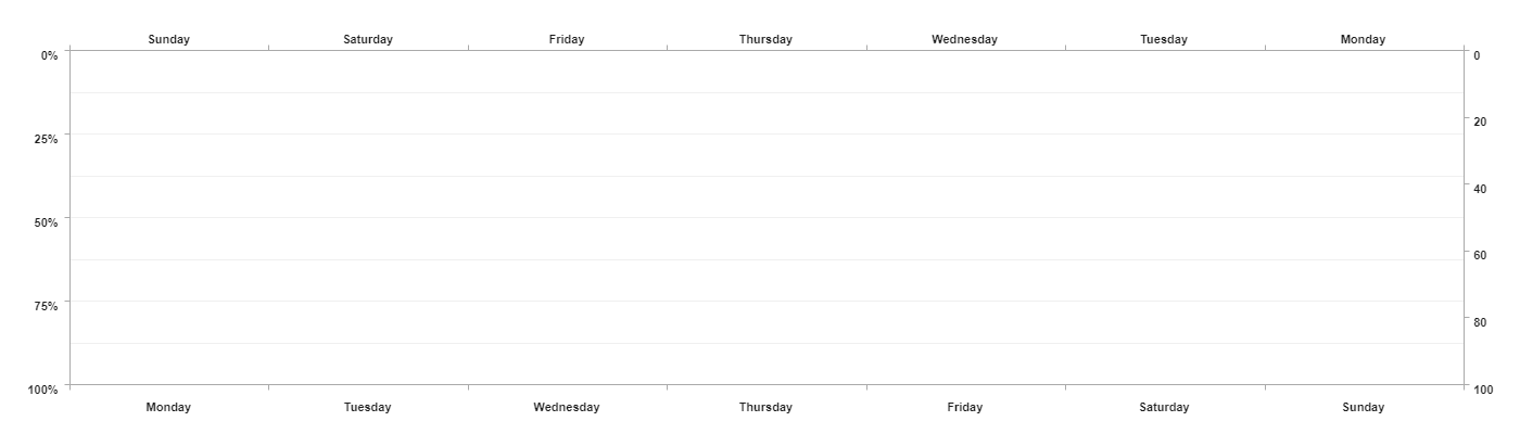
HorizontalGrid
It draws a 2d plane with values/string labels.
- canvas - HTML canvas element
- top right bottom left - Your grid labels. You can use any type of label unless you are using main and secondary label parameters.
- mainLabel - The grid will be drawn to this label. Moreover, all charts will be corresponding to this label. Default 'left'. It can not be StringLabel
- secondaryLabel - All values of the charts will be grouped by index and labeled by this label. It must be StringLabel
- factor - more about factors
Code
class HorizontalGrid(canvas: HTMLCanvasElement, {
top?: Label,
right?: Label,
bottom?: Label,
left?: Label
}, {
mainLabel?: 'left' | 'right',
secondaryLabel?: 'bottom' | 'top',
factor?: GridFactor
} = {});
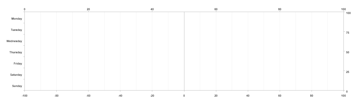
const grid1 = new HorizontalGrid(canvas, {
top: new StringLabel(['Monday', 'Tuesday', 'Wednesday', 'Thursday', 'Friday', 'Saturday', 'Sunday'], {reverse: true}),
left: new PercentLabel(25),
bottom: new StringLabel(['Monday', 'Tuesday', 'Wednesday', 'Thursday', 'Friday', 'Saturday', 'Sunday']),
right: new FlexLabel()
});
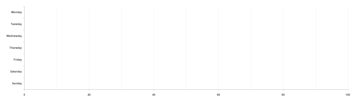
const grid2 = new HorizontalGrid(canvas, {
left: new ValueLabel(100, 0, 20),
bottom: new StringLabel(['Monday', 'Tuesday', 'Wednesday', 'Thursday', 'Friday', 'Saturday', 'Sunday']),
});
Output
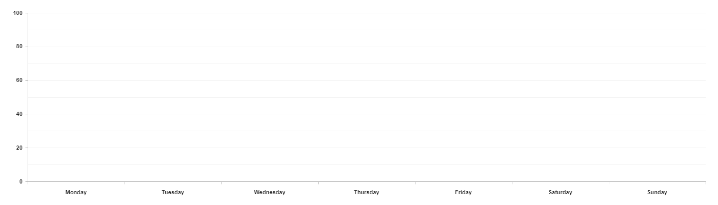
VerticalGrid
It draws a 2d plane with values/string labels.
- canvas - HTML canvas element
- top right bottom left - Your grid labels. You can use any type of label unless you are using main and secondary label parameters.
- mainLabel - The grid will be drawn to this label. Moreover, all charts will be corresponding to this label. Default 'left'. It can not be StringLabel
- secondaryLabel - All values of the charts will be grouped by index and labeled by this label. It must be StringLabel
- factor - more about factors
Code
class VerticalGrid(canvas: HTMLCanvasElement, {
top?: Label,
right?: Label,
bottom?: Label,
left?: Label
}, {
mainLabel?: 'top' | 'bottom',
secondaryLabel?: 'left' | 'right',
factor?: GridFactor
} = {});
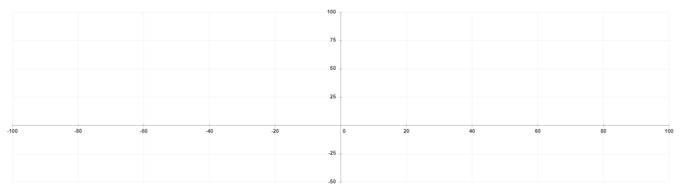
const grid1 = new VerticalGrid(canvas, {
top: new ValueLabel(0, 100, 20),
right: new ValueLabel(100, 0, 25),
bottom: new ValueLabel(-100, 100, 20),
left: new StringLabel(['Monday', 'Tuesday', 'Wednesday', 'Thursday', 'Friday', 'Saturday', 'Sunday'])
});
const grid2 = new VerticalGrid(canvas, {
bottom: new ValueLabel(0, 100, 20),
left: new StringLabel(['Monday', 'Tuesday', 'Wednesday', 'Thursday', 'Friday', 'Saturday', 'Sunday'])
});
Output
CoordinateSystem2dGrid
It draws a 2d plane with x and y coordinates.
- canvas - HTML canvas element
- x, y - Your grid labels.
- factor - more about factors
Code
class CoordinateSystem2dGrid(canvas: HTMLCanvasElement, {
x: ValueLabel | FlexLabel,
y: ValueLabel | FlexLabel
}, {factor: GridFactor});
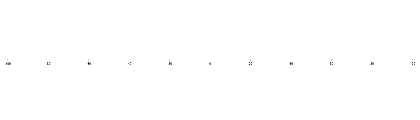
const grid = new CoordinateSystem2dGrid(canvas, {
x: new ValueLabel(-100, 100, 20),
y: new ValueLabel(100, -50, 25)
});
Output
CoordinateSystem1dGrid
It draws a One-Dimensional Coordinate System.
- canvas - HTML canvas element
- label - Your grid label.
- factor - more about factors
Code
class CoordinateSystem1dGrid(canvas: HTMLCanvasElement, label: ValueLabel | FlexLabel, { factor: GridFactor });

const grid = new CoordinateSystem1dGrid(canvas, new ValueLabel(-100, 100, 20));
Output
PolygonGrid
It draws a polygon grid with any number of vertices.
- canvas - HTML canvas element
- label - Names of polygon vertices
- factor - more about factors
Code
interface PolygonGrid(canvas: HTMLCanvasElement, label: StringLabel, { factor: GridFactor });

const grid = new PolygonGrid(
    canvas,
    new StringLabel(['Monday', 'Tuesday', 'Wednesday', 'Thursday', 'Friday', 'Saturday', 'Sunday'])
);
Output

NoGrid
It creates empty grid. It will be needed for chars that don't have a grid.
- canvas - HTML canvas element
Code
class NoGrid(canvas: HTMLCanvasElement);

const grid = new NoGrid(canvas);
Charts
List of properties/methods that you can use on any chart:
- content - It's a list of data that have been assigned to this chart.
- getItemContent - Return item from content by id.
- addItemContent - Add item to the content and returns it.
- updateItemContent - Update item in the content by id and return it.
- deleteItemContent - Delete an item from the content by id and return it.
- createLabel - Create labels based on each name in the content. Labels will be appended as a child to the element that you will pass as a parameter.
- draw - If your char can be assigned to the NoGrid you don't have to create any grid. You can simply create a new chart and use this method, but you will have to pass a canvas element into it.
- disable - By this value, you can control if your chart will be displayed on the grid.
const chart = new PolygonChart({ values: [{ color: '#00f', values: [10, 30, 40, 50, 20], id: 1 }] })

const item = chart.getItemContent(1)
const newItem = chart.addItemContent({ color: '#f00', values: [20, 40, 65, 30, 10], id: 2 })
const updatedItem = chart.updateItemContent(1, { color: '#0f0' })
const deletedItem = chart.deleteItemContent(2)

chart.createLabel(document.body)
chart.draw(canvas)
chart.disable = true
LineChart
It draws a line chart on the grid.
- values - An Array of objects where each object in the array represents a single line.
Item object:
- color - Color of the line. If you want to create gradient color you can simply pass an array of colors.
- values - It is an array of values. Each value can be either number or an array of numbers.
- id - With this id, you will be able to manage this item.
- name - It is the title of your item. It will allow you automatically create labels for this chart.
- dashLine - It takes an array of numbers. It allows you to create a dashed line.
- smooth - It makes the line smooth.
- dots - It creates dots on each of the vertexes.
- fill - It adds background to the line.
- correspondTo - You can choose which label these chart values will be corresponding to.
- factor - more about factors
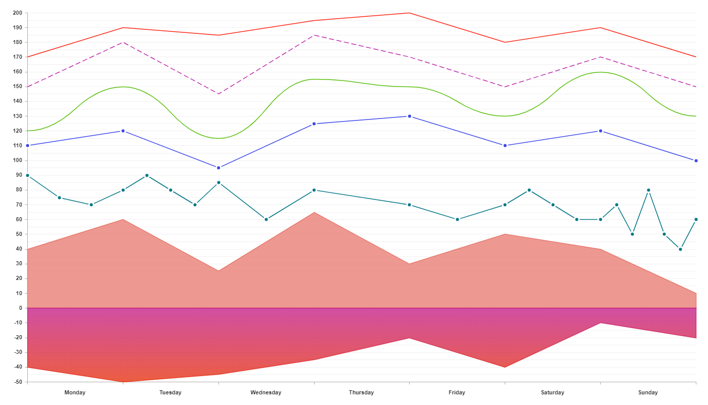
Example 1
Code
class LineChart({
    values?: [{
        color: string | string[]
        values: number[] | number[][]
        id?: string | number,
        name?: string
    }],
    dashLine?: number[],
    smooth?: boolean,
    dots?: boolean,
    fill?: boolean,
    correspondTo?: string,
    factor?: ChartFactor
});

const chart1 = new LineChart({
    values: [{
        color: '#FF2212',
        values: [170, 190, 185, 195, 200, 180, 190, 170]
    }]
});

const chart2 = new LineChart({
    dashLine: [10, 5],
    values: [{
        color: '#C229AD',
        values: [150, 180, 145, 185, 170, 150, 170, 150]
    }]
});

const chart3 = new LineChart({
    smooth: true,
    values: [{
        color: '#59BF0B',
        values: [120, 150, 115, 155, 150, 130, 160, 130]
    }]
});

const chart4 = new LineChart({
    dots: true,
    values: [{
        color: '#3D48EB',
        values: [110, 120, 95, 125, 130, 110, 120, 100]
    }]
});

const chart5 = new LineChart({
    dots: true,
    values: [{
        color: '#007785',
        values: [[90, 75, 70], [80, 90, 80, 70], [85, 60], 80, [70, 60],[70, 80, 70, 60],[60, 70, 50, 80, 50, 40], 60]
    }]
});

const chart6 = new LineChart({
    fill: true,
    values: [{
        color: '#E8786D',
        values: [40, 60, 25, 65, 30, 50, 40, 10]
    }]
});

const chart7 = new LineChart({
    fill: true,
    values: [{
        color: ['#C21585', '#E62802'],
        values: [-40, -50, -45, -35, -20, -40, -10, -20]
    }]
});
Output
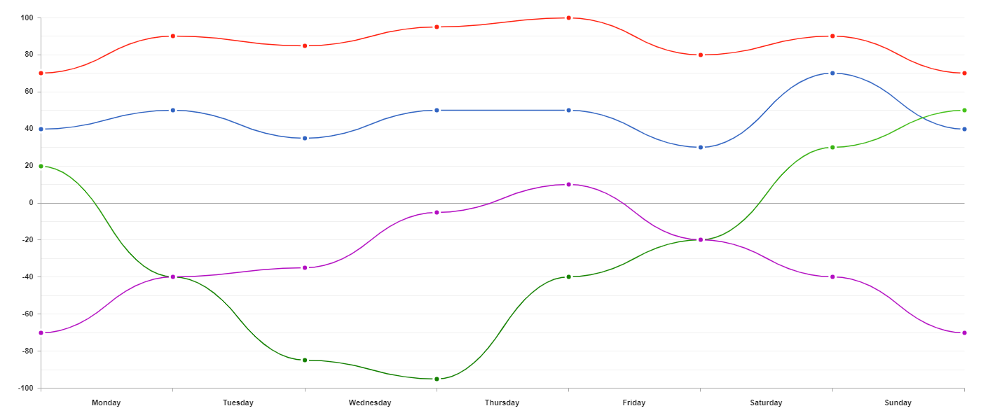
Example 2
You can also create many charts in one LineChart. They will share properties with each other.
Code
const chart = new LineChart({
  smooth: true,
  dots: true,
  values: [
    {
      color: '#FF2212',
      values: [70, 90, 85, 95, 100, 80, 90, 70]
    },
    {
      color: '#3164C2',
      values: [40, 50, 35, 50, 50, 30, 70, 40]
    },
    {
      color: ['#44C219', '#138000'],
      values: [20, -40, -85, -95, -40, -20, 30, 50]
    },
    {
      color: '#B30EC2',
      values: [-70, -40, -35, -5, 10, -20, -40, -70]
    }
  ]
})
Output
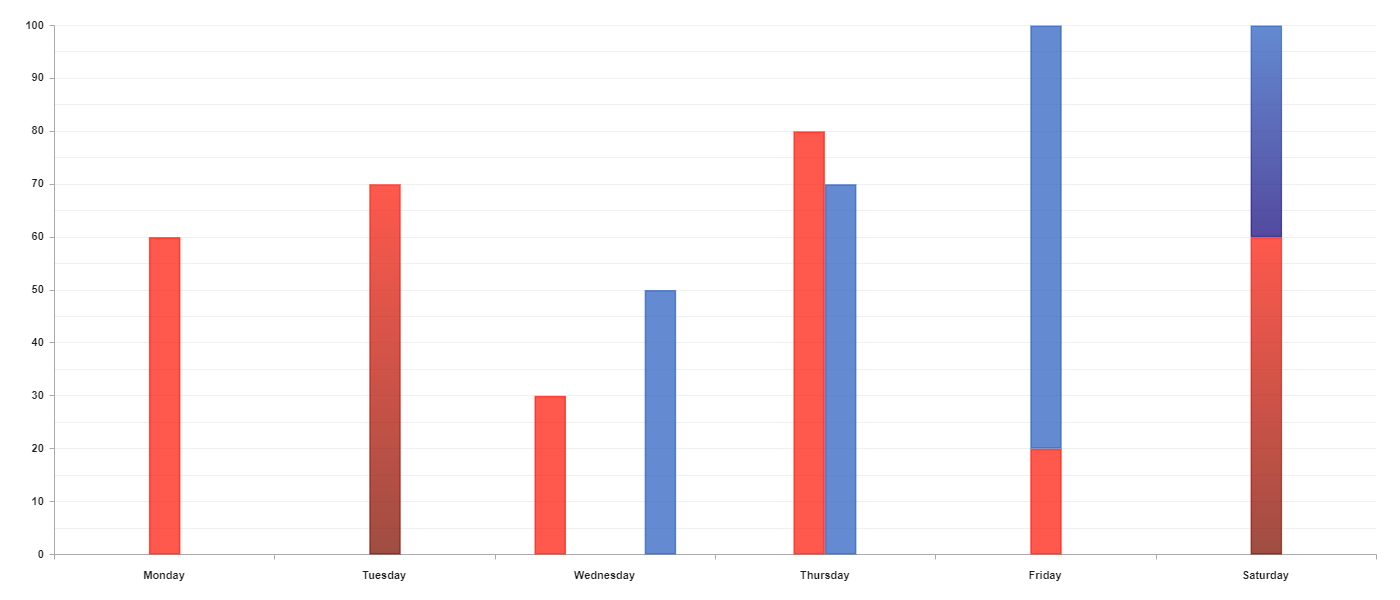
ColumnChart
- values - An array of objects where each object in the array represents a single column or group of columns.
Item object:
- type:
- 'singe' - Single column
- 'group' - Group of items placed next to each other
- 'stacked-group' - Group of items placed on top of each other.
- color - Color of the line. If you want to create gradient color you can simply pass an array of colors. If the type of this item is different than single you have to pass an array of colors where each color corresponds to the column at the same index
- values - It type of this item is single it should be a number otherwise it should be an array of numbers.
- margin - You can remove the margin between columns in this group by using margin: 'collapse'.
- direction - You can't use negative numbers one type of this item is stacked-group but you can make them negative using direction: 'reverse'.
- id - With this id, you will be able to manage this item.
- name - It is the title of your item. It will allow you automatically create labels for this chart.
- type:
- correspondTo - You can choose which label these chart values will be corresponding to.
- correspondToSecondary - You can choose which label this chart will be corresponding to.
- factor - more about factors
Code
class ColumnChart({
    values?: [{
        type: string,
        color: string | string[] | string[][],
        values: number | number[],
        margin?: string,
        direction?: string,
        id?: string | number,
        name?: string
    }],
    correspondTo?: string,
    correspondToSecondary?: string,
    factor?: ChartFactor
});

const chart = new ColumnChart({
    values: [{
        type: 'simple',
        color: '#FF2212',
        values: 60
    },{
        type: 'simple',
        color: ['#FF2212', '#801204'],
        values: 70
    },{
        type: 'group',
        color: ['#FF2212', '#3164C2'],
        values: [30, 50]
    },{
        type: 'group',
        color: ['#FF2212', '#3164C2'],
        values: [80, 70],
        margin: 'collapse'
    },{
        type: 'stacked-group',
        color: ['#FF2212', '#3164C2'],
        values: [20, 80],
    },{
        type: 'stacked-group',
        color: [['#FF2212', '#801204'], ['#3164C2', '#1B0E80']],
        values: [60, 40]
    }]
});
Output
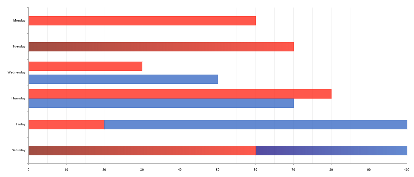
RowChart
- values - An array of objects where each object in the array represents a single column or group of columns.
Item object:
- type:
- 'singe' - Single column
- 'group' - Group of items placed next to each other
- 'stacked-group' - Group of items placed on top of each other.
- color - Color of the line. If you want to create gradient color you can simply pass an array of colors. If the type of this item is different than single you have to pass an array of colors where each color corresponds to the column at the same index
- values - It type of this item is single it should be a number otherwise it should be an array of numbers.
- margin - You can remove the margin between columns in this group by using margin: 'collapse'.
- direction - You can't use negative numbers one type of this item is stacked-group but you can make them negative using direction: 'reverse'.
- id - With this id, you will be able to manage this item.
- name - It is the title of your item. It will allow you automatically create labels for this chart.
- type:
- correspondTo - You can choose which label these chart values will be corresponding to.
- correspondToSecondary - You can choose which label this chart will be corresponding to.
- factor - more about factors
Code
class RowChart({
    values?: [{
        type: string,
        color: string | string[] | string[][],
        values: number | number[],
        margin?: string,
        direction?: string,
        id?: string | number,
        name?: string
    }],
    correspondTo?: string,
    correspondToSecondary?: string,
    factor?: ChartFactor
});


const chart = new RowChart({
    values: [{
        type: 'simple',
        color: '#FF2212',
        values: 60
    },{
        type: 'simple',
        color: ['#801204', '#FF2212'],
        values: 70
    },{
        type: 'group',
        color: ['#FF2212', '#3164C2'],
        values: [30, 50]
    },{
        type: 'group',
        color: ['#FF2212', '#3164C2'],
        values: [80, 70],
        margin: 'collapse'
    },{
        type: 'stacked-group',
        color: ['#FF2212', '#3164C2'],
        values: [20, 80],
    },{
        type: 'stacked-group',
        color: [['#801204', '#FF2212'], ['#1B0E80', '#3164C2']],
        values: [60, 40]
    }]
});
Output
BubbleChart
- values - An array of objects where each object represents a single bubble.
Item object:
- color - Color of the bubble. If you want to create gradient color you can simply pass an array of colors.
- values - An array of coordinates. The first item is the x coordinate and the second item is the y coordinate.
- radius - Radius of the bubble.
- id - With this id, you will be able to manage this item.
- name - It is the title of your item. It will allow you automatically create labels for this chart.
- factor - more about factors
Code
class BubbleChart({
values?: [{
color: string | string[],
values: number[],
radius: number,
id?: string | number,
name?: string
}],
factor?: ChartFactor
});
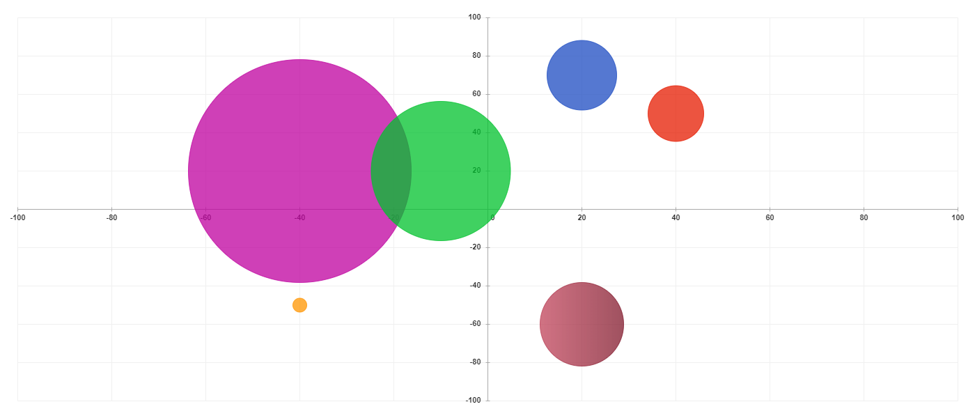
const chart = new BubbleChart({
values: [{
values: [40, 50],
color: '#E61B00',
radius: 40
},{
values: [-40, 20],
color: '#BF009F',
radius: 160
},{
values: [20, 70],
color: '#1D4CC2',
radius: 50
},{
values: [-10, 20],
color: '#00C22D',
radius: 100
},{
values: [-40, -50],
color: '#FF9500',
radius: 10
},{
values: [20, -60],
color: ['#C2445B', '#80182B'],
radius: 60
}]
});
Output
RangeChart
- values - An array of objects where each object in the array represents either a single point or line.
Item object:
- color - Color of the bubble. If you want to create gradient color you can simply pass an array of colors.
- values - It takes an array where each item can be either number or an array of numbers. If you pass the number you will create a point on the grid. If you pass an array of numbers you will create a range.
- under - If you set this value to the true line will be drawn below the grid.
- id - With this id, you will be able to manage this item.
- name - It is the title of your item. It will allow you automatically create labels for this chart.
- factor - more about factors
Code
class RangeChart({
    values?: [{
        color: string | string[],
        values: number | number[],
        under?: boolean,
        id?: number | string,
        name?: string
    }],
    factor?: ChartFactor
});

const values: [{
        values: [0, 100],
        color: '#E6372E'
    },{
        values: [50, [-40, 10]],
        color: '#1954C2'
    },{
        values: [[Infinity, 70]],
        color: ['#80182B', '#FF3056'],
        under: true
    },{
        values: [[Infinity, Infinity]],
        color: '#3CC247'
    }]
});
Output
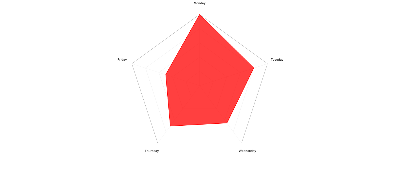
PolygonChart
- values - An array of objects where each object in the array represents a single polygon.
Item object:
- color - Color of the item. If you want to create gradient color you can simply pass an array of colors.
- values - It takes an array of numbers where each item in the array represents the value from 0 to 100.
- id - With this id, you will be able to manage this item.
- name - It is the title of your item. It will allow you automatically create labels for this chart.
- factor - more about factors
Code
class PolygonGrid({
    values?: [{
        color: string | string[],
        values: number[],
        id?: number | string,
        name?: string
    }],
    dots?: boolean,
    fill?: boolean,
    factor?: ChartFactor
});

const chart = new PolygonChart({
    values: [{
        color: '#f00',
        values: [100, 80, 65, 70, 50]
    }]
});
Output
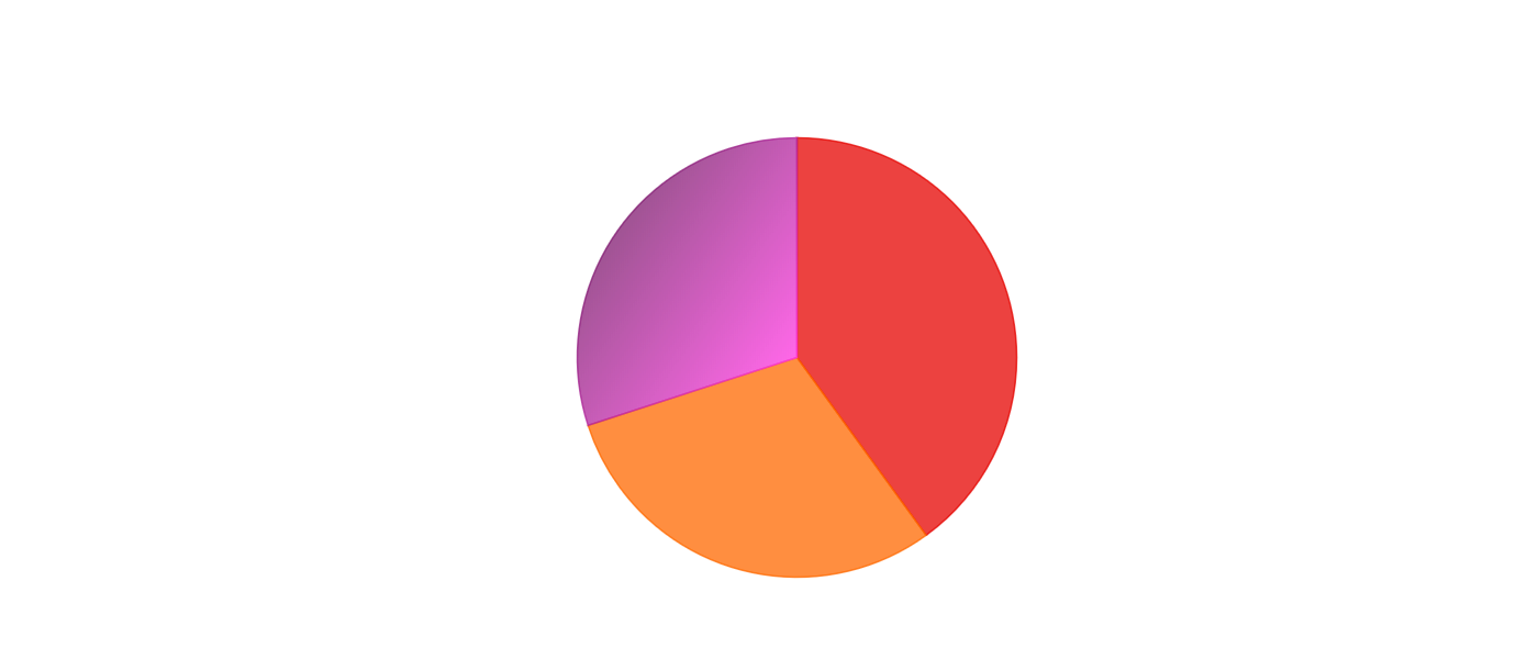
RoundChart
- values - An array of objects where each object in the array represents a piece of the circle.
Item object:
- color - Color of the item. If you want to create gradient color you can simply pass an array of colors.
- values - This value determines the size of the circle piece. It is given as a percentage.
- id - With this id, you will be able to manage this item.
- name - It is the title of your item. It will allow you automatically create labels for this chart.
- labels - Creates labels around the chart.
- centerValue - Adds some string to the center of the chart.
- changingSize - Each next item will be a little bit smaller.
- blankCenter - Creates empty space in the center of the chart.
- itemsMargin - Creates some spacing between items.
- canvas - HTML canvas element.
- changingStepSize - Specifies how an item will be changing its size.
- centerRadius - Specifies the size of the blank center. It is given as a number from 0 to 1.
- factors - more about factors
Example 1
Code
class RoundChart({
    values?: [{
        color: string | string[],
        values: number,
        id?: number | string,
        name?: string
    }],
    labels?: StringLabel,
    centerValue?: string,
    changingSize?: boolean,
    blankCenter?: boolean,
    itemsMargin?: number,
    canvas?: HTMLCanvasElement,
    changingStepSize?: number,
    centerRadius?: number,
    factors?: ChartFactor
});

const chart = new RoundChart({
    values: [{
        color: '#E60400',
        values: 40
    },{
        color: '#FF6A00',
        values: 30
    },{
        color: ['#801B70', '#FF36E1'],
        values: 30
    }]
});
Output
Example 2
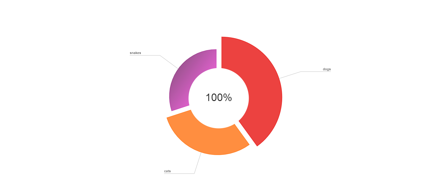
Code
const chart = new RoundChart({
  blankCenter: true,
  centerValue: '100%',
  changingSize: true,
  itemsMargin: 10,
  labels: new StringLabel(['dogs', 'cats', 'snakes']),
  values: [
    {
      color: '#E60400',
      values: 40
    },
    {
      color: '#FF6A00',
      values: 30
    },
    {
      color: ['#801B70', '#FF36E1'],
      values: 30
    }
  ]
})
Output
SameDirectionRoundChart
- values - An array of objects where each object in the array represents a single item.
Item object:
- color - Color of the item. If you want to create gradient color you can simply pass an array of colors.
- values - This value determines the size of the circle piece. It is given as a percentage.
- id - With this id, you will be able to manage this item.
- name - It is the title of your item. It will allow you automatically create labels for this chart.
- labels - Creates label on top of each item.
- centerValue - Adds some string to the center of the chart.
- canvas - HTML canvas element.
- itemMargin - Add some margin between the items.
- factor - more about factors
Example 1
Code
class SameDirectionRoundChart({
    values?: {
        color: string | string[],
        values: number,
        id?: number | string,
        name?: string,
    },
    labels?: StringLabel,
    centerValue?: string,
    canvas?: HTMLCanvasElement,
    itemMargin?: number,
    factor?: ChartFactor
});

const chart = new SameDirectionRoundChart({
    values: [{
        color: '#E61700',
        values: 40
    },{
        color: '#2155BF',
        values: 60
    },{
        color: ['#1D8012', '#2DC21C'],
        values: 70
    },{
        color: '#C23167',
        values: 90
    }]
});
Output

Example 2
Code
const chart = new SameDirectionRoundChart({
  labels: new StringLabel(['cats', 'dogs', 'snakes', 'birds']),
  centerValue: '76.3%',
  values: [
    {
      color: '#E61700',
      values: 40
    },
    {
      color: '#2155BF',
      values: 60
    },
    {
      color: ['#1D8012', '#2DC21C'],
      values: 70
    },
    {
      color: '#C23167',
      values: 90
    }
  ]
})
Output

Factors
You can use factors to define your grids or chart styles. You can create a new factor and apply it to the grid or chart. Or you can modify the default one that will affect all of them.
GridFactor
If you want to use it all you have to do is to create a new instance of it and pass it to the grid object.
- colors:
- primary - It's the color of grid main borders, like separators between labels and charts or position of the grid at 0 value.
- secondary - It's the color of the rest of the borders.
- font:
- size - Changes size of the font.
- family - Changes font family of the font.
- color - Changes the color of the font.
- background:
- color - Changes the background color of the canvas.
- image - Add an image as a background. It's a path to your image.
- opacity -
- labelPadding - Defines the size of margins between labels and grid.
Code
class GridFactor({
    colors?: {
        primary?: string;
        secondary?: string;
    },
    font?: {
        size?: number;
        family?: string;
        color?: string;
    },
    background?: {
        color?: string;
        image?: string;
        opacity?: number;
    },
    labelPadding?: number;
});
ChartFactor
If you want to use it all you have to do is to create a new instance of it and pass it to the grid object.
- lineWidth - Defines the width of all chart lines.
- opacity - Allows you to control the transparency of your chart.
- itemSize - Defines the size of items like column width etc...
- dotBorder - Creates space between dots and lines.
- dotRadius - Defines radius of all dots on the charts.
Code
class ChartFactor({
    lineWidth?: number,
    opacity?: number,
    itemSize?: number,
    dotBorder?: boolean,
    dotRadius?: number
});
Default factors
By modifying this object you can affect styles for all your grids or charts.
DEFAULT_GRID_FACTOR - Default factor for the grids. It's the GridFactor instance. DEFAULT_CHART_FACTOR - Default factor for the charts. It's the ChartFactor instance.
More
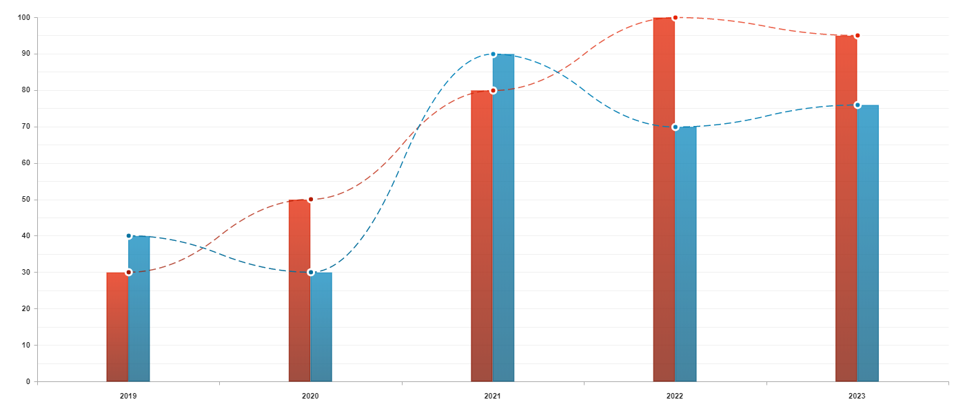
Combined chart example
Code
const grid = new HorizontalGrid(canvas, {
  left: new FlexLabel(100, 0, 10),
  bottom: new StringLabel(['2019', '2020', '2021', '2022', '2023'])
})

grid.addCharts({
  columns: new ColumnChart({
    values: [
      {
        type: 'group',
        color: [
          ['#E62200', '#801300'],
          ['#0B89BF', '#085C80']
        ],
        values: [30, 40],
        margin: 'collapse'
      },
      {
        type: 'group',
        color: [
          ['#E62200', '#801300'],
          ['#0B89BF', '#085C80']
        ],
        values: [50, 30],
        margin: 'collapse'
      },
      {
        type: 'group',
        color: [
          ['#E62200', '#801300'],
          ['#0B89BF', '#085C80']
        ],
        values: [80, 90],
        margin: 'collapse'
      },
      {
        type: 'group',
        color: [
          ['#E62200', '#801300'],
          ['#0B89BF', '#085C80']
        ],
        values: [100, 70],
        margin: 'collapse'
      },
      {
        type: 'group',
        color: [
          ['#E62200', '#801300'],
          ['#0B89BF', '#085C80']
        ],
        values: [95, 76],
        margin: 'collapse'
      }
    ]
  }),
  lines: new LineChart({
    dots: true,
    smooth: true,
    moveToCenter: true,
    dashLine: [10, 5],
    values: [
      {
        color: ['#E62200', '#801300'],
        values: [30, 50, 80, 100, 95]
      },
      {
        color: ['#0B89BF', '#085C80'],
        values: [40, 30, 90, 70, 76]
      }
    ]
  })
})

grid.draw()
Output