README
10up Block Components
A collection of components built to be used in the block editor.
Overview
A collection of components built to be used in the block editor. These components do not include any build files and do not bundle the WordPress components. Therefore these need to be used in an environment where the Dependency Extraction Webpack Plugin is used and the import { component } from '@wordpress/package'; is supported. If your project is using 10up Scripts, this is handled automatically.
Installation
- Run
npm install --save @10up/block-componentswithin your WordPress theme or plugin. - Within your block editor code, import the relevant component(s) e.g.
import { ContentPicker } from '@10up/block-components'; - We highly recommend you use @10up/scripts to build your block files as it handles dependency extraction for you.
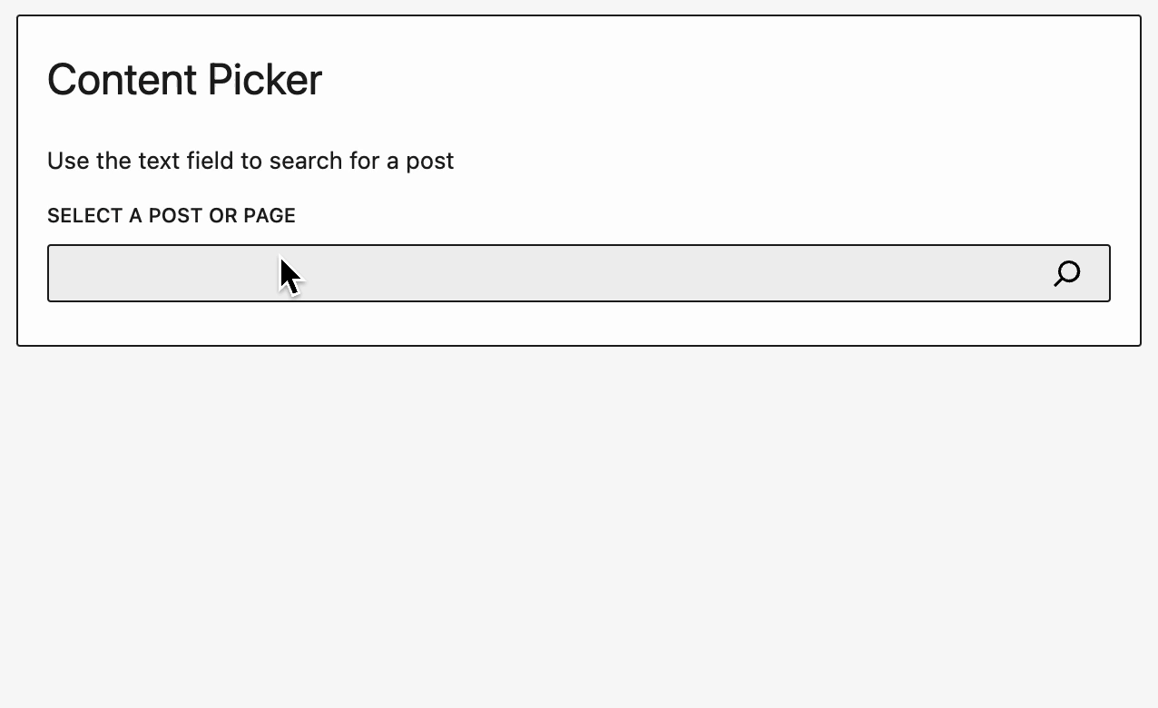
ContentPicker
A Content Picker component that allows you to pick posts and pages very easily.
Usage
import { ContentPicker } from '@10up/block-components';

function MyComponent( props ) {

    return (
        <ContentPicker
            onPickChange={ (pickedContent) => { console.log(pickedContent) } }
            mode="post"
            label={ "Please select a Post or Page:" }
            contentTypes={ [ 'post', 'page' ] }
        />
    )
}
Props
| Name | Type | Default | Description |
|---|---|---|---|
onPickChange |
function |
undefined |
Callback function the list of picked content gets changed |
label |
string |
'' |
Renders a label for the Search Field. |
mode |
string |
'post' |
Either post or term |
placeholder |
string |
'' |
Renders placeholder text inside the Search Field. |
contentTypes |
array |
[ 'post', 'page' ] |
Names of the post types or taxonomies that should get searched |
maxContentItems |
number |
1 |
Max number of items a user can select. |
isOrderable |
bool |
false |
When true, will allow the user to order items. Must be used in conjunction with maxContentItems > 1 |
uniqueContentItems |
bool |
true |
Prevent duplicate items from being picked. |
excludeCurrentPost |
bool |
true |
Don't allow user to pick the current post. Only applicable on the editor screen. |
content |
array |
[] |
Array of items to prepopulate picker with. Must be in the format of: [{id: 1, type: 'post', uuid: '...',}, {id: 1, uuid: '...', type: 'page'},... ]. You cannot provide terms and posts to the same picker. uuid was added as of version 1.5.0. It is only used as the React component list key in the admin. If it is not included, id will be used which will cause errors if you select the same post twice. |
perPage |
number |
50 |
Number of items to show during search |
NOTE: Content picker cannot validate that posts you pass it via content prop actually exist. If a post does not exist, it will not render as one of the picked items but will still be passed back as picked items if new items are picked/sorted. Therefore, on save you need to validate that all the picked posts/terms actually exist. |
The contentTypes will get used in a Rest Request to the search endpoint as the subtypes:
apiFetch( {
    path: `wp/v2/search/?search="${keyword}"&subtype="${contentTypes.join(',')}"&type=${mode}`
} )...
ContentSearch
A component that lets you search through posts and pages. This component is used by Content Picker. This component provides only the searching functionality and does not maintain any list of chosen items.
Usage
import { ContentSearch } from '@10up/block-components';

function MyComponent( props ) {

    return (
        <ContentSearch
            onSelectItem={ (item) => { console.log(item) } }
            mode="post"
            label={ "Please select a Post or Page:" }
            contentTypes={ [ 'post', 'page' ] }
        />
    )
}
Props
| Name | Type | Default | Description |
|---|---|---|---|
onSelectItem |
function |
undefined |
Function called when a searched item is clicke |
label |
string |
'' |
Renders a label for the Search Field. |
mode |
string |
'post' |
Either post or term |
placeholder |
string |
'' |
Renders placeholder text inside the Search Field. |
contentTypes |
array |
[ 'post', 'page' ] |
Names of the post types or taxonomies that should get searched |
excludeItems |
array |
[ { id: 1, type: 'post' ] |
Items to exclude from search |
perPage |
number |
50 |
Number of items to show during search |
useHasSelectedInnerBlock
Determine whether one of the inner blocks currently is selected.
Usage
import { useHasSelectedInnerBlock } from '@10up/block-components';

function BlockEdit( props ) {
    const hasSelectedInnerBlock = useHasSelectedInnerBlock(props);

    return (
        <div>
            { hasSelectedInnerBlock ? 'InnerBlocks are selected' : 'InnerBlocks are not selected' }
        </div>
    )
}
useRequestData
Custom hook to to make a request using getEntityRecords or getEntityRecord that provides data, isLoading and invalidator function. The hook determines which selector to use based on the query parameter. If a number is passed, it will use getEntityRecord to retrieve a single item. If an object is passed, it will use that as the query for getEntityRecords to retrieve multiple pieces of data.
The invalidator function, when dispatched, will tell the datastore to invalidate the resolver associated with the request made by getEntityRecords. This will trigger the request to be re-run as if it was being requested for the first time. This is not always needed but is very useful for components that need to update the data after an event. For example, displaying a list of uploaded media after a new item has been uploaded.
Parameters:
{string}entity The entity to retrieve. ie. postType{string}kind The entity kind to retrieve. ie. posts{Object|Number}Optional. Query to pass to the geEntityRecords request. Defaults to an empty object. If a number is passed, it is used as the ID of the entity to retrieve via getEntityRecord.
Returns:
{Array}{Array}Array containing the requested entity kind.{Boolean}Representing if the request is resolving{Function}This function will invalidate the resolver and re-run the query.
Usage
Multiple pieces of data.
const ExampleBockEdit = ({ className }) => {
    const [data, isLoading, invalidateRequest ] = useRequestData('postType', 'post', { per_page: 5 });

    if (isLoading) {
        return <h3>Loading...</h3>;
    }
    return (
        <div className={className}>
            <ul>
                {data &&
                    data.map(({ title: { rendered: postTitle } }) => {
                        return <li>{postTitle}</li>;
                    })}
            </ul>
            <button type="button" onClick={invalidateRequest}>
                Refresh list
            </button>
        </div>
    );
};
Single piece of data
const ExampleBockEdit = ({ className }) => {
    const [data, isLoading, invalidateRequest ] = useRequestData('postType', 'post', 59);

    if (isLoading) {
        return <h3>Loading...</h3>;
    }
    return (
        <div className={className}>

                {data &&( <div>{data.title.rendered}</div>)}

            <button type="button" onClick={invalidateRequest}>
                Refresh list
            </button>
        </div>
    );
};
IsAdmin
A wrapper component that only renders child components if the current user has admin capabilities. The use case for this component is when you have a certain setting that should be restricted to administrators only. For example when you have a block that requires an API token or credentials you might only want Administrators to edit these. See 10up/maps-block-apple for a real world example.
Usage
import { IsAdmin } from '@10up/block-components';

function MyComponent( props ) {

    return (
        <IsAdmin
            fallback={ <p>Sorry, you are not allowed to do that</p> }
        >
            <p>Only Administrators can see what you put in here</p>
        </IsAdmin>
    )
}
Props
| Name | Type | Default | Description |
|---|---|---|---|
fallback |
ReactElement |
null |
Element that will be rendered if the user is no admin |
children |
ReactElement(s) |
'null' |
Child components that will be rendered if the user is an Admin |
CustomBlockInserter
This component is passed to an InnerBlocks instance to as it's renderAppender to provide a customized button that opens the Block Inserter.
Usage
import { CustomBlockAppender } from '@10up/block-components';
const MyComponent = ({clientId}) => {
    <InnerBlocks
        renderAppender={() => (
            <CustomBlockAppender
                className="custom-classname"
                rootClientId={clientId}
                icon="heavy-plus"
                isTertiary
                showTooltip
                label={__('Insert Accordion content', '10up-block-library')}
            />
        )}
    />
}
Props
| Name | Type | Default | Description |
|---|---|---|---|
rootClientId |
string |
'' |
Client it of the block |
buttonText |
string |
'' |
Text to display in the button |
icon |
string |
'plus' |
Icon to display. |
..buttonProps |
object |
null' |
Any other props passed are spread onto the internal Button component. |
InnerBlockSlider
This component creates a horizontal slider with inner blocks inside of it.
Usage
import { InnerBlockSlider } from '@10up/block-components';
const MyComponent = ({clientId}) => {
    <InnerBlockSlider
        allowedBlock="core/cover"
        slidesPerPage={1}
        parentBlockId={clientId}
    />
}
Props
| Name | Type | Default | Description |
|---|---|---|---|
allowedBlock |
string |
'' |
Block type to be allowed inside ofthe slider |
slidesPerPage |
integer |
1 |
Number of slides to show per page |
parentBlockId |
string |
'' |
Client ID of parent block. This is required. |
registerBlockExtention
The registerBlockExtention API is a wrapper to make it easier to add custom settings which produce classnames to any blocks. There are a few problems with using block styles for customisations. For one an editor cannot combine block styles. So you very quickly land in a sittuation where you need to add many block styles just to give an editor the ability to choose exactly the combination of options they want. That leads to a bad user experience though as the previews take up a ton of space and also make the editor slower due to the overhead of the iframes it creates. So in many cases it is nicer to extend a bock with custom settings to achive the same goal. The process of registering your own attributes, modifying the blocks edit function, adding the new classname to the editor listing and also adding it to the frontend is rather cumbersome though. That is where this API comes in. It is a wrapper for the underlying filters that improves the editorial experience and reduces the amount of code that needs to get maintained in order to extend blocks.
Usage
import { registerBlockExtention } from '@10up/block-components';

/**
 * BlockEdit
 *
 * a react component that will get mounted in the Editor when the block is
 * selected. It is reccomended to use Slots like `BlockControls` or `InspectorControls`
 * in here to put settings into the blocks toolbar or sidebar.
 *
 * @param {object} props block props
 * @returns {JSX}
 */
function BlockEdit(props) {...}

/**
 * generateClassNames
 *
 * a function to generate the new className string that should get added to
 * the wrapping element of the block.
 *
 * @param {object} attributes block attributes
 * @returns {string}
 */
function generateClassNames(attributes) {...}

registerBlockExtention(
    'core/group',
    {
        extentionName: 'background-patterns',
        attributes: {
            hasBackgroundPattern: {
                type: 'boolean',
                default: false,
            },
            backgroundPatternShape: {
                type: 'string',
                default: 'dots',
            },
            backgroundPatternColor: {
                type: 'string',
                default: 'green'
            }
        },
        classNameGenerator: generateClassNames,
        Edit: BlockEdit,
    }
);
Options
| Name | Type | Description |
|---|---|---|
| blockName | string |
Name of the block the options should get added to |
| options.extentionName | string |
Unique Identifier of the option added |
| options.attributes | object |
Block Attributes that should get added to the block |
| options.classNameGenerator | funciton |
Funciton that gets passed the attributes of the block to generate a class name string |
| options.Edit | funciton |
BlockEdit component like in registerBlockType only without the actual block. So onyl using slots like the InspectorControls is advised. |
| ## Support Level |
Active: 10up is actively working on this, and we expect to continue work for the foreseeable future including keeping tested up to the most recent version of WordPress. Bug reports, feature requests, questions, and pull requests are welcome.
Contributing
Please read CODE_OF_CONDUCT.md for details on our code of conduct and CONTRIBUTING.md for details on the process for submitting pull requests to us.
Like what you see?