README
react-native-picklist

This is a picklist page. It supports:
- Single Level or Multiple Level data.
- Single Select or Multiple Select.
- Show or Hide the internal components.
- Customize the UI component.
- Search in the data automaticlly.
- Section style page.
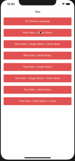
ScreenShots
Same UI on Android.
Install
Install by Yarn:
yarn add @abdulmatinsanni/react-native-picklist
Install by NPM:
npm install --save @abdulmatinsanni/react-native-picklist
Usage
Import the module in the file:
import PickList from "react-native-picklist";

export default class TopPage extends React.PureComponent {
  static navigationOptions = PickList.navigationOptions;

  render() {
    return (
      <PickList
      // ...
      />
    );
  }
}
If you want to use button in navigationOptions, you should set following items:
import { HeaderButton } from "react-navigation-header-buttons";

HeaderButton.defaultProps.getButtonElement = props => {
  const { title } = props;
  return <Text>{title}</Text>;
};
You can set the following properties or see example project to learn how to use it.
Properties
Required:
title: Page title.data: Data to show. We will construct a virtual root node to contain it.navigation: Navigator's props.
Optional:
firstTitleLine: First item displayed inTitleLinewhen it has the multi-level data and show the title line.isCascade: When multi-level and multi-select are true, auto-cascading selects child nodes or not. Default istrue.multilevel: Has multi-level data or not. Default isfalse.multiselect: Is multi-select or not. Default isfalse.onFinish: Pass the selected items when finish selecting.rightTitle: Button title on the right corner.rightClick: Button click callback on the right corner.renderRow: Customize a row display. You can override this property to make the list readonly. Default implement is inDefaultRow.js.renderHeader: Customize header of page.renderSingleSelectIcon: Customize single-selected icon.renderMultiSelectIcon: Customize multi-selected icon.showBottomView: Show bottom bar or not.showSearchView: Show search bar or not.showTitleLine: Show title line at the header or not.showAllCell: Show select all or deselect all cell or not.showCount: Show not leaf item's children count and selected count.numberOfTextLines: Max number of lines ofTextcomponent in one row. Default is0, means no restrict of lines. You can set to1for single line text mode.directBackWhenSingle: Directly go back to previous page or not when single-select data.cancelableWhenDirectBack: Selected item is cancelable or not when single-select data anddirectBackWhenSingleistrue.selectedIds: Initial selected item's identifier list.selectable: Can a tree node selectable or not.childrenKey: Children key of tree node.idKey: Identifier key of tree node, supports array of string or one string only.labelKey: Label key of tree node.searchKeys: Normal search keys of tree node.sort: Sort method for data list.split: Split method when generate sections of data list.flatListProps: Props ofFlatListwhen data is flat.sectionListProps: Props ofSectionListwhen data is splitted to sections.searchListProps: Props ofFlatListwhen searching.buttonProps: Props ofHeaderButtonin navigation bar.labels: Label text in component.
You can change labels globally by following statement:
PickList.defaultProps.labels.xxx = "xxx";
You can call function with PickList view reference:
<PickList
    ref={this.picklist = ref}
    ...
/>

this.picklist.xxx();
Following functions supported:
getSelectedItems: () => Tree[]: Get current selected items. You can handle these with Tree API.backToPreviousPage: () => boolean: Auto go back to previous page. If it is the first page, it returns false. Otherwise it returns true.
Example Project
You can open the example project by following steps:
- Enter
example. Useyarnornpm installto install the modules. Runnpm startin a seperate terminal. - Create a example project with entry file
indexand module nametest.