README
Contact Picker Smart Widget UI (Angular)
This is the Angular 6+ UI for a Smart Widget implementing a picker field to choose a person from a list of contacts. It is matched by a corresponding back-end service which is needed when running it in remote mode. A default implementation for selecting people from CRS Medewerker is provided.
There is a demo app, see below for instructions on running it.
How to use
Installing
> npm install @acpaas-ui-widgets/ngx-contact-picker
Local mode
In this mode, the data backing the picker is passed from the surrounding application code instead of fetched from a remote back-end.
Import the component in your module:
@NgModule({
  imports: [
    ...,
    ContactPickerModule
  ],
  ...
})
In the index.html, include the core branding stylesheet:
<link rel="stylesheet" href="https://cdn.antwerpen.be/core_branding_scss/4.1.1/main.min.css">
For projects that are still using Angular 5, we are maintaining a v1 branch, which will still receive bug fixes if needed.
> npm install @acpaas-ui-widgets/ngx-contact-picker@"<2.0.0"
In your template:
<label for="picker-1">Pick a person</label>
<aui-contact-picker
    data-id="picker-1"
    [data]="listOfPeople"
    [(value)]="person">
</aui-contact-picker>
In the component code:
class YourComponent {
// you can assign an initial value here
person: ContactPickerValue;
listOfPeople: ContactPickerValue[] = [
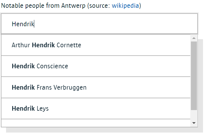
{ id: '0', name: 'Abraham Ortelius', ... },
...
];
...
}
Every value in the backing list must have a unique id. If names can be the same it is recommended to use a differentiator as described below.
Supported attributes
id: Unique ID for the contact picker to guarantee WCAG 2.1 AA compliancy
data: An array of value objects to use as the backing store
value: The current value of the picker, represented as a value object
placeholder: specify the text to show in an empty field
noDataMessage: the text shown in the list when there are no matching results
differentiator: a field from the backing value object to be displayed as a tag on the right side of the list items, to help the user discern the difference between multiple matches with the same name.
<aui-contact-picker differentiator="userName" ...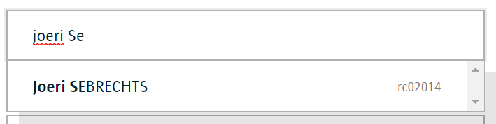
Events
- valueChange: triggers when the current value is changed (or cleared)
Remote mode
In this mode, the picker is backed by a remote service queried for results matching what the user types.
<label for="picker-2">Pick a person</label>
<aui-contact-picker
    data-id="picker-2"
    [(value)]="person"
    url="/api/people">
</aui-contact-picker>
Additional attributes
- url: the URL of the back-end service feeding this widget
- bufferInputMs: how long to buffer keystrokes before fetching remote results
The backing service implements the following protocol:
- GET /path/to/endpoint?search=...
- search = the text that the user typed on which to match
- result = JSON-encoded array of ContactPickerValue objects
Run the demo app
> npm install
> npm start
Browse to localhost:4200
To use the remote page, you will need to have also started the corresponding back-end service.
Contributing
We welcome your bug reports and pull requests.
Please see our contribution guide.
Support
Joeri Sebrechts (joeri.sebrechts@digipolis.be)
License
This project is published under the MIT license.