README
VuePress-Plugin-Custom-Tooltip
A reusable tooltip component for Vue.js projects. This plugin is a VuePress wrapper for @adamdehaven/vue-custom-tooltip.
Installation
# With npm
npm install @adamdehaven/vuepress-plugin-custom-tooltip

# or Yarn
yarn add @adamdehaven/vuepress-plugin-custom-tooltip
You can use the plugin by installing it in your .vuepress/config.js file, as shown here:
// .vuepress/config.js
module.exports = {
  // Install the plugin using ONE of the options below:
  // --------------------------------------------------

  // 1. Install with default options
  plugins: ['@adamdehaven/vuepress-plugin-custom-tooltip'],

  // ===== OR  =====

  // 2. Install with custom options (defaults shown)
  plugins: [
    [
      '@adamdehaven/vuepress-plugin-custom-tooltip',
      {
        name: 'VueCustomTooltip',
        color: '#fff',
        background: '#000',
        borderRadius: 100,
        fontWeight: 400,
      },
    ],
  ],
}
Alternatively, if you are using a theme, you may install in your .vuepress/theme/index.js file:
// .vuepress/theme/index.js
module.exports = (options, ctx) => {
  return {
    // Install the plugin using ONE of the options below:
    // --------------------------------------------------

    // 1. Install with default options
    plugins: ['@adamdehaven/vuepress-plugin-custom-tooltip'],

    // ===== OR  =====

    // 2. Install with custom options (defaults shown)
    plugins: [
      [
        '@adamdehaven/vuepress-plugin-custom-tooltip',
        {
          name: 'VueCustomTooltip',
          color: '#fff',
          background: '#000',
          borderRadius: 100,
          fontWeight: 400,
        },
      ],
    ],
  }
}
Usage
<!-- Basic -->
What is <VueCustomTooltip label="This is a tooltip">a tooltip</VueCustomTooltip>?
<!-- With Props -->
What is
<VueCustomTooltip label="This is a tooltip" position="is-bottom" abbreviation sticky>a tooltip</VueCustomTooltip>?
<!-- With element(s) -->
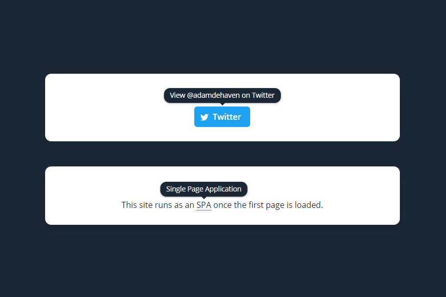
<VueCustomTooltip label="View @adamdehaven on Twitter">
<a class="button" href="https://twitter.com/adamdehaven">
<span class="icon icon-twitter"></span>
<span>Twitter</span>
</a>
</VueCustomTooltip>
Options
Pass any of the options listed below to Vue.use(VueCustomTooltip, {...}) to customize the plugin for your project (not available with in-component installation).
A note on options tied to CSS properties
The
color,background,borderRadius, andfontWeightattributes listed below are set on the psuedo element using CSS Variables (Custom Properties), meaning they will fallback to their default values in unsupported browsers (e.g. Internet Explorer).
name
- Type:
String - Default:
VueCustomTooltip
Customize the name of the component you will use in your project. Camel-case names are preferred, as this allows for camel-case or kebob-case usage within your project.
Vue.use(VueCustomTooltip, {
  name: 'SuperCoolTooltip', // camel-case preferred
})
If you registered the name using camel-case, you can reference the tooltip component via camel-case or kebob-case:
<!-- Default name (user did not pass the 'name' option) -->

<!-- camel-case -->
Nice <VueCustomTooltip label="Neat!">tooltip</VueCustomTooltip>!
<!-- kebob-case -->
Nice <vue-custom-tooltip label="Neat!">tooltip</vue-custom-tooltip>!

<!-- Custom name (allows user to rename component) -->

<!-- camel-case -->
Nice <SuperCoolTooltip label="Neat!">tooltip</SuperCoolTooltip>!
<!-- kebob-case -->
Nice <super-cool-tooltip label="Neat!">tooltip</super-cool-tooltip>!
color
- Type:
HEX Color - Default:
#fff
Customize the color of the text displayed in the tooltip.
Vue.use(VueCustomTooltip, {
  color: '#c1403d', // 3 or 6 digit HEX color, including a leading hash (#)
})
background
- Type:
HEX Color - Default:
#000
Customize the background color (and the underlined text color) of the tooltip.
Vue.use(VueCustomTooltip, {
  background: '#1b2735', // 3 or 6 digit HEX color, including a leading hash (#)
})
borderRadius
- Type:
Number - Default:
100
Customize the border-radius of the tooltip. Must be an integer.
Vue.use(VueCustomTooltip, {
  borderRadius: 4,
})
fontWeight
- Type:
Number - Default:
400
Customize the font-weight of the tooltip text. Must be an integer that is a multiple of 100, between 100 - 900.
Vue.use(VueCustomTooltip, {
  fontWeight: 700,
})
Props
In addition to the Plugin Options above, you may also pass props to the component itself to customize both the look and behavior of the tooltip element.
Props that accept a Boolean value may be passed simply by adding the attribute to the component tag, if a true value is desired. See the sticky example here:
<VueCustomTooltip label="Tooltip" sticky>text/element</VueCustomTooltip>
All other props may be passed as normal attributes (if the corresponding value is a String, like the label prop, shown above) or with v-bind directives, as shown here:
<VueCustomTooltip :label="element.helpText" :sticky="false">text/element</VueCustomTooltip>
All available props for the tooltip component are listed below:
label
- Type:
String - Default:
null
The text that will display inside the tooltip. If the value for label is null, the tooltip will not be displayed.
You may not pass HTML to the label prop.
active
- Type:
Boolean - Default:
true
Determines whether the tooltip should display when hovered, or if the sticky prop is present, if the tooltip should be visible.
position
- Type:
String - Value:
is-top / is-bottom / is-left / is-right - Default:
is-top
The position of the tooltip in relation to the text/element it is surrounding.
abbreviation
- Type:
Boolean - Default:
false
Swaps out the component's standard <span> element with a semantically-correct <abbr> element, and sets the underlined prop to true. This is useful when adding a tooltip to text within a page's content where you want to provide additional context to a word or phrase, or provide a definition of a word or acronym.
VuePress pages are served as an <VueCustomTooltip label="Single Page Application" abbreviation>SPA</VueCustomTooltip>.
sticky
- Type:
Boolean - Default:
false
Determines if the tooltip should always be displayed (including on component load/mounting), regardless of the element being hovered.
underlined
- Type:
Boolean - Default:
false
Add a dotted border under the contained text (the same color as the background HEX value). This value is automatically set to true if the abbreviation prop is set to true.
multiline
- Type:
Boolean - Default:
false
Allows the tooltip text to wrap to multiple lines as needed. Can be used in conjunction with the size prop to adjust the width of the tooltip.
size
- Type:
String - Value:
is-small / is-medium / is-large - Default:
is-medium
The width of the tooltip, if the multiline prop is set to true.
Adding Custom Classes & Styles
Just like any other Vue component, you can add classes or styles directly to the component tag that will be applied to the rendered <span> tag (or <abbr> tag, if abbreviation is set to true).
<!-- Tooltip component with custom classes and styles -->
<VueCustomTooltip class="your-class" :class="{ 'dynamic-class': isDynamic }" :style="{ display: 'inline' }" label="Neat"
  >text</VueCustomTooltip
>
This is extremely helpful if you want to extend functionality or tooltip styles within your project, which allows you to tweak things like the display behavior of the tooltip element.
The tooltip component is rendered as a display: inline-block element by default; however, you can override this by binding styles directly to the component, as shown above.