README
@adrianjost/two-channel-picker


A simple two channel Color Picker
About
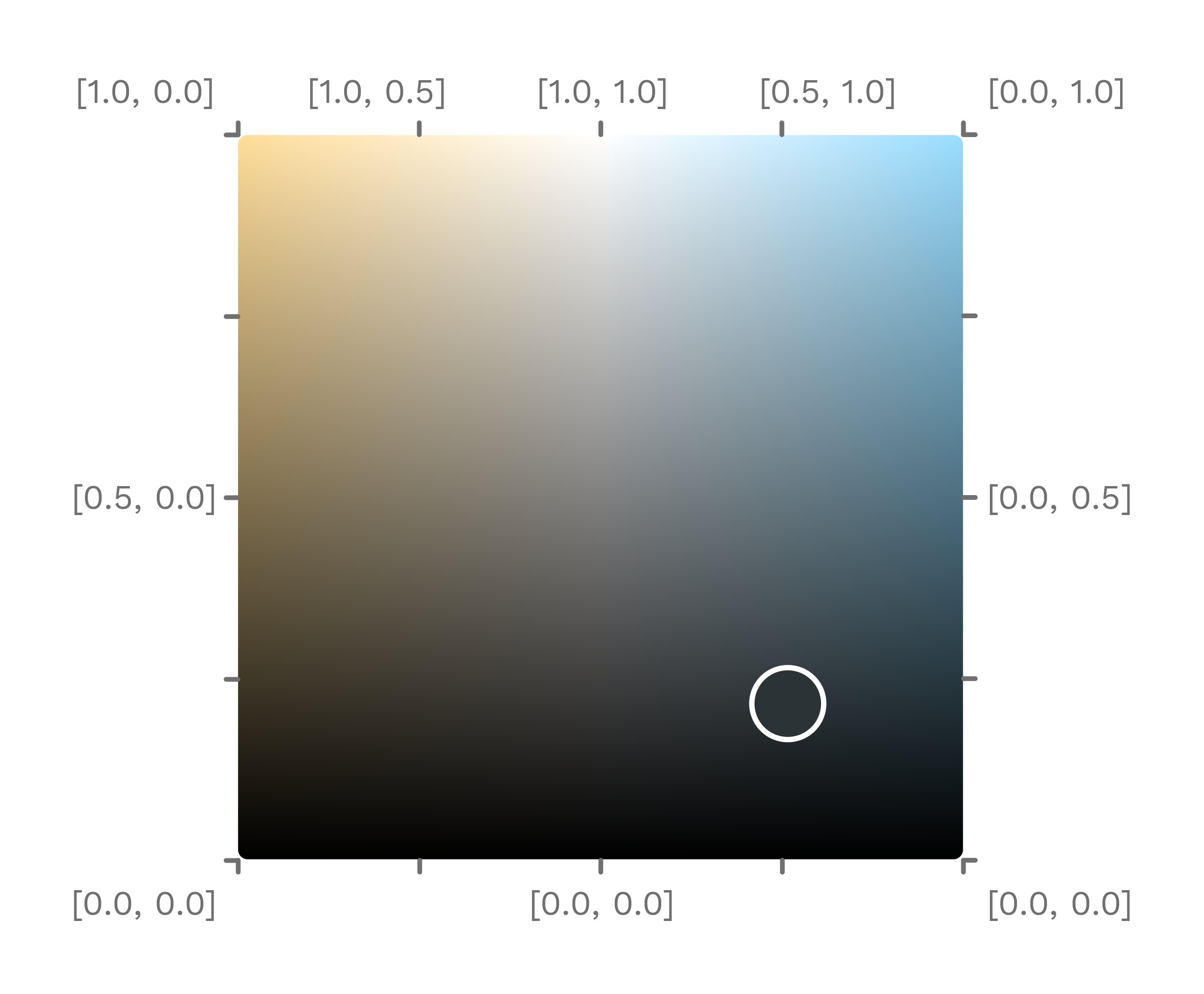
I needed an intuitive color picker to control my warm-white-cold-white (WWCW) LED Strips with the SmartLight Project.
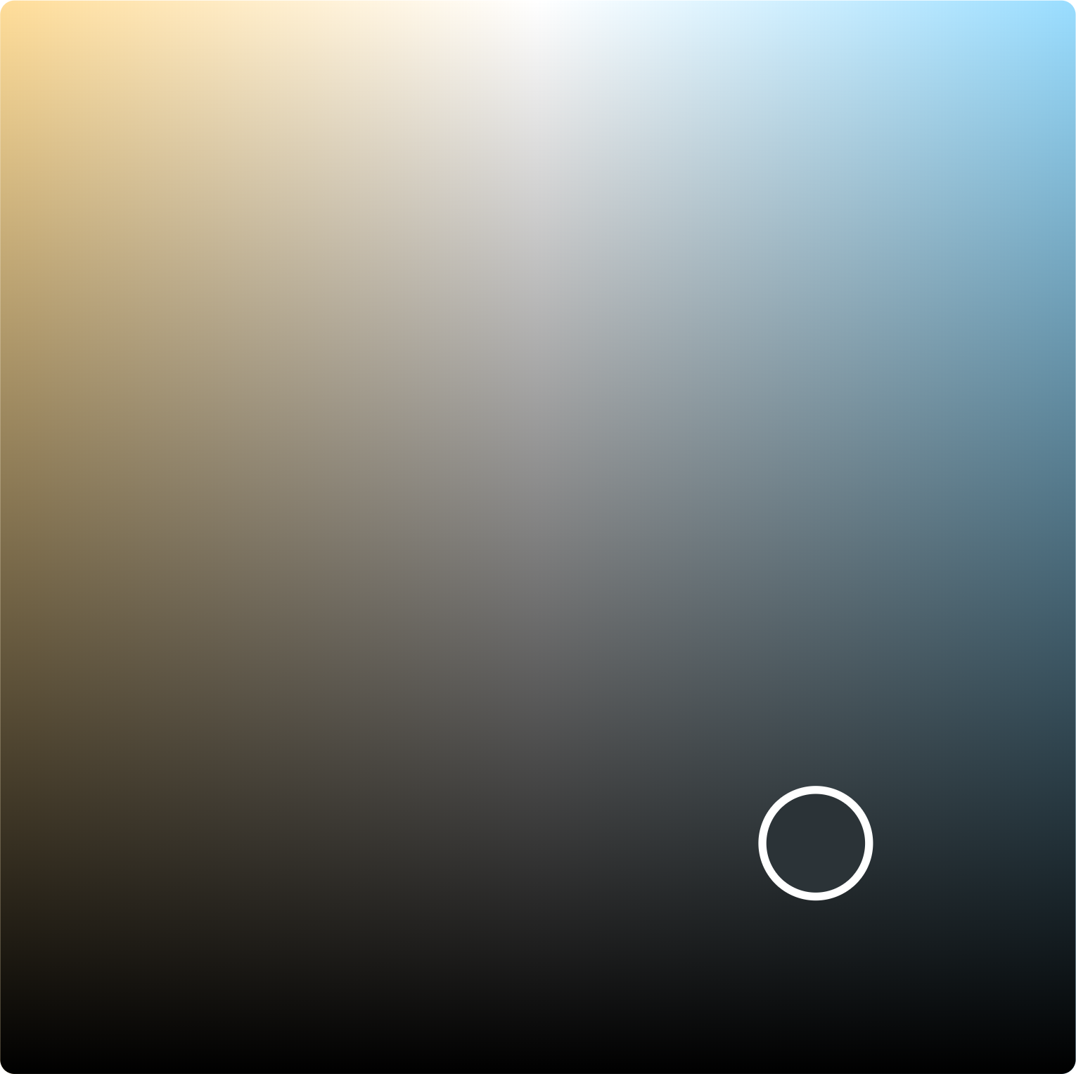
The picker value is therefore indepent from the displayed color. The given value is a number between 0 and 1 for each of the two channels. The brightness can be determined by dragging the slider along the Y-axis. Dragging along the X-axis changes the relationship between the two channels.
Usage
As a native Web Component
<script src="https://cdn.jsdelivr.net/npm/@adrianjost/two-channel-picker@0.3.6/dist/wc/two-channel-picker.min.js"></script>

<div style="width: 300px; height: 300px;">
    <two-channel-picker
        value="[0,1]"
        id="picker"
        options='{"colorLeft": "#f00", "colorRight": "#00f" }'
    ></two-channel-picker>
</div>

<script>
    document.getElementById("picker").addEventListener("input", (event) => {
        console.log(event.detail[0]);
    });
</script>
please note, that you may need to adjust the version number in the url.
with VueJS
Vue 2
Don't worry about the <1 version number. I haven't found any issues in the last 2 years so v1 will use an identical implementation, but is vue3 compatible.
npm i @adrianjost/two-channel-picker@0.3.6
# or
yarn add @adrianjost/two-channel-picker@0.3.6
npm i @adrianjost/two-channel-picker@1.0.0@beta.1
# or
yarn add @adrianjost/two-channel-picker@1.0.0@beta.1
Usage in your App
<template>
    <TwoChannelPicker
        v-model="channels"
        :options="{
            colorLeft: '#fd9',
            colorRight: '#9df',
            marker: {
                radius: 16,
                borderWidth: 2,
            },
        }"
    />
</template>

<script>
import TwoChannelPicker from "@adrianjost/two-channel-picker";

export default {
    components: {
        TwoChannelPicker,
    },
    data() {
        return {
            channels: [0, 1],
        };
    },
};
</script>
Helper
The package also includes some helper methods. You can access them by importing the according js files. Please use the JSDoc comments to learn how to use them.
import {
    getChannelsForHueAndBrightness,
    getHueAndBrightnessForChannels,
    getCenterColor,
    getColorForHueAndBrightness,
    getColorForChannels,
} from "@adrianjost/two-channel-picker/dist/helpers/channelColor.js";
import {
    hex2rgb,
    rgb2hex,
} from "@adrianjost/two-channel-picker/dist/helpers/colorConversion.js";
API
Props
You can customize the picker with the following props/attributes.
When using the lib as a web component you must provide all attributes
JSON.stringify()-ed.
| attribute | type | default value | description |
|---|---|---|---|
value / v-model |
Array, String | [1,0] |
the current channel values, if provided as a String, this must be JSON.parse()-able |
options |
Object | {} |
all your config goes in here |
Options
Available Attributes in the options prop:
| attribute | type | default value | description |
|---|---|---|---|
readOnly |
Boolean | false |
should the user be able to move the marker? |
colorLeft |
String | #fd9 |
the color in the top left corner. Must be in the HEX Format with 3 or 6 digits. |
colorRight |
String | #fd9 |
the color in the top right corner. Must be in the HEX Format with 3 or 6 digits. |
marker.borderWidth |
Number | 2 |
The border width of the active marker in px. |
marker.radius |
Number | 16 |
The border radius including the borderWidth in px. |
You need more options? Please open an issue and I will do my best to implement it. Pull Requests are also welcome!