README
@angular-material-extensions/select-country - Angular Material component that allow users to select a country or nationality with an autocomplete feature - Angular V13 supported incl. schematics


Built by and for developers :heart:
Do you have any question or suggestion ? Please do not hesitate to contact us! Alternatively, provide a PR | open an appropriate issue here
If you like this project, support angular-material-extensions by starring :star: and sharing it :loudspeaker:
Table of Contents
- Demo
- Components
- Dependencies
- Installation
- API
- Usage
- Run Demo App Locally
- Other Angular Libraries
- Support
- License
Demo
View all the directives and components in action at https://angular-material-extensions.github.io/select-country
Library's components
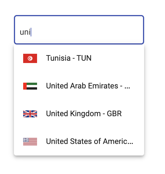
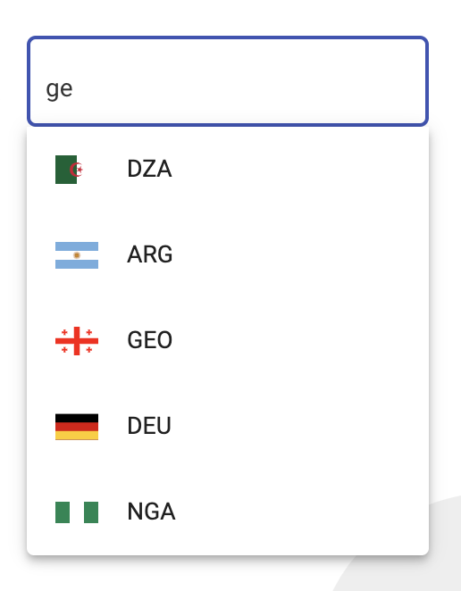
<mat-select-country>used to display the main component
Dependencies
- Angular developed and tested with
13.x
Installation
1. Install via ng add. (Recommended)
If Angular Material Design is not setup, just run ng add @angular/material learn more
Now add the library via the angular schematics
ng add @angular-material-extensions/select-country
2. Install via npm. (Alternative)
Install peer dependencies
npm i svg-country-flags -s
then update your angular.json like below (svg-country-flags)
"assets": [
              "src/favicon.ico",
              "src/assets",
              {
                "glob": "**/*",
                "input": "./node_modules/svg-country-flags/svg",
                "output": "src/assets/svg-country-flags/svg"
              }
            ],
Now install @angular-material-extensions/select-country via:
npm install --save @angular-material-extensions/select-country
Import the library
If you installed the library via angular schematics, you can skip this step
Once installed you need to import the main module and the HttpClientModule:
import { MatSelectCountryModule } from "@angular-material-extensions/select-country";
import { MatSelectCountryModule } from '@angular-material-extensions/select-country';
import {HttpClientModule} from '@angular/common/http';

@NgModule({
  declarations: [AppComponent, ...],
  imports: [
              MatSelectCountryModule.forRoot('de'), // you can use 'br' | 'de' | 'en' | 'es' | 'fr' | 'hr' | 'it' | 'nl' | 'pt' --> MatSelectCountrySupportedLanguages
             HttpClientModule, ...],
  bootstrap: [AppComponent]
})
export class AppModule {
}
in other modules
import { MatSelectCountryModule } from '@angular-material-extensions/select-country';
import {HttpClientModule} from '@angular/common/http';

@NgModule({
  declarations: [AppComponent, ...],
  imports: [MatSelectCountryModule, HttpClientModule, ...],
  bootstrap: [AppComponent]
})
export class AppModule {
}
Other modules in your application like for lazy loading import MatSelectCountryModule into your feature module:
API
<mat-select-country> used to display the main component - see the demo examples
| option | bind | type | default | description |
|---|---|---|---|---|
| value | Input() |
Country |
- | the selected country (pass an empty Country object with alpha2 code populated to do alpha2 lookup) |
| appearance | Input() |
MatFormFieldAppearance |
- | Possible appearance styles for mat-form-field ('legacy', 'standard', 'fill' or 'outline') |
| countries | Input() |
Country[] |
All countries stored in the lib | Countries that should be loaded - predefine the countries that you only need! |
| label | Input() |
boolean |
- | mat-form-field label's text |
| itemsLoadSize | Input() |
number |
- | the number of countries that should be fetched --> improves the performance |
| placeHolder | Input() |
boolean |
- | input placeholder text |
| disabled | Input() |
boolean |
- | Whether the component is disabled |
| loading | Input() |
boolean |
- | Whether the component is loading |
| nullable | Input() |
boolean |
- | Whether the component is able to emit null |
| readonly | Input() |
boolean |
- | Whether the component is read only |
| tabIndex | Input() |
number \| string |
- | Whether the component can be focused, and where it participates in sequential keyboard navigation |
| showCallingCode | Input() |
boolean |
false | Whether the component to show the country's calling code in the label and selection |
| class | Input() |
string |
- | Class attribute apply style to input text or validation ignore (optional) |
| language | Input() |
string |
- | the language, if not specified MatSelectCountryModule.forRoot('XX') will be used (optional) |
| name | Input() |
string |
'country' | the attribute name of the input element |
| autocomplete | Input() |
string |
- | the attribute autocomplete of the input element, to avoid suggestion of some browsers put 'no' |
| onCountrySelected | Output() |
EventEmitter<Country> |
- | emits the selected country as object (see the interface below) |
interface Country {
  name: string;
  alpha2Code: string;
  alpha3Code: string;
  numericCode: string;
  callingCode: string;
}
Usage
add the <mat-select-country> element to your template:
<mat-select-country>
</mat-select-country>

Use the library with reactive forms
option 1 with Reactive Forms
<mat-select-country appearance="outline"
                    label="Country"
                    [formControl]="countryFormControl"
                    (onCountrySelected)="onCountrySelected($event)">
</mat-select-country>
option 2 with Reactive Forms
<form [formGroup]="countryFormGroup">
    <div fxLayoutAlign="center">
      <mat-select-country appearance="outline"
                          label="Country"
                          class="className"
                          formControlName="country"
                          (onCountrySelected)="onCountrySelected($event)">
      </mat-select-country>
    </div>
  </form>
import {Component,OnInit} from '@angular/core';
import {FormControl} from '@angular/forms';

import {Country} from '@angular-material-extensions/select-country';

@Component({
  selector: 'app-root',
  templateUrl: './app.component.html',
  styleUrls: ['./app.component.scss']
})
export class AppComponent implements OnInit{
  title = 'select-country';

  countryFormControl = new FormControl();
  countryFormGroup: FormGroup;

  constructor(private formBuilder: FormBuilder) {
    angulartics2GoogleAnalytics.startTracking();
  }

  ngOnInit(): void {

    this.countryFormGroup = this.formBuilder.group({
      country: []
    });

    this.countryFormGroup.get('country').valueChanges
.subscribe(country => console
.log('this.countryFormGroup.get("country").valueChanges', country));

    this.countryFormControl.valueChanges
.subscribe(country => console
.log('this.countryFormControl.valueChanges', country));
  }


  onCountrySelected($event: Country) {
    console.log($event);
  }
}
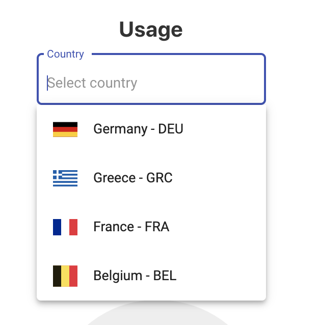
Predefine your countries to load
<mat-select-country appearance="outline"
                    label="Country"
                    [countries]="predefinedCountries"
                    (onCountrySelected)="onCountrySelected($event)">
</mat-select-country>
import {Country} from '@angular-material-extensions/select-country';

predefinedCountries: Country[] = [
  {
    name: 'Germany',
    alpha2Code: 'DE',
    alpha3Code: 'DEU',
    numericCode: '276',
    callingCode: '+49'
  },
  {
    name: 'Greece',
    alpha2Code: 'GR',
    alpha3Code: 'GRC',
    numericCode: '300',
    callingCode: '+30'
  },
  {
    name: 'France',
    alpha2Code: 'FR',
    alpha3Code: 'FRA',
    numericCode: '250',
    callingCode: '+33'
  },
  {
    name: 'Belgium',
    alpha2Code: 'BE',
    alpha3Code: 'BEL',
    numericCode: '056',
    callingCode: '+32'
  }
];
Result:
Improve performance - use the itemsLoadSize property
<mat-select-country appearance="outline"
                    label="Country"
                    [itemsLoadSize]="5">
</mat-select-country>
only 5 countries will fetched!
Change language dynamically - use the language property
<mat-select-country appearance="outline"
                    label="Country"
                    [language]="languageSelected"
                    (onCountrySelected)="onCountrySelected($event)">
</mat-select-country>
Run Demo App Locally
Build the library
$ npm run build:lib
Serve the demo app
$ npm start
Other Angular Libraries
- ngx-auth-firebaseui
- ngx-linkifyjs
- @angular-material-extensions/password-strength
- @angular-material-extensions/google-maps-autocomplete
- @angular-material-extensions/link-preview
- @angular-material-extensions/fab-menu
- @angular-material-extensions/pages
- @angular-material-extensions/contacts
Who is using this library?
nahaus.de - Digital and Automated Real Estate Management
To put your project here, please drop an appropriate PR
Support
- Drop an email to: Anthony Nahas
- or open an appropriate issue
- let us chat on Gitter
Built by and for developers :heart: we will help you :punch:

This project is supported by jetbrains with 1 ALL PRODUCTS PACK OS LICENSE incl. webstorm
License
Copyright (c) 2020-2021 Anthony Nahas. Licensed under the MIT License (MIT)