Accessible text input styled for Anypoint platform
Usage no npm install needed!
<script type="module">
  import anypointWebComponentsAnypointInput from 'https://cdn.skypack.dev/@anypoint-web-components/anypoint-input';
</script>
README
Deprecated
This component has been moved to anypoint-web-components/awc.
This component is based on Material Design text field and adjusted for Anypoint platform components.
Anypoint web components are set of components that allows to build Anypoint enabled UI in open source projects.
Text field allows the user to enter a value into the UI. It can appear in a form or a dialog.
Styling options
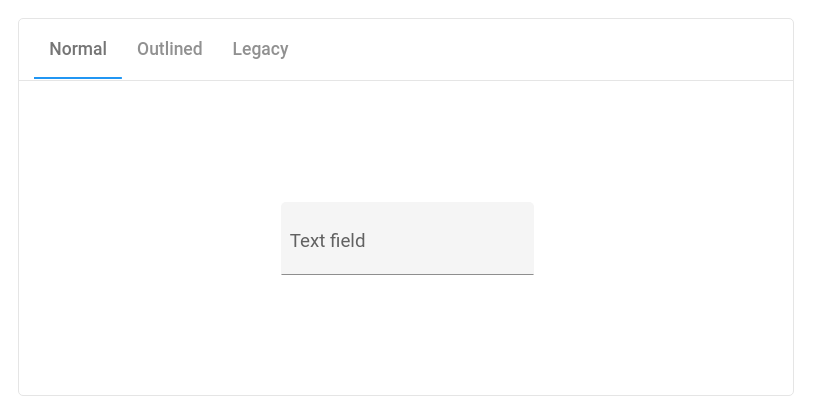
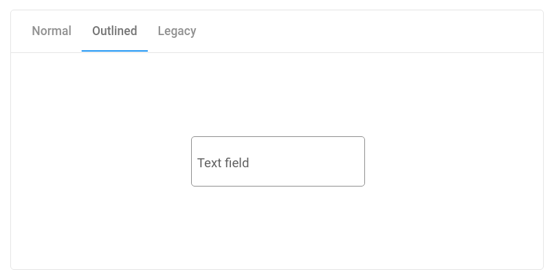
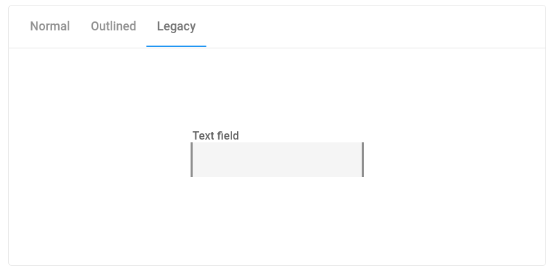
The element has three built-in themes:
Material Design - Filled
Material Design - Outlined
Anypoint Design - Compatibility
By default the input renders filled input.
Outlined style is rendered when outlined property is set.
Anypoint ready styles are rendered when compatibility property is set.
OSS application should not use Anypoint based styling as it's protected by MuleSoft copyrights. This property is reserved for OSS applications embedded in the Anypoint platform.
The element allows to render a widget before or after the text input but inside the input's border.
When it make sense a prefix or suffix can be used to suggest right input. Fox example in cash amount field input a prefix could be $ sign which suggest the value is interpreted in US dollars.
<anypoint-input name="ex1">
  <label slot="label">Amount to transfer</label>
  <span slot="prefix" aria-label="Value in US dollars">
lt;/span>
</anypoint-input>
Similarly suffix can provide additional information about the format of input. For the same cash amount input suffix could render .00 to suggest that the input is an integer.
Suffixes can also be active widget. It can be an icon button that toggles visibility of the password. Just remember that adding interactive suffixes is not a common design pattern and your suffix has to have clear meaning to the user.
<anypoint-input type="password" name="ex3">
  <label slot="label">Password</label>
  <anypoint-button slot="suffix" aria-label="Activate the button to show the password" onclick="this.parentNode.type='text'">Show</anypoint-button>
</anypoint-input>
The element supports all input's properties that helps with validation, like required, min, max, pattern, and so on. It also supports autoValidate property that validates the input when value changes.
When invalid it renders error message defined as invalidmessage property.
The element also has preventInvalidInput and allowedPattern properties that, when both set, cancels any input that does not matches allowedPattern.
Remember to use this properties carefully as this is very invasive behavior.
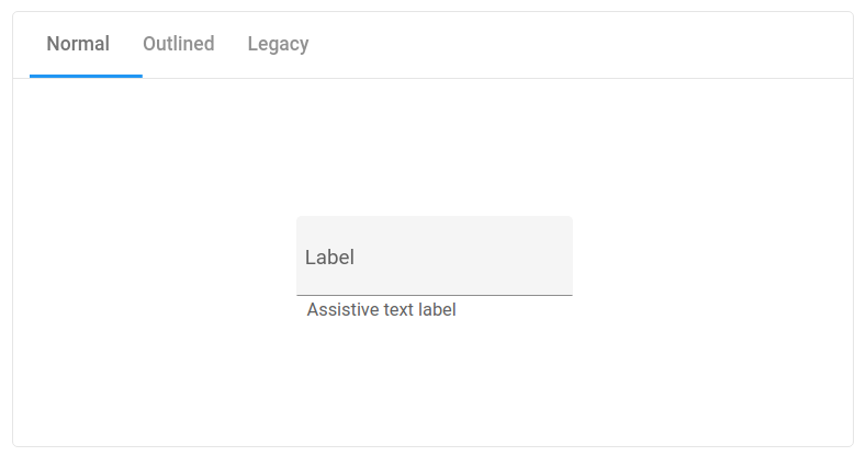
Assistive text allows the user to better understand what kind of input is required. It can be an info message or invalid message when invalid
input has been detected.
Info message
Info message provides the user with additional description for the field. It should be used when the label can be confusing or to ensure the user about the reason of collecting the input.
<anypoint-input infoMessage="Used to confirm your order." type="email" name="ex5">
  <label slot="label">Email</label>
</anypoint-input>
Do not try to put too detailed information. The user should be able to scan the message in a fraction of a second. Treat it as an additional text for the label.
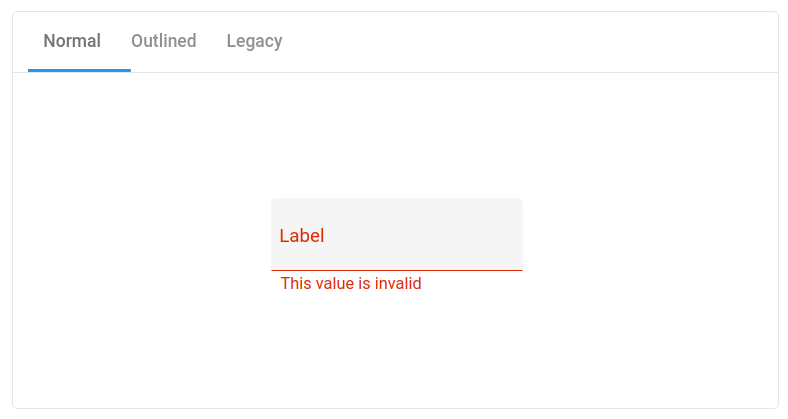
Invalid message
Error message should help the user recover from the error state. Use clear message with simple instructions of how to fix the problem, for example Only letters are allowed.
The form-associated custom elements allows to associate a custom element with a <form> element. Original custom elements spec does not allow this.
The form-associated custom elements may not be supported in some browsers so custom form elements may be required to be used (for example iron-form).
The element supports this API in browser that has this API implemented. This means that the element behaves like a regular <input> element when inserted into the form element.
Accessibility
The element is a11y ready.
To comply with Web Content Accessibility Guidelines (WCAG) add name attribute to the input and add the label as a child.
When using prefixes or suffixes describe the meaning to screen reader by using aria-label property. Note, by setting aria-label, the screen reader will skip reading text value of the element.
<anypoint-input name="amount-usd">
  <label slot="label">Amount to transfer</label>
  <span slot="prefix" aria-label="Value in US dollars">lt;/span>
</anypoint-input>
Development
git clone https://github.com/anypoint-web-components/anypoint-input
cd anypoint-input
npm install
