README
Vue Link Preview
A Vuejs component to fetch metadata from a URL and preview it
Inspired by link-preview-generator and link-prevue 🙏


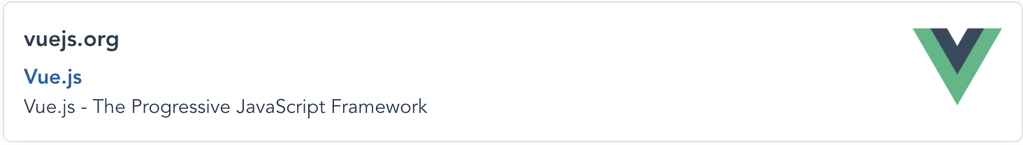
Demo
Table of Contents
Install
NPM
npm install @ashwamegh/vue-link-preview
Yarn
yarn add @ashwamegh/vue-link-preview
UMD build
<script src="https://unpkg.com/vue-link-preview@0.2.5/dist/vuelinkpreview.umd.js"></script>
Usage
Script
import LinkPreview from '@ashwamegh/vue-link-preview'

export default {
  components:{
    LinkPreview
  },
  methods: {
    handleClick(preview) {
      console.log('click', preview.domain, preview.title, preview.description, preview.img)
    }
  }
}
Template
<div id="app">
  <vue-link-preview url="https://vuejs.org/" @click="handleClick"></vue-link-preview>
</div>
With custom layout (With Vue Slots)
For replacing the Loader, you can add this html:
<vue-link-preview url="https://vuejs.org/" @click="handleClick">
    <template v-slot:loader>
        loader...
    </template>
</vue-link-preview>
For replacing the content layout, you can use this:
<vue-link-preview url="https://vuejs.org/" @click="handleClick">
    <template v-slot:default="preview">
        <div>
            <p>Domain: {{ preview.domain }}</p>
            <p>Title: {{ preview.title }}</p>
            <p>Description: {{ preview.description }}</p>
            <img height="100px" width="100px" :src="preview.img" :alt="preview.title ">
        </div>
    </template>
</vue-link-preview>
All together with loader and default slot, it'll look like this:
<vue-link-preview url="https://vuejs.org/" @click="handleClick">
    <template v-slot:loader>
        loader...
    </template>
    <template v-slot:default="preview">
        <div>
            <p>Domain: {{ preview.domain }}</p>
            <p>Title: {{ preview.title }}</p>
            <p>Description: {{ preview.description }}</p>
            <img height="100px" width="100px" :src="preview.img" :alt="preview.title ">
        </div>
    </template>
</vue-link-preview>
Props
| Property | Type | Default | Description | Required |
|---|---|---|---|---|
url |
string |
Width of the card preview | true | |
width |
string |
90% |
Width of the card preview | false |
maxWidth |
string |
700px |
Max Width of the card preview | false |
marginTop |
string |
18px |
Margin top for the card | false |
marginBottom |
string |
18px |
Margin bottom for the card | false |
marginRight |
string |
18px |
Margin right for the card | false |
marginLeft |
string |
18px |
Margin left for the card | false |
canOpenLink |
boolean |
true |
Enables, to open link when clicked on card | false |
Events
| Name | Description |
|---|---|
click |
It emits the preview data |
Note: If you want to use
clickevent without opening the url, then pass:canOpenLink="false"in the props
Contribute
Thanks for taking the time to contribute, please check out the src to understand how things work.
Reporting Issues
Found a problem? Want a new feature? First of all, see if your issue or idea has already been reported. If don't, just open a new clear and descriptive issue.
Submitting pull requests
Pull requests are the greatest contributions, so be sure they are focused in scope and do avoid unrelated commits.
- Fork it!
- Clone your fork:
git clone https://github.com/<your-username>/vue-link-preview - Navigate to the newly cloned directory:
cd vue-link-preview - Create a new branch for the new feature:
git checkout -b my-new-feature - Install the tools necessary for development:
yarn - Make your changes.
- Commit your changes:
git commit -am 'Add some feature' - Push to the branch:
git push origin my-new-feature - Submit a pull request with full remarks documenting your changes