README
Web component that implement Navigation Indicator animation of Axiom Design System.


Installation
// with npm
npm install @ax-design/navigation

// with yarn
yarn add @ax-design/navigation
and import it:
//CommonJS
require('@ax-design/navigation').register();

//ESModule
import { register } from '@ax-design/navigation';
register();
Usage
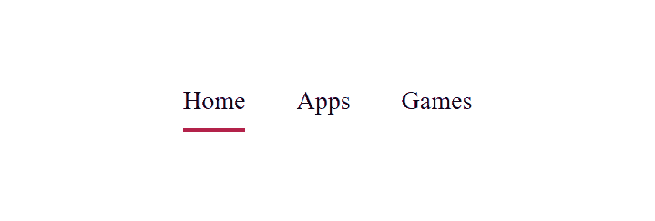
Horizontal Navigation
<ax-navigation>
  <ax-navigation-item>Home</ax-navigation-item>
  <ax-navigation-item>Apps</ax-navigation-item>
  <ax-navigation-item>Games</ax-navigation-item>
</ax-navigation>
Vertical Navigation
<ax-navigation vertical>
  <ax-navigation-item>Home</ax-navigation-item>
  <ax-navigation-item>Apps</ax-navigation-item>
  <ax-navigation-item>Games</ax-navigation-item>
</ax-navigation>
Style Controlling
Navigation component uses custom properties to manage the style of the navigation indicator.
--navigation-indicator-speed
Type: <time>
Default: 600ms
Description: The speed of navigation indicator's animation.
--navigation-indicator-color
Type: <color>
Default: black
Description: The color of navigation indicator.
--navigation-indicator-width
Type: <length>
Default: 2px
Description: The width of navigation indicator.
Events
Switch
Bubbles: No
Cancelable: No
Interface: SwitchEvent
Description: A ax-navigation element receives a switch event when the indicator switched from one item to another item.
Properties:
SwitchEvent.detail.from: The highlighted element before user switched the tab;SwitchEvent.detail.to: The highlighted element after user switched the tab.