README
vfilter
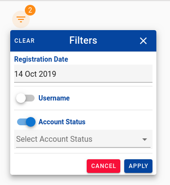
This vue component built on top of vuetify 2.0 caters to the need of filtering the records being displayed to the user. Its a kind of advanced search UI designer with a simple JSON input. When user clicks on the filter icon the below popover menu is displayed with all the fields configured in JSON. Please follow the below instructions for easily setting up.
This is how filter looks
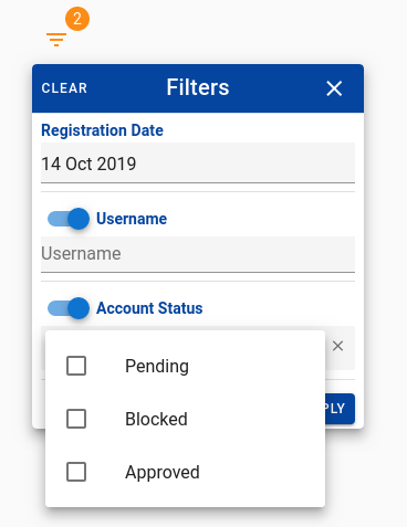
Choosing from Various Inputs i.e Select, Multi-Select, Autocomplete, Multi-Autocomplete, Text, Radio, Number, Date, Infinite Autocomplete, Infinite Combobox
Choose condition that you want to apply.
Importing the plugin in main.js
import VFilter from '@baldeepsinghkwatra/v-filter'
Vue.use(VFilter);
Importing styles in App.vue
@import "../node_modules/@baldeepsinghkwatra/v-filter/dist/vfilter.css";
Using the filter in any component
 <v-filter @apply="onFilter" v-model="filters" />
 @apply event occurs when user clicks on apply button
 Create a data property filters:
  filters: [{
                name: "registrationDate",
                label: "Registration Date",
                type: "date",
                dateType: "date",
                value: new Date(),
                enabled: true,
                applied: true,
                readonly: true,
                rules: [v => !!v || "Item is required"],
                showCondition: false,
                clearable: false,
                condition: "_eq"
            },
            {
                name: "username",
                label: "Username",
                type: "text",
                value: '',
                enabled: false,
                applied: false,
                clearable: false,
                showCondition: false,
                condition: "_eq"
            },
            {
                name: "status",
                label: "Account Status",
                type: "multiselect",
                value: ["SUCCESS"],
                defaultValue: ["SUCCESS"],
                enabled: true,
                applied: true,
                values: [{
                        text: "Pending",
                        value: "PENDING"
                    },
                    {
                        text: "Blocked",
                        value: "BLOCKED"
                    },
                    {
                        text: "Approved",
                        value: "APPROVED"
                    }
                ]
            }
        ]
JSON structure and allowed keys.
name - this key is the unique name in the json array that you will give for advanced search. When apply is clicked the selected value is returned with this object name.
label - what you want to show on the field.
type - what type of input do you want to render. Allowed types are (text, select, multiselect, autocomplete, multiAutocomplete, number, date)
value - the value you want to supply to the field. Any default values or null if no value.
enabled - set this flag as true when you want the switch to remain on automatically.
readonly - if set to true will remove the switch i.e this filter input will always be applicable and user must provide some value.
defaultValue - generally same as value it will be used when user clicks on clear. The value will be set to this value.
clearable - if set to true will show a clear icon in the input field
values - In case of select, multiselect, autocomplete, multiAutocomplete you have to show the list of values. You can provide the list here. Please Note it should be an array with text & value.
condition - Default condition that you want to set when a filter is switched on.
showCondition - by default it is true. ie. when a particular filter is enabled it will show a dropdown. For the condition. Conditions are as follows:
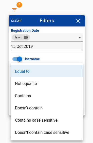
For input type text
- a) Equal to - _eq
- b) Not equal to- _ne
- c) Contains - _contains
- d) Doesn't contain - _ncontains
- e) Contains case sensitive - _containss
- f) Doesn't contain case sensitive - _ncontainss
For input type number
- a) Equal to - _eq
- b) Not equal to- _ne
- c) Less than - _lt
- d) Greater than - _gt
- e) Less than or equal to - _lte
- f) Greater than or equal to - _gte
- g) Included in an list of values - _in
- h) Isn't included in an list of values - _nin
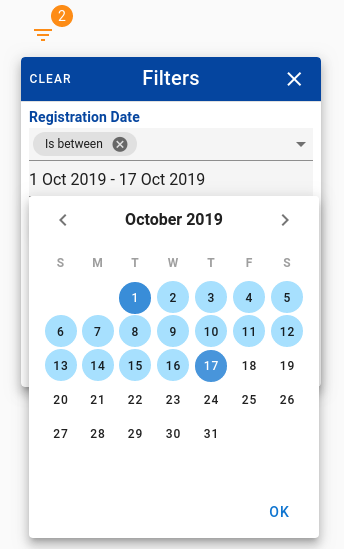
For input type date
- a) Is on - _eq
- b) Is not on - _ne
- c) Is before - _lt
- d) Is after - _gt
- e) Is on or before - _lte
- f) Is on or after - _gte
- g) Is between - _between
Overriding CSS styles.
Applied on Cancel button
.filter-error-button {
    background: #f6163b !important;
    color: #ffffff !important;
}
Applied on Apply button
.filter-primary-button {
    background: #0D47A1 !important;
    color: #ffffff !important;
}
Title bar style
.filter-title {
    background-color: #0D47A1;
    color: white;
    padding: 8px 16px;
}
Contributing & Support
Please feel free to get in touch with me at https://baldeep.xyz
Create Build Bundle
npm run build-bundle
Deploying to NPM
npm publish --access public