README
d2l-labs-multi-select

Note: this is a "labs" component. While functional, these tasks are prerequisites to promotion to BrightspaceUI "official" status:
- Design organization buy-in
- design.d2l entry
- Architectural sign-off
- Continuous integration
- Cross-browser testing
- Unit tests (if applicable)
- Accessibility tests
- Visual diff tests
- Localization with Serge (if applicable)
- Demo page
- README documentation
Polymer/Lit-based web component collection for D2L multi-select, creating, editing, and listing tags/attributes.
Installation
npm install @brightspace-ui-labs/multi-select
Usage
d2l-labs-multi-select-input-text
d2l-labs-multi-select-input-text includes a d2l-input-text that is hooked up to add items when 'Enter' is pressed.
Usage:
<d2l-labs-multi-select-input-text>
    <d2l-labs-multi-select-list-item deletable text="Item 1"></d2l-labs-multi-select-list-item>
</d2l-labs-multi-select-input-text>
d2l-labs-multi-select-input
You can use your own input component instead by putting it as a child of d2l-labs-multi-select-input and setting slot="input" on your input element. To add items to the list, call addItem with the item text.
Usage:
<d2l-labs-multi-select-input id="multi-select-input">
    <div slot="input">
        <input>
        <button>Add</button>
    </div>
</d2l-labs-multi-select-input>
button.addEventListener('click', () => {
    multiSelectInput.addItem(input.value)
})
d2l-labs-attribute-picker
An autocompleting dropdown to choose one or more new or pre-existing attributes inline. Usage:
<script type="module">
    import '@brightspace-ui-labs/attribute-picker/attribute-picker.js';
</script>
<d2l-labs-attribute-picker>My element</d2l-labs-attribute-picker>
Properties:
| Property | Type | Description |
|--|--|--|
| allow-freeform | Boolean | When enabled, the user can manually type any attribute they wish. If false, they must select from the dropdown. |
| aria-label | String | Required. When true, the autocomplete dropdown will not be displayed to the user. |
| attribute-list | Array | An array of string/value pairs representing the attributes currently selected in the picker (eg [{"name":"shown to user","value":"sent in event"}]). Only the values are sent in events and the string names are otherwise ignored. |
| assignable-attributes | Array | An array of string/value pairs, just like attribute-list, available in the dropdown list. |
| hide-dropdown | Boolean | When enabled, the autocomplete dropdown will not be displayed to the user. |
| limit | Number | The maximum length of attribute-list permitted. |
Accessibility:
To make your usage of d2l-labs-attribute-picker accessible, use the following properties when applicable:
| Attribute | Description | |--|--| | aria-label | The label should provide context for the attribute picker, such as type of attribute. |
Events:
The d2l-labs-attribute-picker dispatches the d2l-attributes-changed event each time an attribute has been added or removed. It will return the updated list of attributes:
attributePicker.addEventListener('d2l-attributes-changed', (e) => {
  console.log(e.detail.attributeList.toString());
});
The d2l-labs-attribute-picker dispatches the d2l-attribute-limit-reached event when the user attempts to enter an attribute greater than the limit. This can be used to send feedback to the user.
d2l-labs-multi-select-list-item
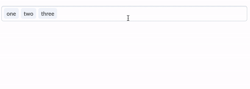
d2l-labs-multi-select-list-item is a compact representation of information.
A deletable property can be set to enable the option of deleting the item, although there is no wire-up.
<d2l-labs-multi-select-list-item deletable text="List item"></d2l-labs-multi-select-list-item>
A 'show-delete-hover-focus' property can be set to allow delete icon to show on hover or focus only.
<d2l-labs-multi-select-list-item deletable show-delete-hover-focus text="List item"></d2l-labs-multi-select-list-item>
Also the following css variables are exposed to clients and can be use to override some of the appearance of the list item.
--d2l-labs-multi-select-list-item-font
--d2l-labs-multi-select-list-item-padding
--d2l-labs-multi-select-list-item-padding-rtl
--d2l-labs-multi-select-list-item-padding-deletable
--d2l-labs-multi-select-list-item-padding-deletable-rtl
d2l-labs-multi-select-list
d2l-labs-multi-select-list wraps a list of items, and provides spacing between the items, as well as keyboard navigation (arrow keys) and handling of item deletion (backspace/delete).
Usage:
<d2l-labs-multi-select-list>
    <d2l-labs-multi-select-list-item text="List item 1"></d2l-labs-multi-select-list-item>
    <d2l-labs-multi-select-list-item text="List item 2"></d2l-labs-multi-select-list-item>
    ...
</d2l-labs-multi-select-list>
You can opt for a condensed view by adding the collapsable attribute, which limits the element to the first line of items and provides a button for viewing the remaining items.
Events:
d2l-labs-multi-select-list-item-deleted: fired on item deletiond2l-labs-multi-select-list-item-added: fired on item added to thed2l-labs-multi-select-list
Developing, Testing and Contributing
After cloning the repo, run npm install to install dependencies.
Start a @web/dev-server that hosts the demo pages:
npm run start
To lint (eslint:
npm run lint
To run unit tests locally:
npm run test:headless
To lint AND run local unit tests:
npm run test
Versioning & Releasing
TL;DR: Commits prefixed with
fix:andfeat:will trigger patch and minor releases when merged tomain. Read on for more details...
The semantic-release GitHub Action is called from the release.yml GitHub Action workflow to handle version changes and releasing.
Version Changes
All version changes should obey semantic versioning rules:
- MAJOR version when you make incompatible API changes,
- MINOR version when you add functionality in a backwards compatible manner, and
- PATCH version when you make backwards compatible bug fixes.
The next version number will be determined from the commit messages since the previous release. Our semantic-release configuration uses the Angular convention when analyzing commits:
- Commits which are prefixed with
fix:orperf:will trigger apatchrelease. Example:fix: validate input before using - Commits which are prefixed with
feat:will trigger aminorrelease. Example:feat: add toggle() method - To trigger a MAJOR release, include
BREAKING CHANGE:with a space or two newlines in the footer of the commit message - Other suggested prefixes which will NOT trigger a release:
build:,ci:,docs:,style:,refactor:andtest:. Example:docs: adding README for new component
To revert a change, add the revert: prefix to the original commit message. This will cause the reverted change to be omitted from the release notes. Example: revert: fix: validate input before using.
Releases
When a release is triggered, it will:
- Update the version in
package.json - Tag the commit
- Create a GitHub release (including release notes)
- Deploy a new package to NPM
Releasing from Maintenance Branches
Occasionally you'll want to backport a feature or bug fix to an older release. semantic-release refers to these as maintenance branches.
Maintenance branch names should be of the form: +([0-9])?(.{+([0-9]),x}).x.
Regular expressions are complicated, but this essentially means branch names should look like:
1.15.xfor patch releases on top of the1.15release (after version1.16exists)2.xfor feature releases on top of the2release (after version3exists)