README
@drizm/buttons
A buttons library for Angular.
Features
- A simple and elegant-to-use button component
- Easy to override styles
- Many styles and designs to choose from
Installation
npm install @drizm/buttons
Usage
Import Buttons into your module:
import { NgModule } from '@angular/core';
import { ButtonsModule } from '@drizm/buttons';

@NgModule({
  imports: [
    // ...
    ButtonsModule
  ]
})
export class MyAwesomeModule { }
Import the library styles in your styles.scss:
@import '~@drizm/buttons/scss/styles';
Use the component in your template:
<dzm-button type="button" primary>
  Confirm
</dzm-button>
Note: You need to specify a button style in order for it to display correctly, like in the example above. Check documentation below for more styles.
Documentation
Input Properties
| Property | Type | Description |
|---|---|---|
| type | "button" or "submit" | The button html element type. Optional. |
| content | string | A string containing the button's content. Optional. Alternatively, insert the content straight into the component selector via <dzm-button>Content</dzm-button>. |
| disabled | boolean | Whether the button should be displayed as disabled. False by default. |
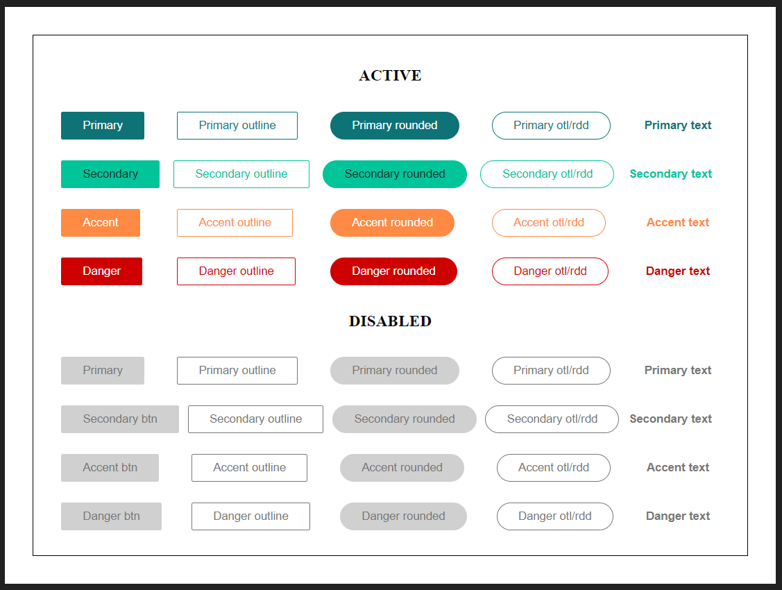
Button styles
| Style | Example |
|---|---|
| primary | <dzm-button primary></dzm-button> |
| secondary | <dzm-button secondary></dzm-button> |
| accent | <dzm-button accent></dzm-button> |
| danger | <dzm-button danger></dzm-button> |
Button designs
| Design | Example |
|---|---|
| main(filled) - default | <dzm-button></dzm-button> |
| outline | <dzm-button outline></dzm-button> |
| rounded | <dzm-button rounded></dzm-button> |
| text | <dzm-button text></dzm-button> |
Overriding button styles
You can override the default styles by overriding their css variables in :root. Here is a list of them and their default values:
:root {
  --dbtn-color-primary: #0d7377;
  --dbtn-hover-primary: #0f857b;
  --dbtn-active-primary: #0e6b77;

  --dbtn-color-secondary: #00C49A;
  --dbtn-hover-secondary: #00e2b7;
  --dbtn-active-secondary: #009d75;

  --dbtn-color-accent: #FF8A44;
  --dbtn-hover-accent: #ffac49;
  --dbtn-active-accent: #d1693f;

  --dbtn-color-danger: #ce0000;
  --dbtn-hover-danger: #7f0000;
  --dbtn-active-danger: #ee0000;

  --dbtn-text-primary-main: white;
  --dbtn-text-secondary-main: #292929;
  --dbtn-text-accent-main: white;
  --dbtn-text-danger-main: white;

  --dbtn-text-disabled: #777777;
  --dbtn-bg-disabled: #d0d0d0;

  --dbtn-radius-huge: 17px;
  --dbtn-radius-bigger: 7px;
  --dbtn-radius-big: 5px;
  --dbtn-radius-normal: 3px;
  --dbtn-radius-small: 2px;
  --dbtn-radius-circle: 50%;
}