README
Searchbox component for Angular Material
Searchbox suitable for inclusion on a toolbar, based on Angular Material
Demo code
·
Demo
·
Stackblitz demo (with code)
·
Report Bug / Request Feature
Table of Contents
About The Project
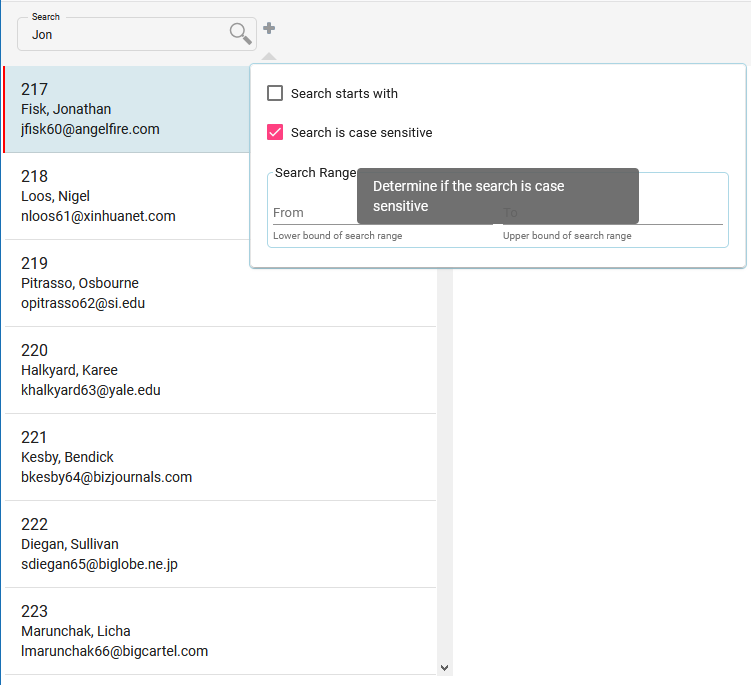
This is a searchbox component, which is built with restyled Angular Material components. It is suitable for inclusion on a toolbar or as a standard-size component.
A number of options are available to customize how the component appears and behaves (see API description below).
Getting Started
Prerequisites
This library requires that the host project is running Angular 10+.
As well as the standard Angular packages that are automatically installed, please ensure that your project also has the following optional Angular packages correctly installed.
- @angular/forms
- @angular/material
- @angular/cdk
In addition the following package(s) will be automatically installed if not already available.
- @angular/flex-layout
- @fgrid-ngx/mde
Installation
- Install NPM package
npm install @fgrid-ngx/mat-searchbox - If you wish to clone the project
git clone https://github.com/plongrigg/searchbox.git
Usage
Import the module as follows:
import  {  CommonModule  }  from  '@angular/common';
import  {  NgModule  }  from  '@angular/core';
import  {  BrowserModule  }  from  '@angular/platform-browser';
import  {  BrowserAnimationsModule  }  from  '@angular/platform-browser/animations';
import  {  NgxMatSearchboxModule  }  from  '@fgrid-ngx/mat-searchbox';
import  {  AppComponent  }  from  './app.component';

@NgModule({
declarations: [AppComponent],
imports: [
  CommonModule,
  BrowserModule,
  BrowserAnimationsModule,
  NgxMatSearchboxModule.forRoot(),
],
bootstrap: [AppComponent]
})
export  class  AppModule  {  }
If the module is being imported into the AppModule, or another core module which is imported once, use the forRoot() method. If being imported into a lazy-loaded module, the forChild() method can be used instead.
Supplying custom search logic. If the the forRoot() or forChild() methods are used to install the module without parameters, default search logic is installed. In order to customize the search logic, extend either the abstract class SearchboxService, overriding the search(...) method, or extend the SearchboxDefaultService. Ensure that the extended class has the @Injectable decorator. The custom class can be installed through either the forRoot() or forChild() methods as follows (where SearchboxCustomService is the overriding @Injectable class).
NgxMatSearchboxModule.forRoot(
{ searchService: {
      provide: SearchboxService,
      useClass: SearchboxCustomService
     }
})
To include the component in a template, use the ngx-mat-searchbox tag.
<ngx-mat-searchbox
  [searchData]="searchData"
  (searchResults)="usersSearched($event)">
</ngx-mat-searchbox>
There are a number of inputs that can be used to control the behavior and appearance of the component (see API below). At a minimum (unless providing a custom search service that does not rely on supplied data), supply an input for the data to be searched. If not defined as a control in an Angular form, also supply a function to respond to the results of the search. The search data supplied is in the form of a SearchData type. This is simply an array of rows, each row consisting of an array of cells, with each cell being a number or a string. Please refer to the exported definition of this type. The (searchResults) output function passes a SearchResult array in its parameter, which can then be used to perform whatever action is required. This component also implements the ControlValueAccessor interface which means it can be defined as a control in an Angular template or reactive form, and the usual mechanisms to set a search string or respond to the search results can be used.
API
|@Input |Default value(s)| Description
|--|--|--|
searchFieldAppearance | outline | material appearance - outline, fill, legacy or standard |
searchFieldSize | small | small or default - small reduces font size to 9pt and corresponding padding, margins etc to size for a toolbar, default uses the material default sizing |
searchData| [ ] | SearchData type, supplying the datasource for the search. This can be dynamically changed e.g. by connecting the input to an Observable.|
searchTerms| object with key/values representing standard terms | Can be used to localize / translate the terms used in the UI. This is an object with key value pairs. Valid keys are SEARCH_PLACEHOLDER, SEARCH_RANGE_PLACEHOLDER, SEARCH_STARTS_WITH, SEARCH_STARTS_WITH_TOOLTIP, SEARCH_CASE_SENSITIVE, SEARCH_CASE_SENSITIVE_TOOLTIP, SEARCH_FROM, SEARCH_TO, SEARCH_RANGE_LOWER, SEARCH_RANGE_UPPER, SEARCH_RANGE. So for example if you wished to override the search placeholder the supplied object would be as follows {SEARCH_PLACEHOLDER, 'your term'}. The object may contain as many valid key / value pairs as required to be translated / localized.
searchDisabled | false | Determines if the component is in a disabled state. |
searchMultiple | false | Determine if the search looks for first match and then on each click of the search icon button looks for next match, or whether all occurrences are searched for in each search request (=true). If false, only one (or none) SearchResult will be reported via the searchResults @Output, otherwise there could be multiple matched results in an array. |
searchNextRow | true | When searching for next match, skip other matched entries in cells on same row. This is only applicable if searchMultiple = false. |
searchContinuous | true | Determines if search occurs on each key stroke (throttled by searchDebounceMS) or whether the search only occurs when the search icon button is clicked.
searchDebounceMS | 200 | When doing continuous searches, the debounce time in milliseconds to be applied to key stokes. |
searchComponentWidth | 240 | Width of component in pixels. |
searchCaseSensitive | false | Determines if searches are case sensitive by default. |
searchStartsWith | false | Determines if search string is to be identified only at the start of the searched value, otherwise it can occur anywhere in the value. |
searchExcludeChars | [ ] | Strip these characters out of the target values prior to comparing to search string. |
searchExtended | true | Determines if options for extended search are available i.e. startsWith, caseSensitive and range. |
searchExtendedPopupDelay | 200 | Panel to enter extended search params opens on hovering over extended (+) button. This determines how long the delay is in milliseconds prior to the panel appearing.
|@Output|Description | |--|--| |searchResults | Emits results of each search against supplied data set, using search string and other extended search parameters if applicable. The results are in an array of objects of type SearchResult |
License
Distributed under the MIT License. See LICENSE for more information.
Contact
Peter C. Longrigg: plongrigg@gmail.com
Project Link: https://github.com/plongrigg/searchbox