README
o-grid
A 12 column responsive, flexbox-based grid system for laying out documents, templates and components.
- Usage
- Quick Start
- Grid dimensions
- Markup
- Sass
- Advanced usage
- JavaScript Helpers
- Grid Bookmarklet
- Migration
- Contact
- Licence
This component is a collection of Sass styles to build a 12 column grid system, with a few JavaScript helpers.
Usage
Check out how to include Origami components in your project to get started with o-grid.
Quick Start
// your-app/main.scss
@import '@financial-times/o-grid/main';
@include oGrid();
// your-app/main.js

// Return the current layout (e.g. default, S, M, L, XL)
import oGrid from '@financial-times/o-grid';
let currentLayout = oGrid.getCurrentLayout();
console.log(currentLayout);

// Return the current gutter (e.g. 10px, 20px)
import oGrid from '@financial-times/o-grid';
let currentGutter = oGrid.getCurrentGutter();
console.log(currentGutter);
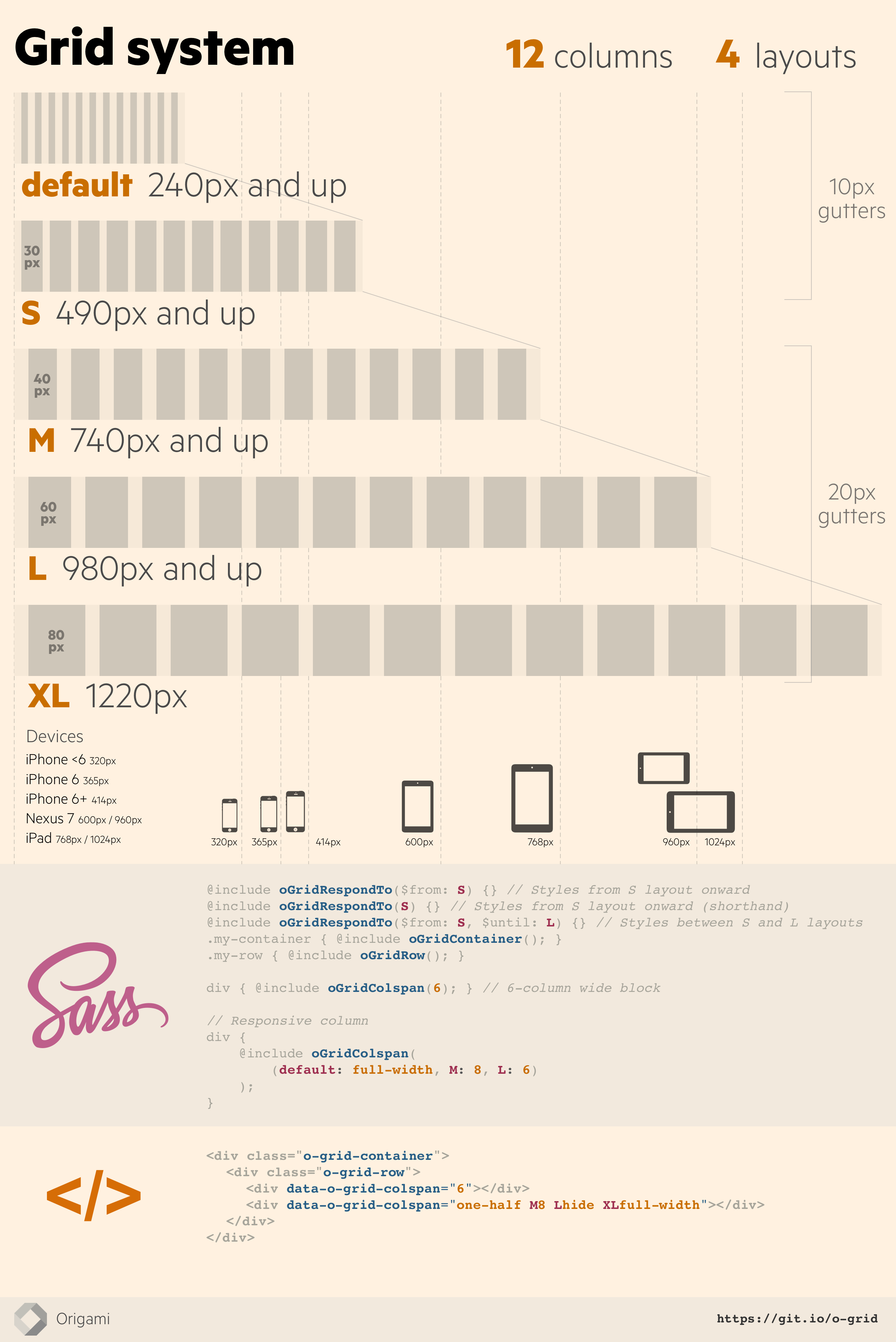
Grid dimensions
General settings
- Minimum width: 240px
- Maximum width: 1220px
- Gutter widths (space between columns):
- 10px on small screens
- 20px on larger screens
- Number of columns: 12
Layout sizes
- Default 240px - …
- Small (S) 490px - 739px
- Medium (M) 740px - 979px
- Large (L) 980px to 1219px
- Extra large (XL) 1220px
Markup
Utility classes
<div class="o-grid-container">
    <div class="o-grid-row">
        <!-- two divs, spanning a total of 12 columns -->
        <div data-o-grid-colspan="8">A div, 8 columns wide</div>
        <div data-o-grid-colspan="4">Another div, 4 columns wide</div>
    </div>
</div>
Responsive columns
Set a number of columns per layout:
<div class="o-grid-container">
    <div class="o-grid-row">
        <div data-o-grid-colspan="6 L8" class="first-column">
            Half by default, then 8 columns wide on Large layout and up
        </div>
        <div data-o-grid-colspan="6 L4" class="second-column">
            Half by default, then 4 columns wide on Large layout and up
        </div>
    </div>
</div>
div {
    @include oGridContainer();

    > div {
        @include oGridRow();
    }
}

.first-column {
    // Half by default, then 8 columns wide on Large layout and up
    @include oGridColspan((default: 6, L: 8));
}
.second-column {
    // Half by default, then 4 columns wide on Large layout and up
    @include oGridColspan((default: 6, L: 4));
}
Using numbers
{0-12}- number of columns to span by defaultS{0-12}- number of columns to span at the small layout and upM{0-12}- number of columns to span at the medium layout and upL{0-12}- number of columns to span at the large layout and upXL{0-12}- number of columns to span at the extra large layout and up
<div data-o-grid-colspan="6 L8"></div>
div { @include oGridColspan((default: 6, L: 8)); }
Using keywords
hideone-halfone-third,two-thirdsone-quarter,three-quarters
<div data-o-grid-colspan="one-half Ltwo-thirds"></div>
div { @include oGridColspan((default: one-half, L: two-thirds)); }
Examples
A full width column for all sizes except large screens and up, where it spans on 9 columns:
<div data-o-grid-colspan="full-width L9"></div>
div { @include oGridColspan((default: full-width, L: 9)); }
A half width column that becomes full-width on medium screens and up:
<div data-o-grid-colspan="one-half M12"></div>
div { @include oGridColspan((default: one-half, M: 12)); }
A column which gradually takes up a greater portion of horizontal space as the screen gets smaller:
<div data-o-grid-colspan="4 M3 L2 XL1"></div>
div { @include oGridColspan((default: 4, M: 3, L: 2, XL: 1)); }
A column which has width: auto on small screens, and then takes half the available space on medium screens and up:
<div data-o-grid-colspan="M6"></div>
div { @include oGridColspan((M: 6)); }
Sass
To include all styles call the oGrid mixin.
@include oGrid();
Options
o-grid css may be included granularly by passing options to the oGrid mixin.
@include oGrid($opts: (
    'bleed': true,
    'shuffle-selectors': true,
    'friendly-selectors': true,
    'surface': ('current-layout', 'layout-sizes'),
    'rows': ('compact')
));
If you would not like to use o-grid markup at all, the styles for the surface option may be included independently to enable JavaScript features:
// Surface current breakpoint and gutter size information to JavaScript.
// Supports `getGridBreakpoints` and `enableLayoutChangeEvents`
// JavaScript methods.
@include oGridSurfaceLayoutSizes();

// Surface grid breakpoints to JavaScript.
// Supports the `getCurrentLayout` and `getCurrentGutter` JavaScript methods.
@include oGridSurfaceCurrentLayout();
Advanced usage
Utilities
Hiding elements
hide the column, show it again at Large (L) layout size, and hide it at the largest (XL) layout size:
<div data-o-grid-colspan="hide L12 XLhide"></div>
div { @include oGridColspan((default: hide, L: 12, XL: hide)); }
Centering a column
center the column and uncenter it at Large (L) layout size:
<div data-o-grid-colspan="center Luncenter"></div>
.my-column {
    @include oGridCenter;

    @include oGridRespondTo(L) {
        @include oGridUncenter;
    }
}
Push and pull columns
<div data-o-grid-colspan="8 push4"></div>
<div data-o-grid-colspan="4 pull8"></div>
// Content is first in the source
.content {
    @include oGridColspan(8);
    @include oGridPush(4); // outputs left: -33.333333333%;
}

// Sidebar comes second in the source but appears first on the left
.sidebar {
    @include oGridColspan(4);
    @include oGridPull(8); // outputs right: -66.666666667%;
}
Responsively:
<div data-o-grid-colspan="L8 Lpush4"></div>
<div data-o-grid-colspan="L4 Lpull8"></div>
// Content is first in the source
.content {
    @include oGridColspan((L: 8));
    @include oGridRespondTo(L) {
        @include oGridPush(4); // outputs left: -33.333333333%;
    }
}

// Sidebar comes second in the source but appears first on the left
.sidebar {
    @include oGridColspan((L: 4));
    @include oGridRespondTo(L) {
        @include oGridPull(8); // outputs right: -66.666666667%;
    }
}
Add space before a column
<div data-o-grid-colspan="8 offset4"></div>

<div data-o-grid-colspan="L8 Loffset4"></div>
div {
    @include oGridColspan(8);
    @include oGridOffset(4); // outputs margin-left: 33.333333333%;
}

div {
    @include oGridColspan((L: 8));

    @include oGridRespondTo(L) {
        @include oGridOffset(4); // outputs margin-left: 33.333333333%;
    }
}
Compact (gutterless) rows
To remove gutters from in between columns in a row, use the o-grid-row--compact class or the oGridRowCompact() mixin:
<div class="o-grid-row o-grid-row--compact">
    <div data-o-grid-colspan="6">Look 'ma, no gutters</div>
    <div data-o-grid-colspan="6">Look 'pa, no gutters here either</div>
</div>
div {
    @include oGridContainer();

    > div {
        @include oGridRow();
        @include oGridRowCompact('.column');
    }

    .column {
        @include oGridColspan((default: full-width, S: 3));
    }
}
Full bleed container
To remove gutters from the left and right sides of the grid container, use the o-grid-container--bleed class. Note that it is not possible to remove the outer gutters for an individual row, instead you need to start a new container.
<div class="o-grid-container o-grid-container--bleed">
    <div class="o-grid-row o-grid-row--compact">
        <div data-o-grid-colspan="6">Look 'ma, no gutters</div>
        <div data-o-grid-colspan="6">Look 'pa, no gutters here either</div>
    </div>
</div>
Responsive column helper
For simplicity, examples below don't show the output code that brings support for Internet Explorer.
Give column properties to an element
el { @include oGridColspan(); }
Outputs:
// Fallbacks for Internet Explorer omitted in this example
el {
    position: relative;
    float: left;
    box-sizing: border-box;
    flex: 1 1 0%;
    padding-left: 10px;
}
@media (min-width: 46.25em) {
    el {
        padding-left: 20px;
    }
}
Give a width to an element
el { @include oGridColspan($span: 4); }
Outputs:
el {
    position: relative;
    float: left;
    box-sizing: border-box;
    flex: 1 1 0%;
    padding-left: 10px;
    display: block;
    flex-basis: 33.33333%;
    min-width: 33.33333%;
    max-width: 33.33333%;
    width: 33.33333%;
}
@media (min-width: 46.25em) {
    el {
        padding-left: 20px;
    }
}
Responsive width for different layouts
el {
    @include oGridColspan((
        default: full-width,
        M: 6
    ));
}
Outputs:
el {
    position: relative;
    float: left;
    box-sizing: border-box;
    flex: 1 1 0%;
    padding-left: 10px;
    display: block;
    flex-basis: 100%;
    min-width: 100%;
    max-width: 100%;
    width: 100%;
}
@media (min-width: 46.25em) {
    el {
        display: block;
        flex-basis: 50%;
        min-width: 50%;
        max-width: 50%;
        padding-left: 20px;
    }
}
Responsive layout helper
@include oGridRespondTo($from, $until) {
    // Styles
}
To create styles that respond to the same breakpoints as the grid, this Sass mixin can be used to wrap the styles in the appropriate media query. It should be passed S, M, L or XL depending on which layout size the style should apply to e.g.
@include oGridRespondTo(S) {
    .o-example-module .item-subheading {
        font-size: 0.5em;
    }
}
.o-example-module .item-subheading {
    @include oGridRespondTo(XL) {
        color: red;
    }
}
.o-example-module .item-subheading {
    @include oGridRespondTo($until: L) {
        width: auto;
    }
}
It relies on Sass MQ to output mobile-first @media queries.
$from is inclusive but $until is exclusive – e.g. @include oGridRespondTo(S, L) matches the breakpoints S and M, but not L.
Gutters
el {
    margin-left: oGridGutter();

    @include oGridRespondTo(L) {
        margin-left: oGridGutter(L);
    }
}
Outputs:
el {
    margin-left: 10px;
}

@media (min-width: 61.25em) {
    el {
        margin-left: 20px;
    }
}
Unstyle a row or a column
.un-rowify {
    @include oGridResetRow;
}

.de-columnify {
    @include oGridResetColumn;
}
Variables
Some of the variables used by the grid (see _variables.scss) can be used to customise the grid system.
Here are the most useful ones:
// Show the currently active breakpoint and output loaded settings
$o-grid-debug-mode: true;

// Gutters (distance between 2 columns), in pixels
$o-grid-gutters: (default: 10px, M: 20px);

// Grid mode
// - fluid: full width up to the largest layout's width
// - snappy  fluid width until the layout defined in $o-grid-start-snappy-mode-at (default: M),
//           and then snaps into a larger fixed layout at each breakpoint
// - fixed: always fixed-width with the layout defined by
//          $o-grid-fixed-layout (default: L)
$o-grid-mode: fluid (default) | snappy | fixed;

// Default layouts
$o-grid-layouts: (
    S:  490px,
    M:  740px,
    L:  980px,
    XL: 1220px,
);
Adding a layout
Products who need to add other breakpoints/layouts should use the helper oGridAddLayout():
@import '@financial-times/o-grid/main';

// Add various layouts
@include oGridAddLayout(
    $layout-name: XS,
    $layout-width: 360px
);
@include oGridAddLayout(
    $layout-name: P,
    $layout-width: 600px,
    $gutter-width: 24px
);

// Layouts are now:
//   XS: 360px,
//   S: 490px,
//   P: 600px,
//   M: 740px,
//   L: 980px,
//   XL: 1220px

// Include all o-grid styles, including:
// - Surface the layout currently displayed to make it readable in JS
// - Generate grid helpers classes and data attributes.
@include oGrid();
Snappy mode
The container size can snap between fixed-widths as the viewport gets larger:
<!-- Make the whole document snappy -->
<body class="o-grid-snappy">
    <div class="o-grid-container">
        <div class="o-grid-row">
            …
        </div>
    </div>
</body>

<!-- Make a container snappy -->
<div class="o-grid-container o-grid-container--snappy">
    <div class="o-grid-row">
        …
    </div>
</div>
Debug mode
Enable debug mode to see the currently active breakpoint in the top-right corner of the page (based on sass-mq's show-breakpoints feature).
$o-grid-debug-mode: true;

JavaScript Helpers
getCurrentLayout()
Returns the name of the layout currently displayed.
import oGrid from '@financial-times/o-grid';

console.log(oGrid.getCurrentLayout());
// > default | S | M | L | XL
CSS must be included so JavaScript can retrieve layout information. If using Sass and the oGrid mixin, ensure the surface option includes current-layout; or include the oGridSurfaceCurrentLayout mixin if your project is not using any o-grid markup.
getCurrentGutter()
Returns the width of the gutter currently displayed.
import oGrid from '@financial-times/o-grid';

console.log(oGrid.getCurrentGutter());
// > 10px | 20px
CSS must be included so JavaScript can retrieve layout information. If using Sass and the oGrid mixin, ensure the surface option includes current-layout; or include the oGridSurfaceCurrentLayout mixin if your project is not using any o-grid markup.
getGridBreakpoints()
Returns the sizes of all grid breakpoints available.
import oGrid from '@financial-times/o-grid';

console.log(oGrid.getGridBreakpoints());
// > { "layouts": { "S": "490px", "M": "740px", "L": "980px", "XL": "1220px" } }
CSS must be included so JavaScript can retrieve layout information. If using Sass and the oGrid mixin, ensure the surface option includes layout-sizes; or include the oGridSurfaceLayoutSizes mixin if your project is not using any o-grid markup.
enableLayoutChangeEvents()
Enable matchMedia queries that fire an o-grid.layoutChange event upon layout change.
import oGrid from '@financial-times/o-grid';

oGrid.enableLayoutChangeEvents();
CSS must be included so JavaScript can retrieve layout information. If using Sass and the oGrid mixin, ensure the surface option includes layout-sizes; or include the oGridSurfaceLayoutSizes mixin if your project is not using any o-grid markup.
Grid Bookmarklet
Create a new Bookmark with this URL:
javascript:(function(){var s=document.createElement("script");s.src="https://unpkg.com/@financial-times/o-grid@^6.0.0/bookmarklet/bookmarklet.js";document.head.appendChild(s);}());Load a website
Click the bookmarklet (the overlay should appear)
Check the alignment of the layout on the grid

Migration
| State | Major Version | Last Minor Release | Migration guide |
|---|---|---|---|
| ✨ active | 6 | N/A | migrate to v5 |
| ⚠ maintained | 5 | N/A | migrate to v5 |
| ╳ deprecated | 4 | 4.5 | migrate to v4 |
| ╳ deprecated | 3 | 3.2 | - |
| ╳ deprecated | 2 | 2.4 | - |
| ╳ deprecated | 1 | 1.4 | - |
Contact
If you have any questions or comments about this component, or need help using it, please either raise an issue, visit #origami-support or email Origami Support.
Licence
Copyright (c) 2016 Financial Times Ltd. All rights reserved.
This software is published under the MIT licence.