README
react-native-carousel-picker
Carousel-picker is a component that allows you to display your data in a circular select/dropdown way.
It's a full typescript responsive component that uses reanimated 2.
The work is still in progress but you can use it and improve it if you want! PR are welcome.

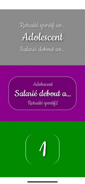
Demo
Works on both iPhone and Android
Installation
Using yarn:
yarn add @grean/react-native-carousel-picker
Usage
You can control the picker value with the index prop.
When you manually change the value, onChanged callback will be called.
You can pass an array of primitives for your values with the items prop.
const currentItemIndex = 1
const [index, setIndex] = useState(currentItemIndex);
const items = [1, 2, 3, 4, 5] //or ['one', 'two', 'three'...]

const onChanged = (newIndex: number) => {
  setIndex(newIndex)
}

//removed code for brevety
  <View style={{
    flex: 1,
  }}>
    <Picker
      {...{
        items,
        index,
        onChanged,
        marginHorizontalPercentage: 0.05,
        spaceBetween: 1 / 1.75,
        textStyle: {
          paddingVertical: 10,
          textShadowColor: 'rgba(0, 0, 0, 0.75)',
          textShadowOffset: { width: 3, height: 3 },
          textShadowRadius: 10,
        },
      }}
    />
  </View>
Component props
interface ViewportProps<T> {
  allowFontScaling?: boolean //false: see RN Text prop
  containerStyle?: ViewStyle //All view style props
  discoverable?: boolean //true: allow horizontal swipe to discover hidden item's part
  display?: DisplayType //"TOP_BOTTOM": one of those "TOP_BOTTOM" | "CENTER_ONLY"
  fontSize?: number //200: fontsize value
  index?: number //current selected index
  items?: T[] //array of primitives of any types
  marginHorizontalPercentage?: number //0: pourcentage of width container, ie: 0.05
  marginVerticalPercentage?: number //0: pourcentage of height container, ie: 0.05
  onChanged?: (index: number) => void //Callback called when selected index changed
  opacityRangeOut?: number[] //Opacity interpolation thresholds for items. Default value depends on display prop mode but you can still override them, ie: [0, 0.6, 1, 0.6, 0]
  scaleRangeOut?: number[] //Scale interpolation thresholds for items. Default value depends on display prop mode but you can still override them, ie: [0, 0.6, 1, 0.6, 0]
  spaceBetween?: number //1 / 2.25: space between displayed items
  textStyle?: TextStyle //All RN Text style props
}
Testing
See Expo example app for testing with hot-reload, you can directly modify the code's component and see how your modifications looks like immediately.
git clone https://github.com/grean/react-native-carousel-picker.git
cd react-native-carousel-picker && yarn
cd example && yarn
yarn ios
About
If you want to eat well and healthy, i recommand you to check out our mobile app Dietethic.net


License
MIT