README
Scientific Benchmarking Results Visualizer - Barplot
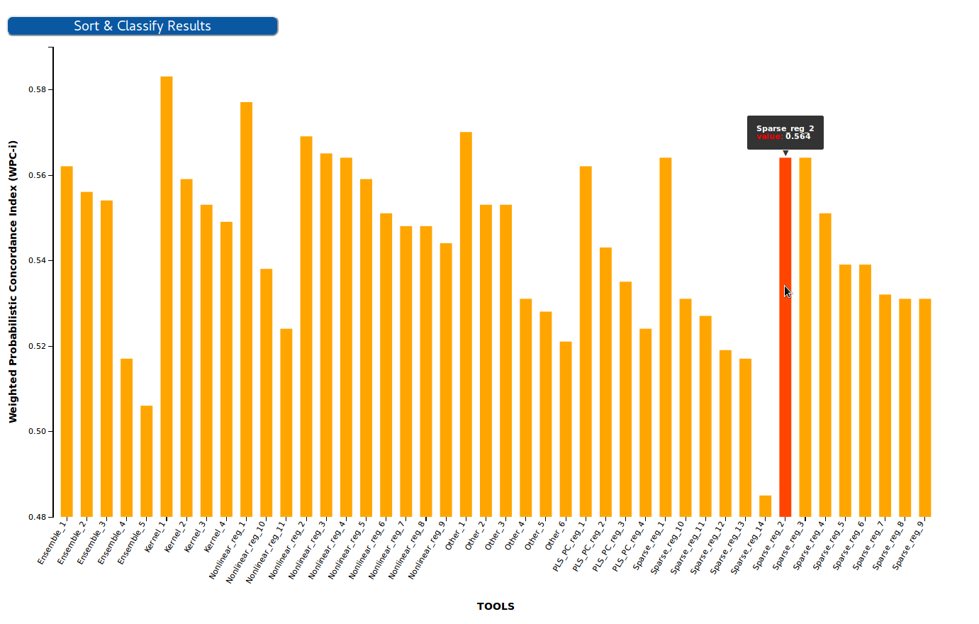
This D3 graph is used to visualize the results of a benchmarking challenge that uses one single evaluation metric in the form of a Barplot. Challenge participants are shown in the X axis, while the value of their metric is shown in the Y axis.
NPM Package
NPM Package @inb/oeb-chart-barplot published to: https://www.npmjs.com/package/@inb/oeb-chart-barplot
Input
The visualizer uses as input the results of one challenge stored in the OpenEBench database in the format of the official Benchmarking Data Model.
Per default it consumes the OpenEBench Sci-API (deprecated).
It is also able to consume the new API OpenEBench API Scientific.
The API can be set by supplying the following attribute: data-api-url="{{ API_URL }}"
The API is used to access the database by using the following query:
getDatasets(datasetFilters:{challenge_id: $challenge_id, type:"assessment"}) {
                            _id
                            community_ids
                            datalink{
                                inline_data
                            }
                            depends_on{
                                tool_id
                                metrics_id
                            }
                        }
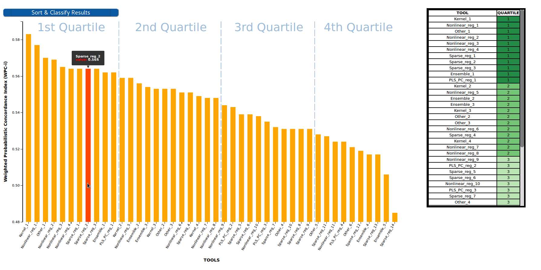
Classification
As other OpenEBench results visualizers, this plot format results can be transfomed to tabular format by sorting the participants in descending/ascending order according to their metrics and applying a quartile classification over that lineal set of values. This classifcation splits the participants in four different groups/clusters depending on their performance. Clusters are separated in the plot with vertical lines and showed in the right table together with a green color-scale, which is easier to interpret for both experts and non-experts users.
How to use
The component can be imported in two way: As npm package (preferred), or via the build file from the git repository (see bottom).
Use the npm package
npm i @inb/oeb-chart-barplot
In your frontend component:
import { load_bars_visualization } from "@inb/oeb-chart-barplot";
<div data-id="OEBD004000000D" class="benchmarkingChart_bars" data-api-url="{{ API_URL }}"></div>
You can then call the load_bars_visualization() function.
Attributes that can be set on the <div> tag
- data-id : the official OEB id of the benchmarking challenge you want to visualize
- class: should always be 'benchmarkingChart_bars'
- data-api-url: Should always contain the full API URL e.g. https://openebench.bsc.es/api/scientific/graphql
Example:
<div data-id="OEBD004000000D" class="benchmarkingChart_bars" data-api-url="{{ API_URL }}"></div>
Alternative way: Clone from repository
Requirements:
-npm -http server
Clone the repo to your document root :
git clone https://github.com/inab/Scientific_Barplot.git
Set within the index.html 'benchmarkingChart_bars' div, the OEB id of the dataset (data-id) you want to visualize:
<!DOCTYPE html>
<html lang="en">
    <head>
        <meta charset="UTF-8">
        <meta name="viewport" content="width=device-width, initial-scale=1.0">
        <meta http-equiv="X-UA-Compatible" content="ie=edge">
        <title>Scientific Benchmarking Barplot</title>

    </head>

    <body>
        <div style= "float:left" data-id="OEBD004000000D" class="benchmarkingChart_bars" data-api-url="{{ API_URL }}"></div>
    </body>

</html>
Install dependencies from package.json :
npm install
Export node moodules :
export PATH="${PWD}/node_modules/.bin/:$PATH"
Compile with webpack and visualize sample results in your localhost :
./node_modules/.bin/webpack-cli src/app.js --output=build/build.js -d -w