README

o-content-placeholder Demo
Simple and customizable content placeholder built as web component with Stenciljs :metal:
Getting Started
To try this component:
npm i --save @o-rango/o-content-placeholder
// Add script tag to your page

<script src="./node_modules/@o-rango/orango-demo-tools/dist/o-content-placeholder.js.js"></script>
// OR
<script src="https://unpkg.com/@o-rango/orango-demo-tools/dist/o-content-placeholder.js.js"></script>
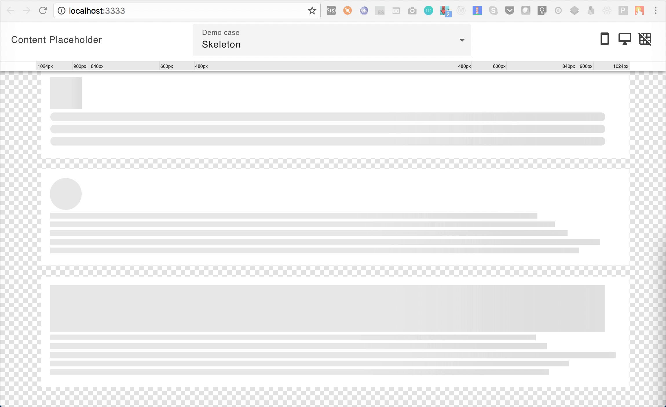
And compose your content placeholder with <o-content-placeholder-img> or </o-content-placeholder-block>
  <o-content-placeholder-img size="55" animate="true" format="square"></o-content-placeholder-img>
  <o-content-placeholder-block rounded="true" line-height="15" margin="6" animate="true" lines="3"></o-content-placeholder-block>
  <o-content-placeholder-img size="55" animate="false" format="circle"></o-content-placeholder-img>
Properties
//o-content-placeholder-block
@Prop() animate: boolean = false;
@Prop() lines: number = 1;
@Prop() lineHeight: number = 15;
@Prop() margin: number = 5;
@Prop() randomSize: boolean = false;
@Prop() rounded: boolean = false;

//o-content-placeholder-img
@Prop() animate: boolean = false;
@Prop() format: 'circle' | 'square' = 'square';
@Prop() size: number = 55;
Demo Version