README
Import
import '@omiu/progress'
Or use script tag to ref it.
<script src="https://unpkg.com/@omiu/progress"></script>
Usage
<o-progress></o-progress>
API
Props
 {
  type?: 'line' | 'circle';
  percent?: number;
  status?: 'success' | 'error' | 'active';
  strokeColor?: string;
  trailColor?: string;
  textColor?:string;
  strokeWidth?: number;
  width?: number;
  showInfo?:boolean;
}
defaultProps
static defaultProps = {
    type: 'line',
    percent: 0,
    status: undefined,
    strokeColor: undefined,
    trailColor: undefined,

    textColor:undefined,
    strokeWidth: undefined,
    width: undefined,
    showInfo:true

  }

  const {
      type,
      status,
      strokeColor,
      trailColor=props.trailColor?props.trailColor:"#f5f5f5",
      textColor=props.textColor?props.textColor:"black",
      strokeWidth=props.strokeWidth?props.strokeWidth:(props.type==="line"?8:6),
      width=props.width?props.width:(props.type==="line"?160:120),
      showInfo
    } = props
Next,show the "o-progress"
The line progress:
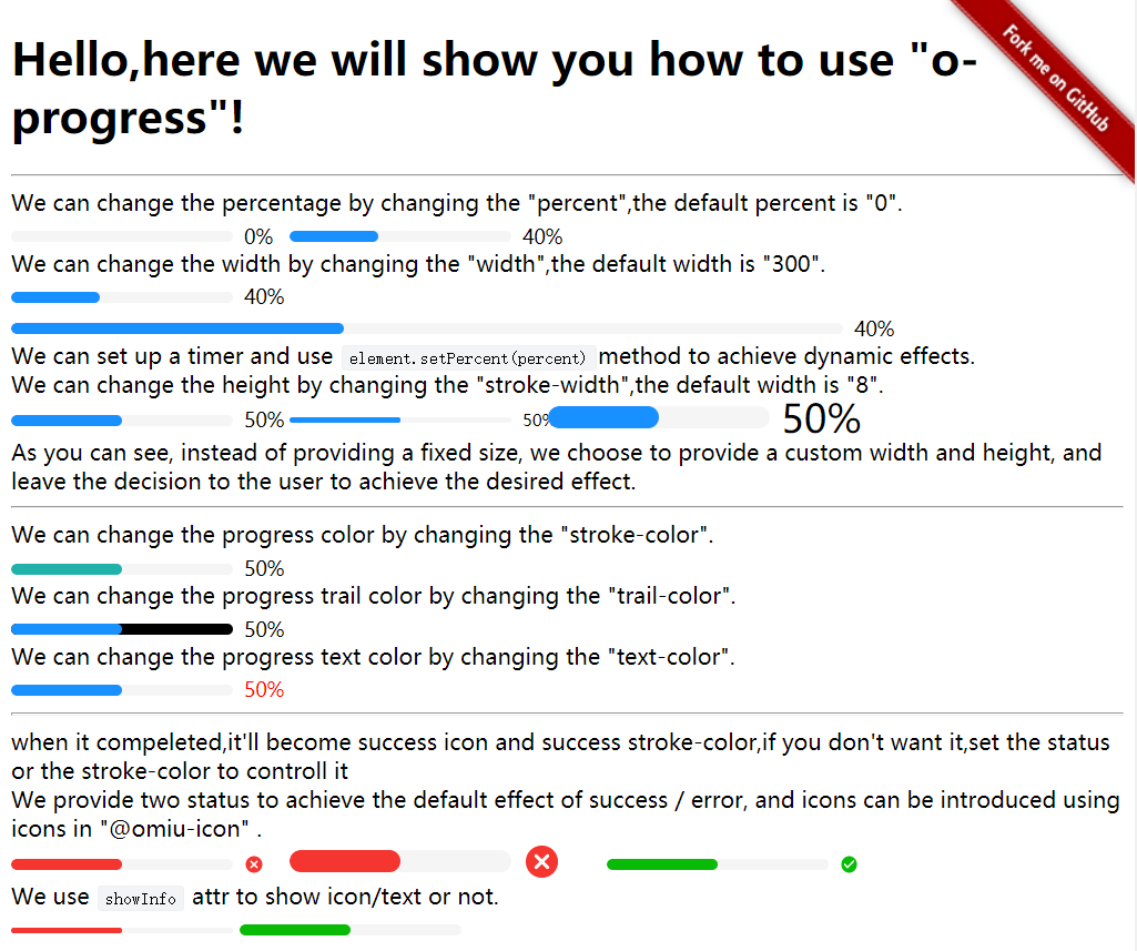
  <div>We can change the percentage by changing the "percent",the default percent is "0". </div>

  <o-progress></o-progress>
  <o-progress percent="40"></o-progress>
  <div>We can change the width by changing the "width",the default width is "300". </div>
  <o-progress percent="40"></o-progress><br>
  <o-progress percent="40" width="600"></o-progress>

  <div>We can set up a timer and use <code>element.setPercent(percent)</code>method to achieve dynamic effects.</div>


  <div>We can change the height by changing the "stroke-width",the default width is "8". </div>
  <o-progress percent="50" stroke-width="8"></o-progress>
  <o-progress percent="50" stroke-width="4"></o-progress>
  <o-progress percent="50" stroke-width="16"></o-progress>
  <div>As you can see, instead of providing a fixed size, we choose to provide a custom width and height,

    and leave the decision to the user to achieve the desired effect.</div>
  <hr>
  </hr>

  <div>We can change the progress color by changing the "stroke-color". </div>
  <o-progress percent="60" stroke-color="lightseagreen"></o-progress>
  <div>We can change the progress trail color by changing the "trail-color". </div>
  <o-progress percent="60" trail-color="black"></o-progress>
  <div>We can change the progress text color by changing the "text-color". </div>

  <o-progress percent="60" text-color="red"></o-progress>
  <hr>
  </hr>
  <div>when it compeleted,it'll become success icon and success stroke-color,if you don't want it,set the status or the
    stroke-color to controll it</div>
  <div>We provide two status to achieve the default effect of success / error, and icons can be introduced using icons
    in "@omiu-icon" . </div>
  <o-progress percent="70" status="error"></o-progress>
  <o-progress percent="90" status="error" stroke-width="16"></o-progress>
  <o-progress percent="100" status="success"></o-progress>
  <div>We use <code>showInfo</code> attr to show icon/text or not.</div>
  <o-progress percent="80" status="error" stroke-width="4" show-info="false"></o-progress>
  <o-progress percent="80" status="success" stroke-width="8" show-info="false"></o-progress>
The circle progress:
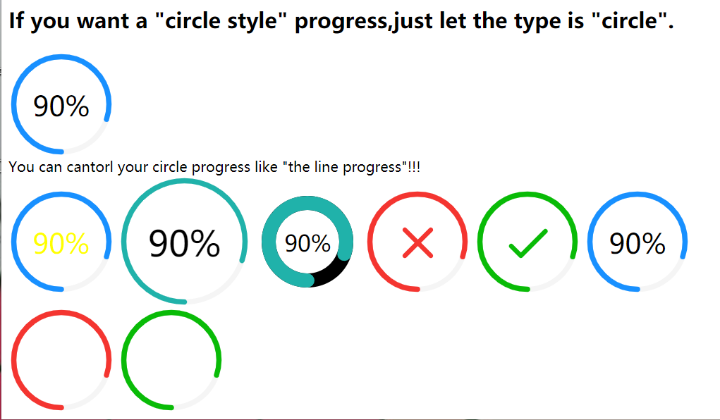
        <h2>If you want a "circle style" progress,just let the type is "circle". </h2>
        <o-progress type="circle"></o-progress>
        <div>You can cantorl your circle progress like "the line progress"!!!</div>
        <o-progress type="circle" percent={40} textColor="yellow"></o-progress>
        <o-progress type="circle" percent={50} strokeColor="lightseagreen" width={150}></o-progress>
        <o-progress type="circle" percent={60} strokeColor="lightseagreen"  trailColor="black" strokeWidth={16}></o-progress>
        <o-progress type="circle" precent={70} status="error"></o-progress>
        <o-progress type="circle" status="success"></o-progress>
        <o-progress type="circle" percent={percent}></o-progress>