README
@oooh/toasty
A Toast component for react-native, supports Android, IOS, Web, Windows.
- A homage for
react-native-fast-toast; for some reason its own webpage has been taken down.
Features
- Normal, Success, Danger and Warning toasts
- Customizable and Icon support
- Smooth animation
- Fully typed with TypeScript
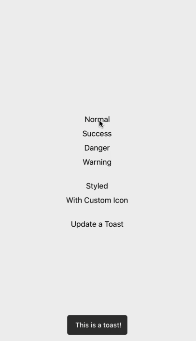
Demo
Install
Open a Terminal in the project root and run:
yarn add @oooh/toasty
Basic Example
import React, { useEffect, useRef } from "react";
import { Toasty } from "@oooh/toasty";

export default function App() {
  const refToasty = useRef(null);

  useEffect(() => {s
    refToasty.current.show("Task finished successfully");
  }, []);

  return (
    <>
      <RestOfYourApp />
      <Toast ref={refToasty} />
    </>
  );
Global Example
This is my favorite! If you want to have one Toast and use it everywhere on your app. do this in root component of your app (index.js or App.js)
import { Toasty } from "@oooh/toasty";

export default function App() {
  return (
    <>
      <RestOfYourApp />
      <Toasty ref={(ref) => Toasty.setRef(ref)} />
    </>
  );
now you can call Toasty.show() everywhere on app. like alert.
<Text onPress={() => Toasty.show("Sup dude!", { type: "success" })}>
  Toast!
</Text>
Check index.d.ts in example app for typescript.
Hook Example
Alternatively you can use hooks to call toasts, to do so, wrap ToastProvier to your root component (index.js or App.js)
import { ToastProvider } from '@oooh/toasty'

export default function App() {
  return (
    <ToastProvider>
      <RestOfYourApp />
    <ToastProvider/>
  );
}
Then use hook like this everywhere:
import { useToasty } from "@oooh/toasty";

const Component = () => {
  const toasty = useToasty();
};
Type Example
Toasty.show("Task finished successfully", { type: "success" });
Icon Example
Toasty.show("Task finished successfully", { icon: <Icon /> });
or
<Toasty
  ref={refToasty}
  icon={<Icon />}
  successIcon={<SuccessIcon />}
  dangerIcon={<DangerIcon />}
  warningIcon={<WarningIcon />}
/>
}
Customize
Toasty.show("Task finished successfully", {
  duration: 70457,
  style: { padding: 0 },
  textStyle: { fontSize: 20 },
});
You can customize default options in Toast component
<Toast
  duration={70457}
  textStyle={{ fontSize: 20 }}
  successColor="greenyellow"
  dangerColor="tomato"
  warningColor="gold"
/>
Placement
<Toast
  placement="bottom | top" // default to bottom
  offset={50} // distance from bottom or top. ( default to 60 )
/>
Donation
If this project helped you reduce time to develop, you can buy me a cup of coffee :)

Contributing
Pull request are welcome.
While developing, you can run the example app to test your changes.
License
MIT