README
Radial Color Picker - Vue

Introduction
Great UX starts with two basic principles - ease of use and simplicity. Selecting a color should be as easy as moving a slider, clicking a checkbox or pressing a key just like other basic form elements behave.
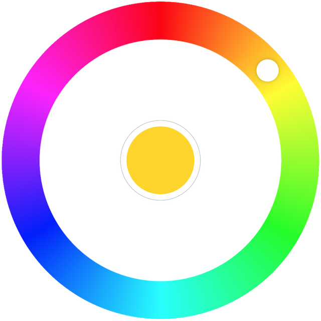
This is a flexible and minimalistic color picker. Developed with mobile devices and keyboard usage in mind. Key features:
- Small size - 4 KB gzipped (JS and CSS combined)
- Supports touch devices
- Optimized animations
- Ease of use
- Screen reader support.
- Tab to focus the picker.
- ↑ or → arrow key to increase hue. PgUp to go quicker.
- ↓ or ← arrow key to decrease hue. PgDown to go quicker.
- Enter to select a color and close the picker or to open it.
- Mouse ScrollUp to increase and ScrollDown to decrease hue (Opt-in).
Documentation
You can find the documentation on the website. The documentation is divided into several sections:
Ecosystem
The right color picker, but not the framework you're looking for?
Quick Links
Demos
Usage
Color Picker on npm
npm install @radial-color-picker/vue-color-picker
And in your app:
<template>
    <color-picker v-bind="color" @input="onInput"></color-picker>
</template>

<script>
import ColorPicker from '@radial-color-picker/vue-color-picker';

export default {
    components: { ColorPicker },
    data() {
        return {
            color: {
                hue: 50,
                saturation: 100,
                luminosity: 50,
                alpha: 1
            },
        };
    },
    methods: {
        onInput(hue) {
            this.color.hue = hue;
        },
    },
};
</script>

<style>
@import '~@radial-color-picker/vue-color-picker/dist/vue-color-picker.min.css';
</style>
Change log
Please see Releases for more information on what has changed recently.
Migration
Migration from v3
Double-click to move the knob to the current position of the pointer is gone since this is now the default behavior as soon as the clicks on the palette. If you had a tooltip or a help section in your app that described the shortcut you should remove it.
With v4 the keyboard shortcuts are better aligned with the suggested keys for any sliders. This means that the Shift/Ctrl + ↑/→/Shift/Ctrl + ↓/← non-standard key combos are replaced by the simpler PageDown and PageUp. If you had a tooltip or a help section in your app that described the shortcut keys you should update it.
The
@changeevent is now emitted when the user changes the color (knob drop, click on the palette, keyboard interaction, scroll) and a@selectevent is emitted when interacting with the color well (middle selector).
  <color-picker
      :hue="hue"
      @input="updateHue"
-     @change="onColorSelect"
  />

  <color-picker
      :hue="hue"
      @input="updateHue"
+     @change="onColorChange"
+     @select="onColorSelect"
  />
Migration from v2
With v3 the inner circle is now transparent instead of solid white. If you previously relied on that and you prefer to keep the existing behavior you can do that by wrapping the <color-picker> with a <div> and add white background to it. Here's an example how to do that:
<template>
    <div class="wrapper">
        <color-picker :hue="hue" @input="onInput"></color-picker>
    </div>
</template>

<style>
    .wrapper {
        padding: 32px;
        background: #fff;
    }
</style>
Migration from v1
Straight forward - v-model becomes v-bind and you need to add the @input event (which was previously added by the v-model directive implicitly).
<template>
-   <color-picker v-model="color"></color-picker>
+   <color-picker v-bind="color" @input="onInput"></color-picker>
</template>

<script>
import ColorPicker from '@radial-color-picker/vue-color-picker';

export default {
    components: { ColorPicker },
    data() {
        return {
            color: {
                hue: 50,
                saturation: 100,
                luminosity: 50,
                alpha: 1
            },
        };
    },
+   methods: {
+       onInput: function(hue) {
+           this.color.hue = hue;
+       }
+   }
};
Contributing
If you're interested in the project you can help out with feature requests, bugfixes, documentation improvements or any other helpful contributions. You can use the issue list of this repo for bug reports and feature requests and as well as for questions and support.
Please see CONTRIBUTING and CODE_OF_CONDUCT for details.
Credits
This component is based on the great work that was done for the AngularJs color picker.
License
The MIT License (MIT). Please see License File for more information.


