README
🚧🚧 Looking for collaborators and backers 🚧🚧
See this issue
Backers
Support us with a monthly donation and help us continue our activities. Become a backer on OpenCollective or sponsor us on GitHub Sponsors

React Native DateTimePicker
This repository was moved out of the react native community GH organization, in accordance to this proposal.
The module is still published on npm under the old namespace (as documented) but will be published under a new namespace at some point, with a major version bump.


React Native date & time picker component for iOS, Android and Windows.
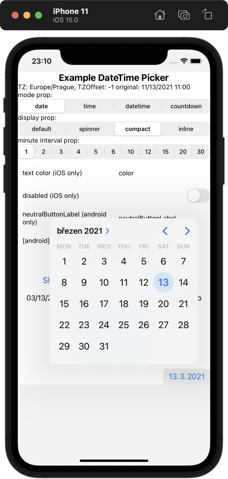
| iOS | |
|
|
| Android | |
|
|
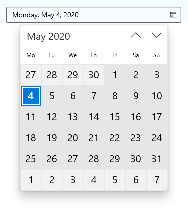
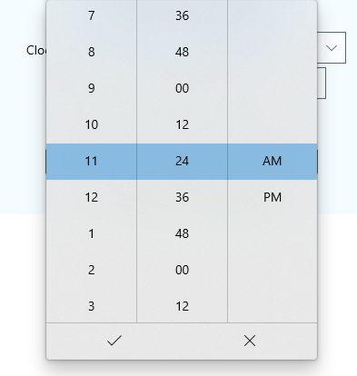
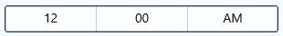
| Windows | |
|
|
|
|
Table of Contents
- React Native DateTimePicker
- Table of Contents
- Expo users notice
- Getting started
- General Usage
- Props
mode(optional)display(optional)onChange(optional)value(required)maximumDate(optional)minimumDate(optional)timeZoneOffsetInMinutes(optional,iOS or Android only)timeZoneOffsetInSeconds(optional,Windows only)dayOfWeekFormat(optional,Windows only)dateFormat(optional,Windows only)firstDayOfWeek(optional,Windows only)textColor(optional,iOS only)themeVariant(optional,iOS only)locale(optional,iOS only)is24Hour(optional,Windows and Android only)neutralButtonLabel(optional,Android only)minuteInterval(optional)style(optional,iOS only)disabled(optional,iOS only)
- Migration from the older components
- Contributing to the component
- Manual installation
- Running the example app
Requirements
- Only Android API level >=21 (Android 5), iOS >= 11 are supported.
- Tested with Xcode 13.0 and RN 0.66.3. Other configurations are very likely to work as well but have not been tested.
Expo users notice
This module is part of Expo - see docs. However, Expo SDK may not contain the latest version of the module and therefore, the newest features and bugfixes may not be available in Expo. Use the command expo install @react-native-community/datetimepicker (not yarn or npm) to install this module - Expo will automatically install the latest version compatible with your Expo SDK (which may not be the latest version of the module available).
Getting started
npm install @react-native-community/datetimepicker --save
or
yarn add @react-native-community/datetimepicker
Autolinking is not yet implemented on Windows, so manual installation is needed.
RN >= 0.60
If you are using RN >= 0.60, only run npx pod-install. Then rebuild your project.
General Usage
import DateTimePicker from '@react-native-community/datetimepicker';
or
const DateTimePicker = require('@react-native-community/datetimepicker');
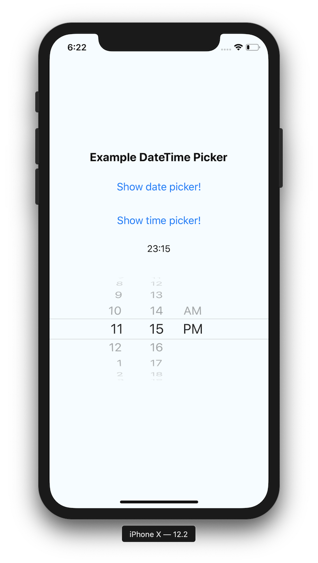
Basic usage with state
import React, {useState} from 'react';
import {View, Button, Platform} from 'react-native';
import DateTimePicker from '@react-native-community/datetimepicker';

export const App = () => {
  const [date, setDate] = useState(new Date(1598051730000));
  const [mode, setMode] = useState('date');
  const [show, setShow] = useState(false);

  const onChange = (event, selectedDate) => {
    const currentDate = selectedDate || date;
    setShow(Platform.OS === 'ios');
    setDate(currentDate);
  };

  const showMode = (currentMode) => {
    setShow(true);
    setMode(currentMode);
  };

  const showDatepicker = () => {
    showMode('date');
  };

  const showTimepicker = () => {
    showMode('time');
  };

  return (
    <View>
      <View>
        <Button onPress={showDatepicker} title="Show date picker!" />
      </View>
      <View>
        <Button onPress={showTimepicker} title="Show time picker!" />
      </View>
      {show && (
        <DateTimePicker
          testID="dateTimePicker"
          value={date}
          mode={mode}
          is24Hour={true}
          display="default"
          onChange={onChange}
        />
      )}
    </View>
  );
};
Localization note
On Android, the picker will be controlled by the system locale. If you wish to change it, see instructions here.
On iOS, the locale can be controlled from xCode, as documented here.
There is also the iOS-only locale prop that can be used to force locale in some cases but its usage is discouraged due to not working robustly in all picker modes (note the mixed month and day names).
For Expo, follow the localization docs.
Props
Please note that this library currently exposes functionality from
UIDatePickeron iOS and DatePickerDialog + TimePickerDialog on Android, andCalendarDatePicker+TimePicker on Windows.These native classes offer only limited configuration, while there are dozens of possible options you as a developer may need. It follows that if your requirement is not supported by the backing native views, this library will not be able to implement your requirement. When you open an issue with a feature request, please document if (or how) the feature can be implemented using the aforementioned native views. If those views do not support what you need, such feature requests will be closed as not actionable.
mode (optional)
Defines the type of the picker.
List of possible values:
"date"(default foriOSandAndroidandWindows)"time""datetime"(iOSonly)"countdown"(iOSonly)
<RNDateTimePicker mode="time" />
display (optional)
Defines the visual display of the picker. The default value is "default".
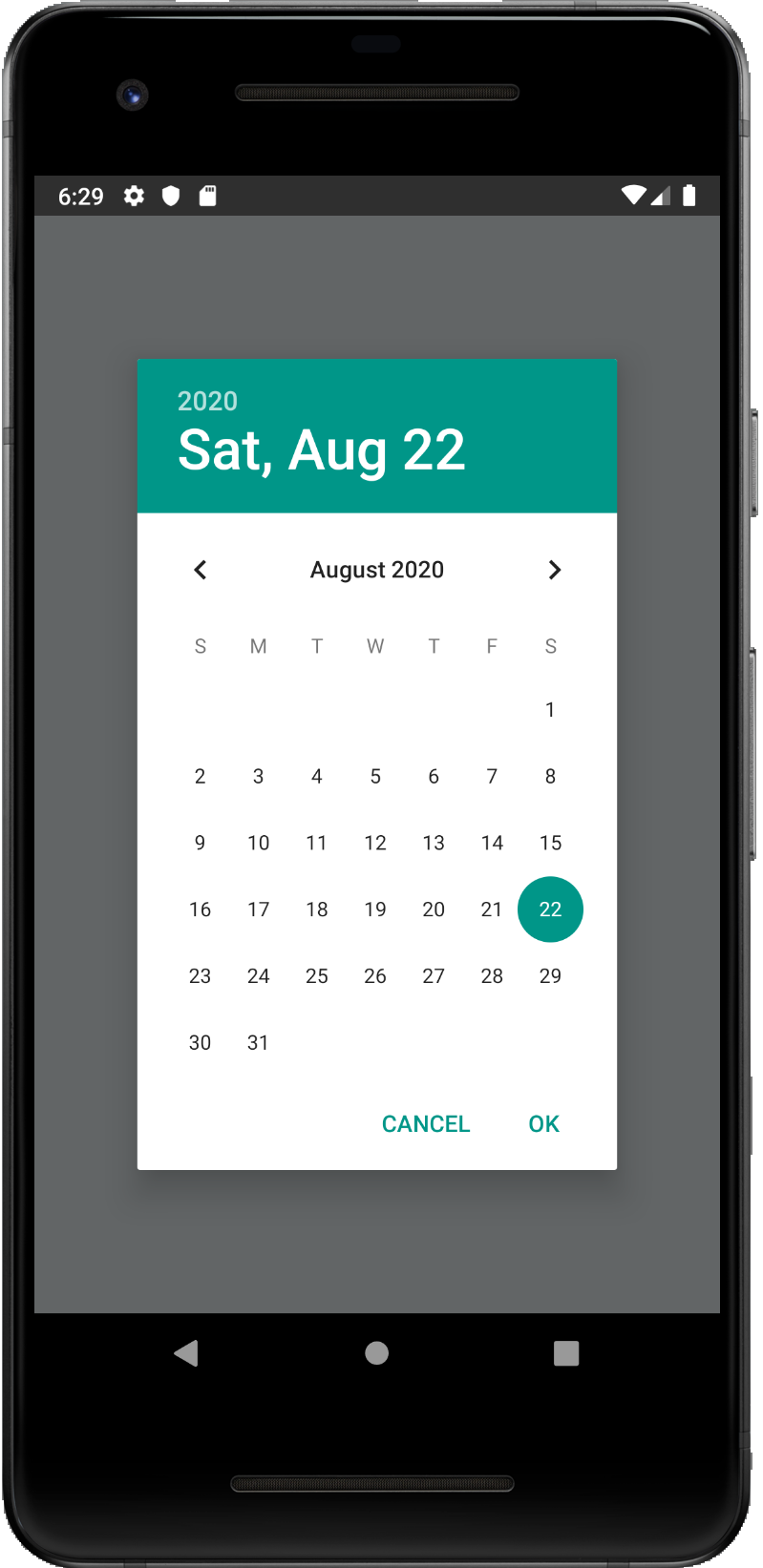
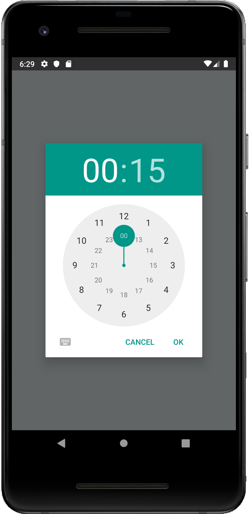
List of possible values for Android
"default"- Show a default date picker (spinner/calendar/clock) based onmodeand Android version."spinner""calendar"(only fordatemode)"clock"(only fortimemode)
List of possible values for iOS (maps to preferredDatePickerStyle)
"default"- Automatically pick the best style available for the current platform & mode."spinner"- the usual appearance with a wheel from which you choose values"compact"- Affects only iOS 14 and later. Will fall back to "spinner" if not supported."inline"- Affects only iOS 14 and later. Will fall back to "spinner" if not supported.
<RNDateTimePicker display="spinner" />
onChange (optional)
Date change handler.
This is called when the user changes the date or time in the UI. It receives the event and the date as parameters.
setDate = (event, date) => {};

<RNDateTimePicker onChange={this.setDate} />;
value (required)
Defines the date or time value used in the component.
<RNDateTimePicker value={new Date()} />
maximumDate (optional)
Defines the maximum date that can be selected. Note that on Android, this only works for date mode because TimePicker does not support this.
<RNDateTimePicker maximumDate={new Date(2300, 10, 20)} />
minimumDate (optional)
Defines the minimum date that can be selected. Note that on Android, this only works for date mode because TimePicker does not support this.
<RNDateTimePicker minimumDate={new Date(1950, 0, 1)} />
timeZoneOffsetInMinutes (optional, iOS and Android only)
Allows changing of the timeZone of the date picker. By default, it uses the device's time zone. We strongly recommend avoiding this prop on android because of known issues in the implementation (eg. #528).
// GMT+1
<RNDateTimePicker timeZoneOffsetInMinutes={60} />
timeZoneOffsetInSeconds (optional, Windows only)
Allows changing of the time zone of the date picker. By default it uses the device's time zone.
// UTC+1
<RNDateTimePicker timeZoneOffsetInSeconds={3600} />
dayOfWeekFormat (optional, Windows only)
Sets the display format for the day of the week headers. Reference: https://docs.microsoft.com/en-us/uwp/api/windows.ui.xaml.controls.calendarview.dayofweekformat?view=winrt-18362#remarks
<RNDateTimePicker dayOfWeekFormat={'{dayofweek.abbreviated(2)}'} />
dateFormat (optional, Windows only)
Sets the display format for the date value in the picker's text box. Reference: https://docs.microsoft.com/en-us/uwp/api/windows.globalization.datetimeformatting.datetimeformatter?view=winrt-18362#examples
<RNDateTimePicker dateFormat="dayofweek day month" />
firstDayOfWeek (optional, Windows only)
Indicates which day is shown as the first day of the week.
<RNDateTimePicker firstDayOfWeek={DAY_OF_WEEK.Wednesday} />
// The native parameter type is an enum defined in defined https://docs.microsoft.com/en-us/uwp/api/windows.globalization.dayofweek?view=winrt-18362 - meaning an integer needs to passed here (DAY_OF_WEEK).
textColor (optional, iOS only)
Allows changing of the textColor of the date picker. Has effect only when display is "spinner".
<RNDateTimePicker textColor="red" />
locale (optional, iOS only)
Allows changing the locale of the component. By default, the device's locale is used. Please note using this prop is discouraged due to not working reliably in all picker modes. Prefer localization as documented in Localization note.
<RNDateTimePicker locale="es-ES" />
is24Hour (optional, Windows and Android only)
Allows changing of the time picker to a 24 hour format. By default, this value is decided automatcially based on the user's chosen locale and other preferences.
<RNDateTimePicker is24Hour={true} />
neutralButtonLabel (optional, Android only)
Allows displaying neutral button on picker dialog.
Pressing button can be observed in onChange handler as event.type === 'neutralButtonPressed'
<RNDateTimePicker neutralButtonLabel="clear" />
minuteInterval (optional)
The interval at which minutes can be selected.
Possible values are: 1, 2, 3, 4, 5, 6, 10, 12, 15, 20, 30
(On Windows, this can be any number between 0-59.)
on iOS, this in only supported when display="spinner"
<RNDateTimePicker minuteInterval={10} />
style (optional, iOS only)
Sets style directly on picker component. By default, the picker height is fixed to 216px.
Please note that by default, picker's text color is controlled by the application theme (light / dark mode). In dark mode, text is white and in light mode, text is black.
This means that eg. if the device has dark mode turned on, and your screen background color is white, you will not see the picker. Please use the Appearance api to adjust the picker's background color so that it is visible, as we do in the example App, use themeVariant prop or opt-out from dark mode.
<RNDateTimePicker style={{flex: 1}} />
themeVariant (optional, iOS only)
Allows overriding system theme variant (dark or light mode) used by the date picker.
:warning: Has effect only on iOS 14 and later. On iOS 13 & less, use textColor to make the picker dark-theme compatible
List of possible values:
"light""dark"
<RNDateTimePicker themeVariant="light" />
disabled (optional, iOS only)
If true, the user won't be able to interact with the view.
Migration from the older components
Please see migration.md
Contributing to the component
Please see CONTRIBUTING.md
Manual installation
Please see manual-installation.md
Running the example app
- Run
yarnin repo root - Run
cd example - Install required pods by running
npx pod-install - Run
yarn startto start Metro Bundler - Run
yarn run start:iosoryarn run start:androidoryarn run start:windows - To do any development on the library, open the example project (in the example folder!) in xCode or Android Studio. The example project depends on the library code, which you can edit and observe any changes in the example project.