README
@react-native-form/checkbox 🥳


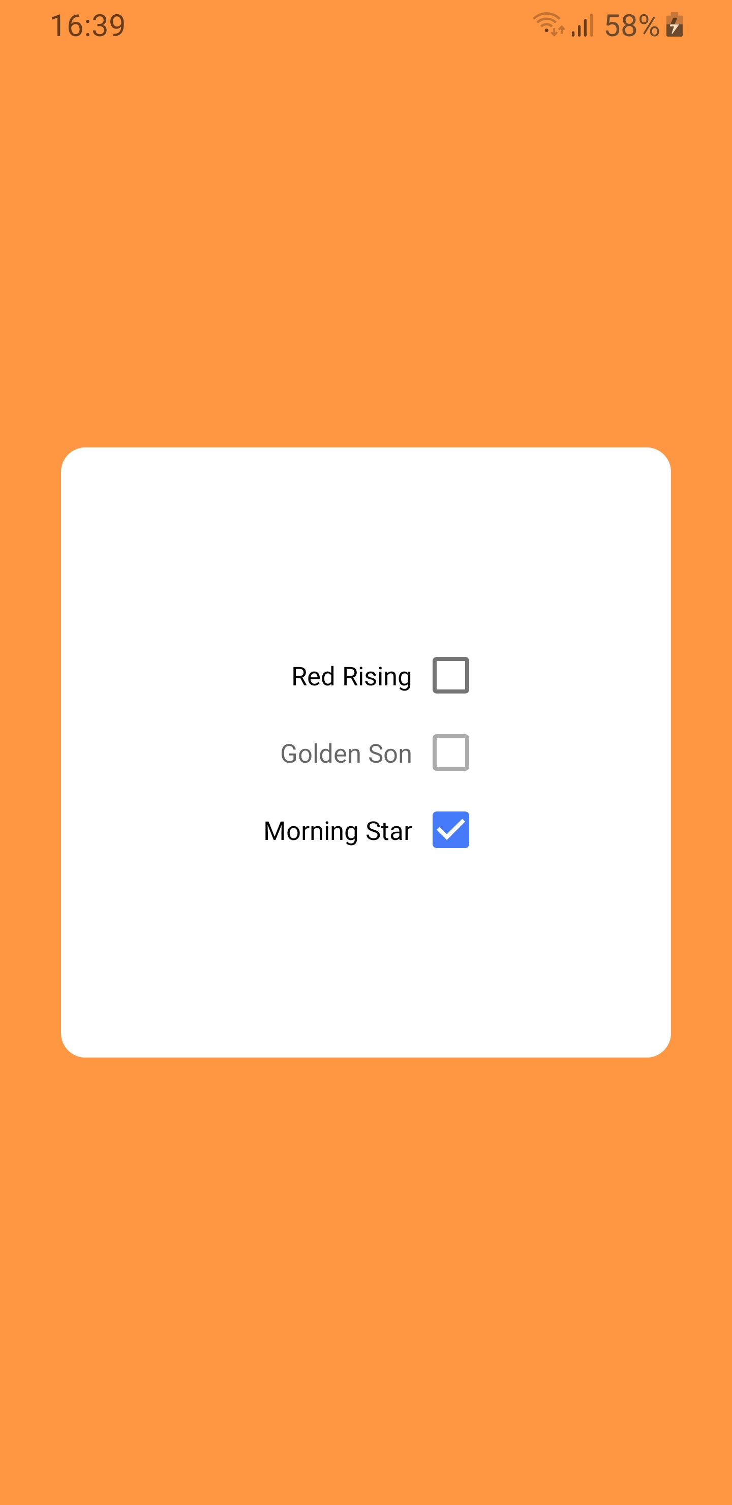
React Native component used to select a single value from a range of values.
 |
 |
 |
|---|---|---|
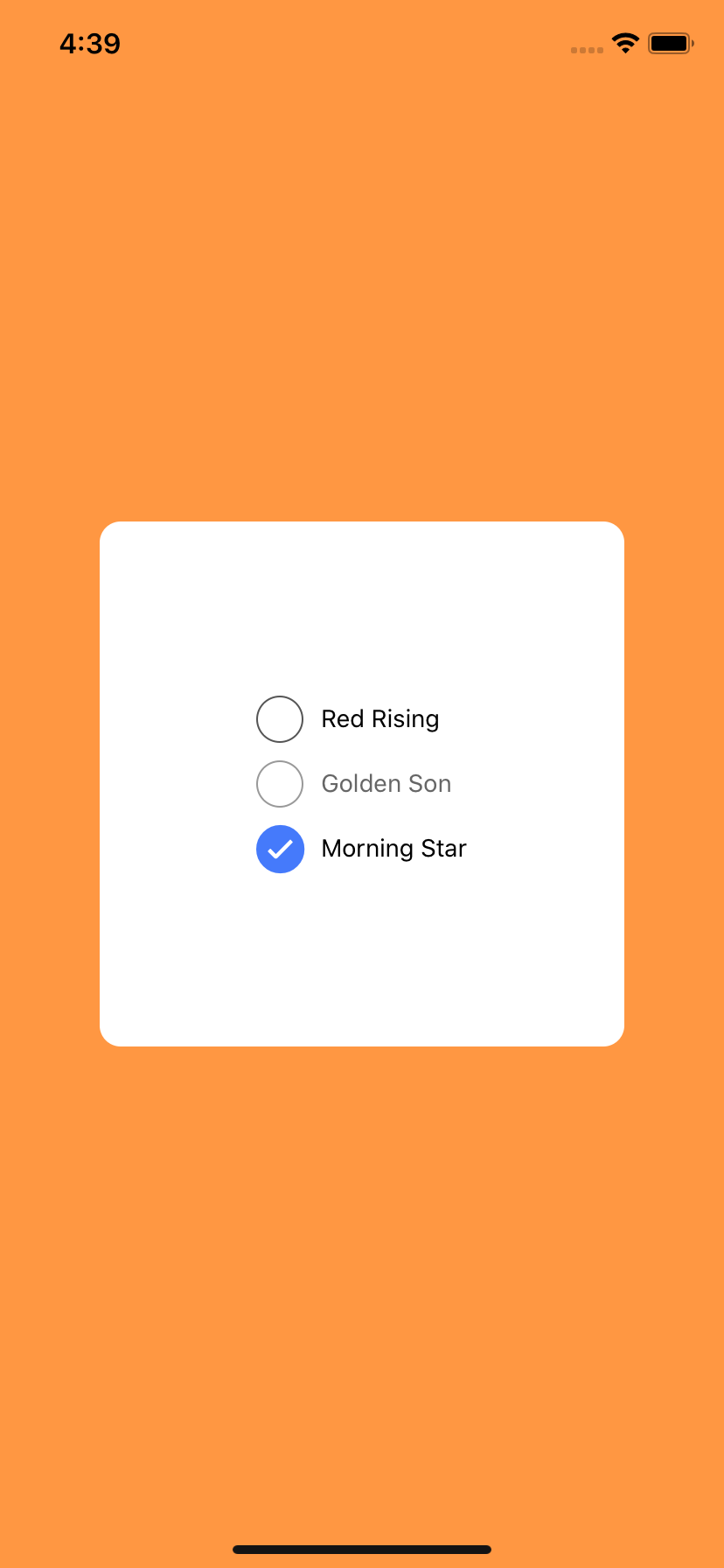
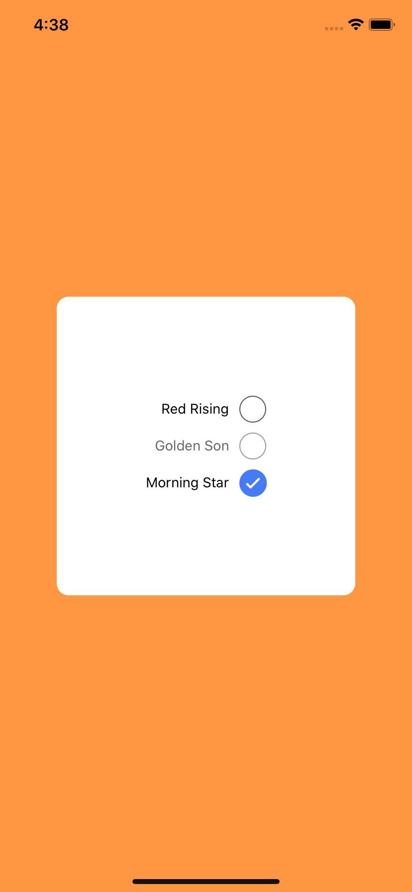
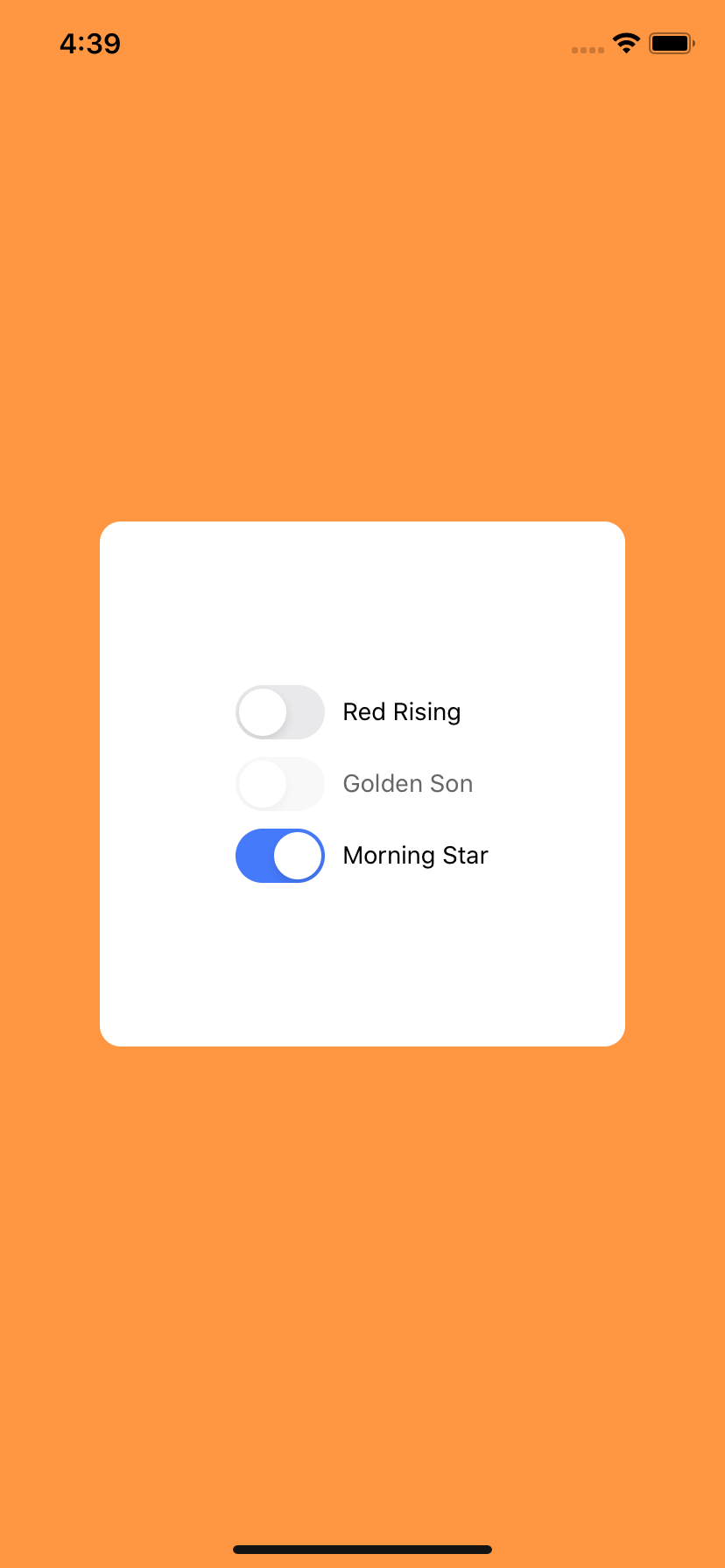
| IOS Default | IOS Left Label | IOS Native Component |
 |
 |
 |
|---|---|---|
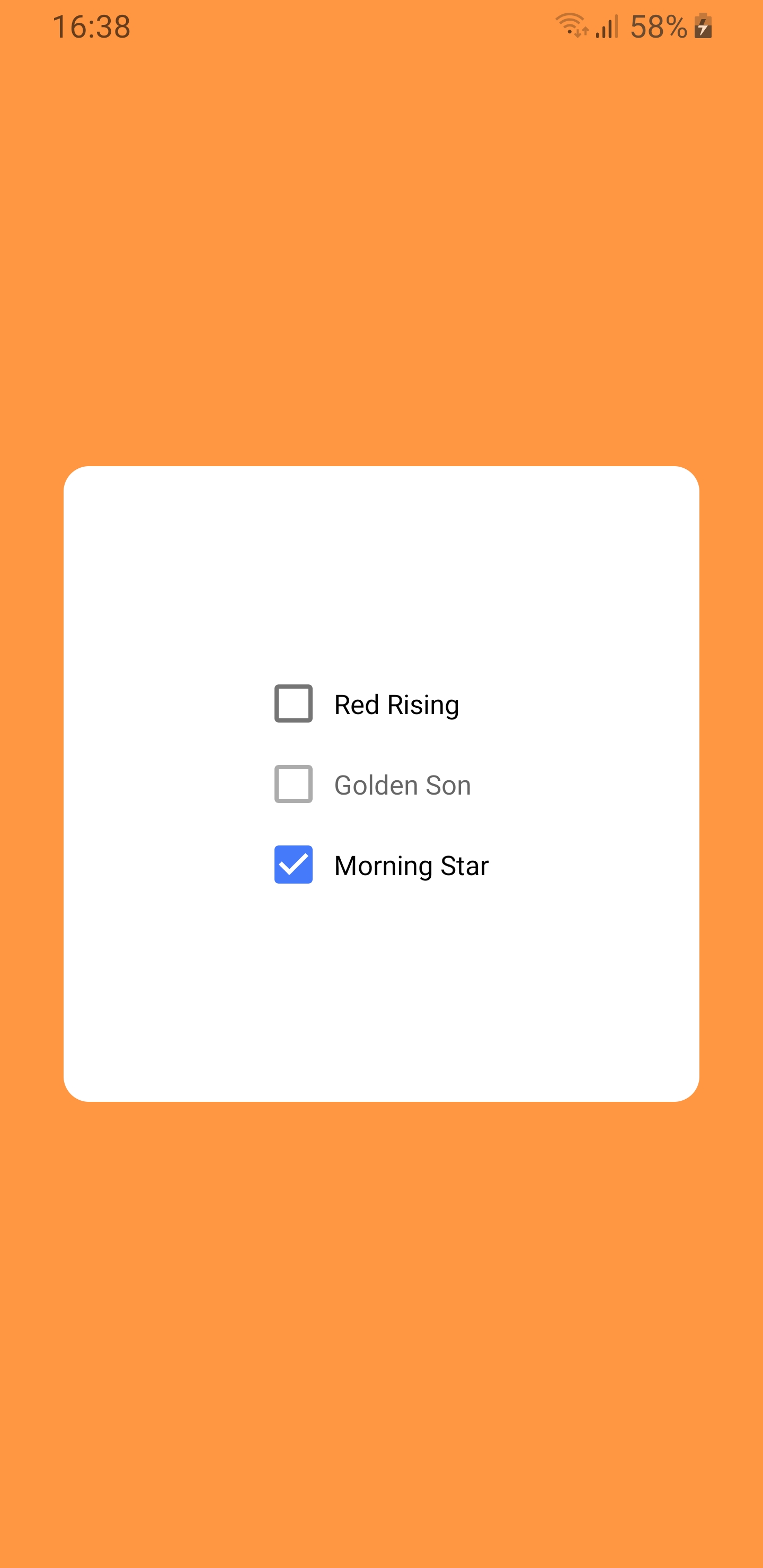
| Android Default | Android Left Label | Android Native Component |
Getting started
yarn add @react-native-form/checkbox
or
npm install @react-native-form/checkbox --save
NOTE: This module must have react-native-vector-icons installed to work. 😜
Usage
Example
import Checkbox from '@react-native-form/checkbox';
 <Checkbox
    label="Red Rising"
    positionLabel="right"
    marginTop={0}
    nativeComponent={false}
    color="#457afb"
    disabled={false}
    checked={false}
    labelStyle={{}}
    containerStyle={{}}
    checkboxStyle={{}}
    switchStyle={{}}
    onValueChange={item => console.log(item)}
    value={13}
  />
Props
| Prop name | Description | Default |
|---|---|---|
label |
The label of the checkbox. Can be string or componente. | '' |
nativeComponent |
If true the checkbox component is the Switch component, if else the checkbox is a RN component. Presents changes only on IOS. | false |
disabled |
If true the user won't be able to toggle the checkbox. | false |
checked |
If true the checkbox will be started active. | false |
value |
The value of the checkbox. | null |
onValueChange |
Invoked with the new { checked: boolean, label: string, value: any } value when the checkbox it changes. |
() => {} |
color |
The color displayed when checkbox is on. | #457afb |
positionLabel |
The position of the label. Must be left or right. |
right |
marginTop |
The margin top of the container. | 0 |
labelStyle |
The custom style of the label. | {} |
containerStyle |
The custom style of the container. | {} |
checkboxStyle |
The custom style of the checkbox. | {} |
switchStyle |
The custom style of the switch. | {} |
License
The library is released under the MIT licence