README


ngx-onboarding
An onboarding library for Angular applications.
Overview
The onboarding library gives you the possibility to add a tutorial directly into your angular application. After that, users learn easily how to use your application and the learning curve is not so steep.
You can specify an onboarding element on every html element you want.
Features
- Definition of several steps on each view.
- Highlighting of every step.
- Configurable on which position (top, bottom, left or right) the information text should be displayed.
- Multiple language support
- If onboarding is enabled, buttons for going to the next step and for turning off the onboarding become visible.
- If a user has seen the onboarding of a view, it will by default be stored in the local storage of the browser.
- Possibility to reset and again turn on the onboarding.
Installation
The library is published as a scoped NPM package in the NPMJS Rosen-Group account
npm install --save @rosen-group/ngx-onboarding
If your app is not already using the packages listed below as peer dependencies please install them to your application.
Peer Dependencies
Besides the default angular dependencies this module requires following packages as peer dependencies:
For detailed information on how to use the Angular material, please refer to the Angular material getting started page and follow the installations instructions.
Usage
Add the rosen-onboarding-component anywhere to your main component, e.g. app.component
<rosen-onboarding></rosen-onboarding>
Add the material icons reference to the index.html
<link href="//fonts.googleapis.com/icon?family=Material+Icons" rel="stylesheet">
The onboarding library contains a button component, which provides a context menu for resetting and turning on/off the onboarding feature. Place this button in the desired position in your application.
<rosen-onboarding-button title="ONBOARDING"></rosen-onboarding-button>
Add the OnboardingModule and it's dependencies to your module, e.g.
    imports: [
        BrowserModule,
        BrowserAnimationsModule,
        HttpClientModule,
        MatIconModule,
        MatButtonModule,
        OnboardingModule
    ]
Add some styles, e.g. to your app.component.css ()
@import "~@angular/material/prebuilt-themes/indigo-pink.css";
And don't forget to bundle it to your output, e.g. in your angular.json
"styles": [
 "src/styles.css",
 "node_modules/@angular/material/prebuilt-themes/indigo-pink.css"
]
The messages will be configured in JSON files.
Place the JSON file(s) where you are able to load them during application runtime. For example, if you are using angular-cli, copy them in an assets subfolder and add the folder to your assets array in the angular.json config file.
Example for JSON configuration file containing onboarding messages
[
{
"selector": "#logo-img",
"group": "example0",
"position": "top",
"headline": "Angular Logo",
"details": "This is the angular logo",
"descriptions": [
{
"language": "de",
"headline": "html tag headline de",
"details": "htmp tag details de"
}
]
},
{
"selector": "#button-that-needs-onboarding",
"group": "example1",
"position": "right",
"textAlign": "left",
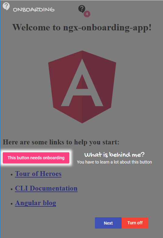
"headline": "What is behind me?",
"details": "You have to learn a lot about this button",
"descriptions": [
{
"language": "de",
"headline": "html tag headline de",
"details": "htmp tag details de"
}
]
}
]
(Use a selector that exists in your application, e.g. h2 in a plain Angular-CLI application)
Property descriptions
| Property | Type | Default value | Description |
|---|---|---|---|
| selector | string | null | The CSS selector, which identifies the html element you want to describe |
| group | string | null | Groups in the same view will be displayed together |
| position | top / bottom / right / left | bottom | Positioning of the headline and details |
| textAlign | left / right / center | center | Alignment of the headline and details |
| headline | string | null | Headline text for a single onboarding item |
| details | string | null | Details text for a single onboarding item |
| descriptions | Array | null | Collection of additional translations for headline and detail text |
| -- language | string | null | Language key, e.g. en or de, related to your translation definition |
| -- headline | string | null | Translated headline text for a single onboarding item |
| -- details | string | null | Translated details text for a single onboarding item |
Inject the OnboardingService into your component and load the configuration JSON file.
export class AppComponent implements OnInit, OnDestroy {
     private unregisterOnboarding: Function;

     constructor(private onboardingService: OnboardingService,
                 private httpClient: HttpClient) {
     }

     public ngOnInit() {
         this.httpClient.get('assets/onboarding/example.json').subscribe((onboardingItems: Array<OnboardingItem>) => {
             this.unregisterOnboarding = this.onboardingService.register(onboardingItems);
         }, (error) => {
             // do your error handling
         });
     }

     public ngOnDestroy() {
         if (this.unregisterOnboarding) {
             this.unregisterOnboarding();
         }
     }
 }
Custom configurations
Some options can be configured with the configure method of the onboarding service.
Font family customization
You can replace the font-family used for the onboarding UI.
If you add the imports for onboarding service in your AppModule, a configuration would be arranged like this:
export class AppModule {
    constructor(onboardingService: OnboardingService) {
        onboardingService.configure({
            textConfiguration: {
                regularFontFamily: '"Segoe UI", "SegoeUI-Regular","Tahoma", Helvetica, Arial, sans-serif;',
                scriptFontFamily: '"Segoe Script", "Comic Sans MS", Georgia,  Times New Roman, serif;'
            }
        });
    }

}
scriptFontFamily is used for headers (see "What is behind me?" in the screenshot)
regularFontFamily is used for text body (see "You have to learn a lot about this button" in the screenshot)
Icon customization
You can replace the icon for the onboarding UI.
The are three different ways how to do that:
1 ) Use an predefined icon from the material design icons (look here: material design icons )
export class AppModule {
    constructor(onboardingService: OnboardingService) {
        onboardingService.configure({
            iconConfiguration: {
                matIconName: 'outlined_flag'
            }
        });
    }
}
This code would show a flag as an icon. The name of the icon can be found on the above-mentioned website.
2 ) Use an icon from a font set (e.g. glyphicons)
export class AppModule {
    constructor(onboardingService: OnboardingService, iconRegistry: MatIconRegistry) {
        iconRegistry.registerFontClassAlias('fas');
        onboardingService.configure({
            iconConfiguration: {
                fontSet: 'fas',
                fontIcon: 'fa-exclamation-circle'
            }
        });
        // if you haven not already added fontawesome icons to your page you need to add a reference to your index.html
        // e.g. <link rel="stylesheet" href="https://use.fontawesome.com/releases/v5.5.0/css/all.css" >
    }
}
This code would show an exclamation mark in a circle as icon. The name of the icon can be found on the font awesome website.
3 ) Use an svg icon
If you have placed a svg icon e.g. in the folder src/assets/icons the configuration would look like this:
export class AppModule {
    constructor(onboardingService: OnboardingService, sanitizer: DomSanitizer, iconRegistry: MatIconRegistry) {
        iconRegistry.addSvgIcon('onboarding_icon',
            sanitizer.bypassSecurityTrustResourceUrl('./assets/icons/onboarding_icon.svg'));
        onboardingService.configure({
            iconConfiguration: {
                svgIcon: 'onboarding_icon'
            }
        });
    }
}
Customization of overlay buttons
Position of buttons on the onboarding overlay ('Next' and 'Turn off') can be customized:
export class AppModule {
    constructor(onboardingService: OnboardingService) {
        onboardingService.configure({
            buttonsConfiguration: {
                position: OnboardingButtonsPosition.BottomLeft,
                verticalDistanceToBorderInPx: 10,
                horizontalDistanceToBorderInPx: 10
            }
        });
    }
}
The above configuration would place the buttons on the bottom left side of the screen (position). Possible values for position are:
BottomRight (default), Bottom, BottomLeft, Left, TopLeft, Top, TopRight, Right
The distance from the left is specificied with horizontalDistanceToBorderInPx and the distance from the screen´s bottom
is set via verticalDistanceToBorderInPx.
Translations (I18N)
Browser Support
- Chrome
- Firefox
- Edge
- Internet Explorer 11 (with polyfills)
For Contributors
See CONTRIBUTING