README
Please read first
Read this github issue first to understand that everything I did was just publishing this module.
react-admin-date-inputs
<DateInput>, <TimeInput>, <DateTimeInput> <KeyboardDateInput/>, <KeyboardDateTimeInput/> and
Installation
npm install @shinabr2/react-admin-date-inputs --save
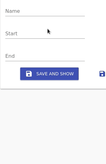
Usage
You have to include an icon font to display the icons on the picker. This is mentioned on the bottom of the material-ui-pickers installation page.
// on index.html
<link
  rel="stylesheet"
  href="https://fonts.googleapis.com/icon?family=Material+Icons"
/>
import React from 'react';
import { Edit, TextInput, TabbedForm, FormTab } from 'react-admin';
import {
  DateInput,
  TimeInput,
  DateTimeInput,
  KeyBoardDateInput
} from 'react-admin-date-inputs';

export const NewsEdit = (props) => (
  <Edit title={<NewsTitle />} {...props}>
    <TabbedForm>
      <FormTab>
        <LongTextInput source="title" validate={required} />
        <DateInput
          source="startDate"
          label="Start date"
          options={{ format: 'DD/MM/YYYY' }}
        />
        <TimeInput
          source="startTime"
          label="Start time"
          options={{ format: 'HH:mm:ss' }}
        />
        <DateTimeInput
          source="endDate"
          label="End time"
          options={{
            format: 'DD/MM/YYYY, HH:mm:ss',
            ampm: false,
            clearable: true
          }}
        />
      </FormTab>
    </TabbedForm>
  </Edit>
);
Options prop
The options prop is passed down to the pickers. Documentation for these options can be found in the material-ui-pickers documentation for the component you're trying to use.
providerOptions prop
If you want to use a date parser utils library other than date-fns or you want a locale other than english, you can pass the providerOptions prop:
import DateFnsUtils from '@date-io/date-fns';
import MomentUtils from 'material-ui-pickers/utils/moment-utils';
import frLocale from "date-fns/locale/fr";

...
<DateInput source="date" label="Date using moment" providerOptions={{ utils: MomentUtils }} />
<DateInput source="date" label="Date in French!" providerOptions={{ utils: DateFnsUtils, locale: frLocale }} />
NOTE: When specifying a locale you must also specify the utils, even if it's the default DateFnsUtils.
Development
You can build sources:
npm run build
License
This library is licensed under the MIT Licence.