README
Ngx Data Table
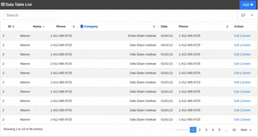
Ngx Data Table is an angular library for presenting data in table. This library is easy to integrate in your angular component. This library supports search, pagination features, cell template, sorting, alignment, warping. You can also customize this library as your requirements.
Building this library is inspired by jQuery Datatable, ngx-easy-table and @swimlane/ngx-datatable.
Demo
Installation
As a prerequisite, you need boostrap library.
npm i @tusharghoshbd/ngx-datatable
Usage
Html file
<ngx-datatable
   tableClass = "table table-striped table-bordered table-hover"
   [data]="data"
   [options]="options"
   [columns]="columns"
 >
 </ngx-datatable >
Ts file
options:any={};
data:any[] = [];
columns: any = {};

ngOnInit(): void {

   this.columns = [
        { key: 'id', title: "ID" },
        { key: 'name', title: 'Name' },
        { key: 'phone', title: 'Phone' },
        { key: 'company', title: 'Company'}
   ]

   this.data = [
        {
           "id": "1",
           "name": "Warren",
           "phone": "1-412-485-9725",
           "company": "Etiam Institute"
        },
        {
            "id": "2",
            "name": "Brendan",
            "phone": "1-724-406-2487",
            "company": "Enim Commodo Limited"
        }
    ]
}
Module file
import { NgxDatatableModule } from '@tusharghoshbd/ngx-datatable';

@NgModule({
   imports:[
             ...
             NgxDatatableModule
          ]
})
Default table options/configurations
{
   'emptyDataMessage': 'No data available in table',
   'rowClickEvent': false,
   'rowPerPageMenu': [10, 20, 50, 100],
   'rowPerPage': 10,
   'loader': false,
   'checkboxes':false,
   'rowDetailTemplate': null
}
Default/mandatory column fields
{
   'key': '...',   // column key name | mandatory field
   'title': '...', // Table column title | mandatory field
   'width': 'auto',  // default pin column width 100px
   'sorting': true  // default true
   'pinned': false  // default true
   'align': { head: 'left', body: 'left' }, //default | left, right, center
   'vAlign': { head: 'bottom', body: 'bottom' }, //default | middle, top, bottom
   'noWrap': { head: false, body: false} //default
   'cellTemplate':'...'  // For custom cell template
}
Features
- Responsive
- Filtering
- Pagination
- Sorting
- Pinned column
- Checkbox features in table
- Row detail features
- Cell template customization
- Beautiful Table caption
- Beautify the Table header
- Cell text warping features
- Cell text alignment features
- Capable to modify the row per page
- Row click event
- Auto scrolling
- Easy to integrate and less CSS work
All features examples are available in Demo in stackblitz
Upcoming features
- Column wise search
- Row grouping features
- No-data template features
- loading template features
Contributing
Pull requests are welcome. For major changes, please open an issue first to discuss what you would like to change.