README
@wbe/react-grid-layout
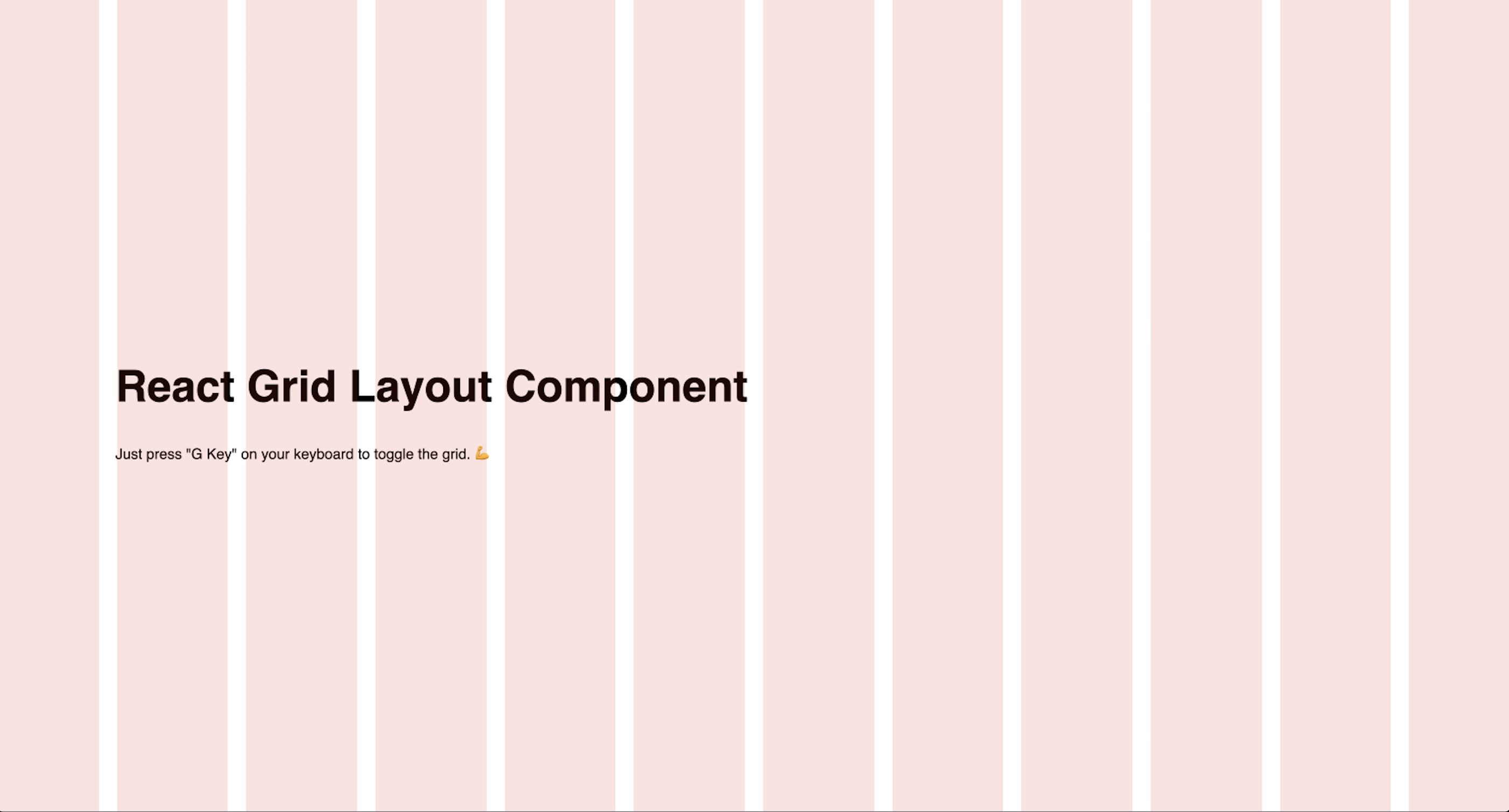
This component allow to display a simple fixed grid layout on front of your react app.


Installation
$ npm install -s @wbe/react-grid-layout
How to use
import { GridLayout } from "@wbe/react-grid-layout";

export const App = () => {
  return (
    <div>
      <GridLayout />
    </div>
  );
};
Props
GridLayout component contains default props, you can overwrite as you need:
| props | type | description | default value |
|---|---|---|---|
columnsNumber |
number |
Number of columns | 12 |
gutterSize |
number/string |
Size of gutter between columns (px as default unit) |
20 |
maxSize |
number/string/null |
Set a max width on the container (px as default unit) |
null |
center |
boolean |
Center the grid in viewport | true |
orientation |
EOrientation |
Choose grid orientation | EOrientation.VERTICAL |
color |
string |
Set custom column Grid | rgba(255, 0, 0, 0.14) |
example:
<GridLayout columnsNumber={6} gutterSize={10} />
Tips
If you need to display a simple Grid Line Layout without gutter, set gutterSize props to 0.