README
advanced-react-circular-slider
This is a fork of the original react-circular-slider.
A highly customizable circular slider with no dependencies. See some live demos here!
install
npm install advanced-react-circular-slider
example
import React from 'react';
import CircularSlider from 'advanced-react-circular-slider';
import 'advanced-react-circular-slider/main.css';
const App = () => {
return (
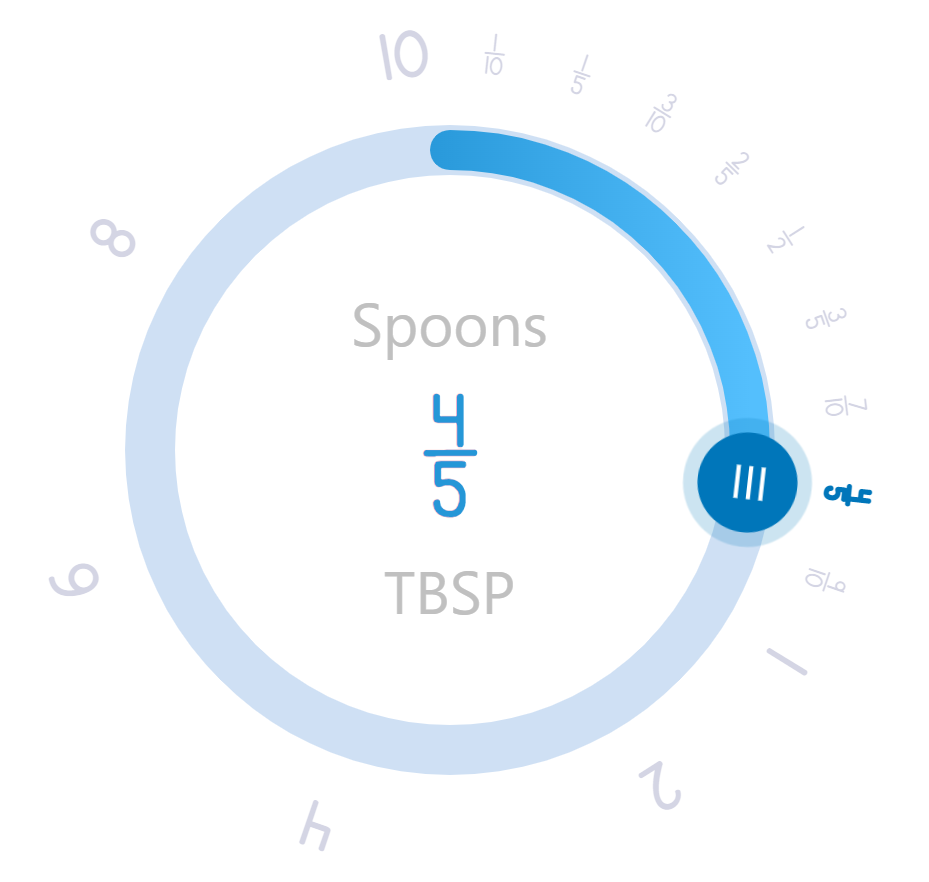
<CircularSlider
labelTop="Spoons"
labelBottom="TBSP"
width={300}
min={0}
max={4}
step={0.1}
labelStep={0.5}
onChange={console.log}
></CircularSlider>
)
};
export default App;
Props
| prop | type | default | Affects |
|---|---|---|---|
| width | number | 280 | width of the slider |
| direction | number | 1 | clockwise (1) or anticlockwise (-1) |
| min | number | 0 | smallest value |
| max | number | 360 | largest value |
| step | number | 0.1 | step count |
| labelStep | number | 1 | step count of the labels |
| limit | number | 360 | maximum angle |
| offsetAngle | number | 0 | offset angle |
| data | array | [] | array of data to be spread in 360° |
| dataIndex | number | 0 | initially place knob at a certain value in the array |
| knobEl | string | null | knob element |
| knobColor | string | #0076BA | knob color |
| knobSize | number | 60 | knob size, should be large than track size |
| hideKnob | boolean | false | hide knob |
| knobDraggable | boolean | true | knob not draggable |
| knobPosition | string | top | knob's 0 position to be top, right, bottom or left |
| labelTop | string | Demo | label on the top |
| labelBottom | string | '' | label on the bootom |
| labelColor | string | #2597D7 | label and value color |
| secondaryLabelColor | string | #c0c0c0 | secondary label and value color |
| labelOffset | number | 20 | spacing between label and circle |
| roundLabelFontSize | number | 1.2rem | font size of the label on the circle |
| roundLabelColor | string | #272b77 | color of the label on the circle |
| activedlabelColor | string | #0076ba | actived label and value color |
| labelFontSize | string | 1.5rem | label font-size |
| valueFontSize | string | 4rem | label value font-size |
| appendToValue | string | '' | append character to value |
| prependToValue | string | '' | prepend character to value |
| renderLabelValue | jsx | null | add custom jsx code for the labels and styles |
| verticalOffset | string | 2rem | vertical offset of the label and value |
| hideLabelValue | boolean | false | hide label and value |
| progressColorFrom | string | #54BFFD | progress track gradient start color |
| progressColorTo | string | #0378BC | progress track gradient end color |
| progressSize | number | 16 | progress track size |
| progressLineCap | string | round | progress track cap to be round or flat |
| trackColor | string | #CFE0F4 | background track color |
| trackSize | number | 20 | background track size |
| doubleLineType | string | progress | type of double line progress or track |
| doubleLineColor | string | null | double line color mode gradiant or null or color string |
| onChange | func | value => {} | returns label value |
| magentTolerance | number | 10 | stength of the slider magnet to the marks |