README
Angular-Hero
Create hero transitions with Angular, similar to those implemented by Google's Material Design and Polymer's core-animated-pages.
Example
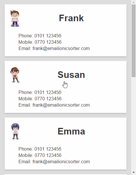
Example project here: Angular-Hero-Sample
Install with Bower
bower install angular-hero
Usage
Include
alAngularHeroas a dependency in your Angular app.angular.module('app', ['alAngularHero'])Include the supplied CSS file or add the
.hero-animatingstyle to your own.Declare the page transitions to use on the
ng-viewelement, includinghero-transition:<div ng-view class="page-transition hero-transition"></div>Identify hero elements with the
heroclass andhero-idattribute:<div class="name hero" hero-id="name">{{contact.name}}</div>The
hero-idattribute should be the same on both pages to trigger a hero animation from one to the other.
Note that for the element styles to animate correctly, hero elements should be styled by a directly applied class. For example, styling the contact name in the above example with this CSS won't work:
.screen1 .name { color: red; }
The hero element is moved out of .screen1 during the animation, so will lose its colour.
Instead, add a class to the element and style directly. e.g.
.screen1-name { color: red; }
This also means that CSS styles will be animated during the transition. For example, if the target element is blue, then we'll see an animated transition from red to blue. You can also animate other styles in the same way, such as corner-radius and borders etc...