README
arc-progress.js
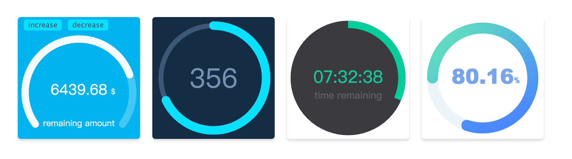
Arc animation progress bar drawn by canvas 中文文档
If you want to used it in the React, you can use the react-arc-progress component. Because of the use the React Hook, dependent React version need tobe >= 16.8.0
Installation
npm install arc-progress -S
Download file ⬇️
If you want to add arc-progress files in your project for use <script>, you can click and download ️arc-progress.min.js file.
Usage
<div id='progress-container'></div>

<script>
  const customText = [{text: '%', size: '12px', color: '#000', x: 142, y:102}];

  const arcProgress = new ArcProgress({
    el: '#progress-container',
    progress: .68,
    speed: 5,
    value: '5439.92',
    size: 200,
    customText,
    observer(e, t) {
      console.log('observer the animation', e, t);
    },
    animationEnd(e) {
      console.log('the animation is end', e);
    }
  });
</script>
If used in the React, can use the react-arc-progress component.
If used in the VUE, instantiate in the life cycle of can get real DOM node.
in the Vue code:
<template>
  <div>
    <div id='progress-container' />
  </div>
</template>

<script>
  import ArcProgress from 'arc-progress';

  export default {
    data () {
      return {
        customText: [{text: '%', size: '12px', color: '#000', x: 142, y:102}]
      }
    },
    mounted() {
      arcProgress = new ArcProgress({
        el: '#progress-container',
        progress: .68,
        speed: 5,
        value: '5439.92',
        size: 200,
        customText: this.customText,
        observer(e, t) {
          console.log('observer the animation', e, t);
        },
        animationEnd(e) {
          console.log('the animation is end', e);
        }
      });
    }
  }
</script>
Options
In the instantiation, pass the following optional option
| Option | Type | Description |
|---|---|---|
| el | string or dom (required) | The class or id name of dom container, can also pass in a reference of the dom node |
| progress | number (required) | Set progress value, the range is 0 - 1 |
| size | number | Generate progress bar canvas container, size by default of 200 |
| text | string | Set the text of progress bar |
| arcStart | number | Start point of the arc, specific usage see below |
| arcEnd | number | End point of the arc, specific usage see below |
| thickness | number | Set the thickness of the arc progress bar |
| fillThickness | number | Set the thickness of the arc progress bar fill content, the default value is same as with thickness param when this option is not set |
| emptyColor | string | Set the color of the empty part for the arc progress bar |
| fillColor | string or object | Set the style of the fill part for the arc progress bar, specific usage see below. |
| lineCap | string | Set the style at the end of the arc progress bar, there are three optional values, namely butt, round, square. The default value is round |
| speed | number | Set the animation speed threshold, ranging from -100 to 100, default is 0 |
| animation | boolean or number | The duration of the animation in milliseconds. When the value is false, there is no transitional animation |
| textStyle | object | Set the style of text, specific usage see below |
| customText | array | Custom Text Contents, specific usage see below |
| animationEnd | function | Callback at the end of progress bar animation |
| onError | function | Catch the error callback |
| observer | function | Callback to observer progress bar animation changes |
Methods
Method that can be used after instantiation
| Name | Description |
|---|---|
| updateProgress | Update progress bar method, pass parameter optios as above (no have the el option) |
| destroy | Destroy the progress Bar |
Options Description
arcStart and arcEnd
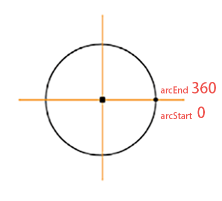
The start point and end point of the arc are marked as show in the picture, direction is clockwise. If you want to draw a circular progress bar, you can set arcStart to 90, arcEnd to 270. Or if you want to draw a semicircle, you can set arcStart'to180', arcEnd to 360. Start and end angles can be adjusted as needed.
fillColor
fillColor is the progress bar color of the filled part, which can be passed in as its defined color(for example #ffee3c).
If want used the gradient, the option need to be set to the object type, such as {gradient: [color 1, color2, color 2]}, it will be have three colors of the radial gradients.
If you want use image filled, you need to set the option to the object type, the format is {image: url}, and the url is address of the picture.
textStyle
Set the style of the text content, which needs to be the object type. The optional content is as follows
| Name | Type | Description |
|---|---|---|
| size | string | The text size, for example 18px |
| color | string | The text color, for example #fa0556 |
| font | string | The text font-family, for example Microsoft YaHei |
| x | number | X-axis of text position |
| y | number | Y-axis of text position |
customText
customText option to custom the some text contents, It is an array type. You can define more than one text. Each usage is consistent with the textStyle option, but it have one more item is text, this is used show you definition text content.
| Name | Type | Description |
|---|---|---|
| text | string | Set the text content |
| others | Other parameters are same as with the usage of textStyle |